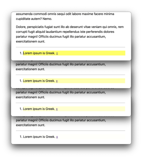
When a hash-link is used on a website, the page scrolls to the position where the element being linked to is visible. But is that entirely clear? Sometimes it’s jarring and confusing. The Yellow Flash is an idea to highlight the element being linked to briefly to guide the eye to it and make sense of a confusing situation.
We’ll get to the Yellow Flash, but it all has to do with on-page scroll position and understanding where you are. These days, CSS alone can animate the scroll position on a page. It’s a one-liner!
html {
  scroll-behavior: smooth;
}
To some degree, this is an aesthetic choice. When a page scrolls from one position to the next (because of, say, a “jump link” to another ID on the page), rather than instantly jumping there the page smoothly scrolls there. Beyond aesthetics, the point of using this might be to help a user understand context. Oh I see, the page scrolled from here to here, and where it stopped represents where I linked to.
But a smooth scroll isn’t the only way to emphasize that the context of linking elsewhere on the same page. We can also do with a visual changed to the targetted area, and I’d argue it’s most clear that way.
Fortunately, there is a CSS pseudo-selector that is perfectly suited to the job of styling elements when they’ve been on-page linked to. The :target selector, which can be used on any element:
section:target {
  background: yellow;
}
What that means is: When the #hash in the URL matches the #id of this element, this selector matches and style it like this.
So if there is an element like…
<section id="footnotes">

</section>
And the URL happens to be:
https://website.com/#footnotesThat selector matches and we’ll see it have a yellow background.
That URL would occur when a link is clicked like:
<a href="/#footnotes">Jump to Footnotes</a>There is a trick here though, of course. A yellow background alone (or any other static styling) doesn’t exactly scream you just linked here! A little animation can go a long way here. If you don’t just set the background of the linked-to element to yellow but instead flash a background of yellow just temporarily, it’s enough to draw the eye and make the action very clear.
Here is an example and demo. Say you have a link to a footnote at the bottom of an article. This is especially interesting because a link to the bottom of a page is especially hard to draw attention to (there may not be enough scrolling room to get the footnote to the top of the page).
<p>
  Lorem ipsum<sup class="footnote" id="footnote-top-1">
    <a href="#footnote-bottom-1">1</a></sup>
  dolor sit amet consectetur adipisicing elit.
</p>
Then at the bottom of the page, the actual footnote you’re linking to:
<div id="footnotes" class="footnotes">
  <ol>
    <li id="footnote-bottom-1">Lorem ipsum is Greek.
      <a href="#footnote-top-1">
        <span class="screen-reader-text">Back to reference</span>
        ↥
      </a></li>
  </ol>
</div>
Note that both of the anchor links here are using jump links, footnote-bottom-1 and footnote-top-1 to those respective IDs.
We can make the footnote itself flash as you arrive at it with a @keyframesanimation:
.footnotes :target {
  animation: yellowflash-bg 2s;
}
@keyframes yellowflash-bg {
  from { background: yellow; }
  to   { background: transparent; }
}
In this case, it flashes to yellow immediately, then fades back out to a transparent background over 2 seconds.

Here’s an interactive example:
That’s the Yellow Flash! Of course, it doesn’t have to be yellow and it doesn’t even have to flash. The point is doing something to visually signify what is being linked to for clarity.
That demo above is paired with smooth scrolling, but you might not want to do that, as you can’t control the timing of the smooth scrolling so there is a risk the yellow flash is done by the time you get there.
Hey, make a shake might be fun too.