There are triangular unicode characters. You could draw a triangle in SVG. But there is another way to draw a triangle on the web, involving nothing but the border property and a little CSS trickery.
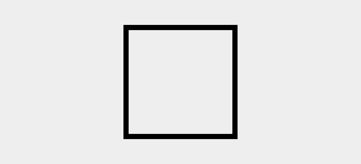
Imagine an element with a thick border:
.triangle {
  width: 200px;
  height: 200px;
  border: 10px solid black;
}
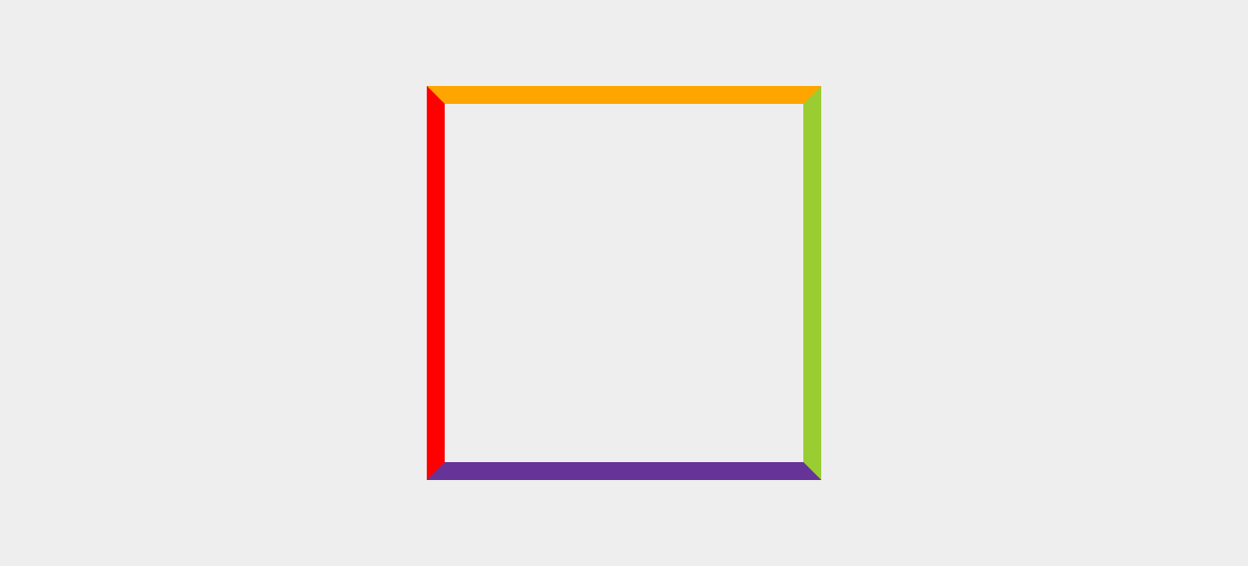
Now imagine all four borders have different colors:
.triangle {
  ...

  border-left-color:    red;
  border-right-color:   yellowgreen;
  border-top-color:     orange;
  border-bottom-color:  rebeccapurple;
}
Notice how the borders meet each other at angles?
Look what happens when we collapse the element to zero width and height:
.triangle {
  ...

  width: 0;
  height: 0;
}
If three of those borders were transparent, we’d have a triangle!
.triangle {
  ...

  border-left-color: transparent;
  border-right-color: transparent;
  border-top-color: transparent;
  border-bottom-color: rebeccapurple;
}
Nice.
This could be useful on something like a pointing bubble of text. In that case, you could add the triangle to another element via a pseudo-element. Here’s a complete example:
