The idea here is to create the appearance of a slideshow without the carousel. In other words, we’re making a […]
The idea here is to create the appearance of a slideshow without the carousel. In other words, we’re making a series of images the slide from left to right and repeat once the end of the images has been reached.
The trick is that we are using a single background image with CSS animations to move it across the screen and repeat when it’s done. This creates the illusion of an image gallery when we’re really using a single image.
Setting up the HTML
Here’s a blueprint for how our HTML needs to be structured:

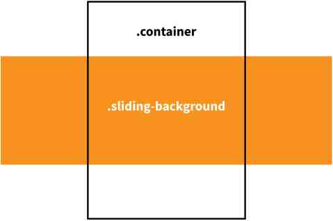
There are two-element we’re working with: the one we’re calling .container that fits the exact width of the viewport and another we’re calling .sliding-background that sits behind the .container and overflows it. In essence, we’re using the .container as a mask to hide the full width of the .sliding-background as it scrolls across the screen.
That means we only need to create two elements in the HTML markup:
<div class="container">
  <div class="sliding-background"></div>
</div>
Positioning the Elements
Let’s go ahead and add some CSS that will correctly position our two elements.
.container {
  overflow: hidden;
}

.sliding-background {
  height: 500px;
  width: 5076px;
}
Our .container uses the overflow property that will hide anything that is visually contained outside of it. Think of it like a crop on a photograph. There may be extra stuff outside the container, but the container is preventing us from seeing it.
That’s where our .sliding-background comes into play. It is set to some ridiculous width that would overflow most viewports. And that’s the trick: it should be something that would overflow the container. In this case, we’re using a somewhat arbitrarily chosen 5076px width that should overflow most browser viewports.
Creating the Background Image
We need an image if we’re creating the illusion of a slideshow gallery, right? That’s our next order of business.
Remember how we mentioned that the somewhat arbitrarily chosen 5076px width for the sliding background? Well, it is arbitrary, but intentional in the sense that it is nicely divisible by 3, which fits into the timing for a minute-long loop, which will come up a little later. That means the canvas for our background image is 5076 / 3 or 1692px. In the end, our background will repeat a total of three times in one minute in an infinite loop. Math for the win!
The 500px height is truly arbitrary. That can be whatever you want and as long as it is also the actual size of the background image file.
The Photoshop file used to create the background image for the demo at the start of this chapter is available to download if you’re looking for a starting point.
Once the image has been saved (and optimized!), this is what we’ll use as the background image in the CSS:
.sliding-background {
  background: url("..path/to/image") repeat-x;
  height: 500px;
  width: 5076px; /* The image width times 3 */
}
Great! That gives us the ginormous image that overflows the container and can now be used to scroll across the screen ad infinitum.
Animating the Background
Alright, let’s make this thing move. We want it to go from left to right in a loop that repeats over and over to create a seamless effect that the image goes on forever.
First, let’s define the CSS animation:
@keyframes slide {
  0% {
    transform: translate3d(0, 0, 0);
  }
  100% {
    transform: translate3d(-1692px, 0, 0); /* The image width */
  }
}
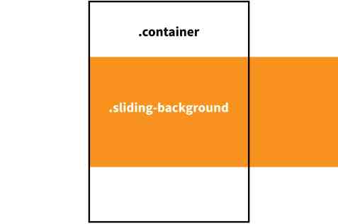
We’re using the transform property to position the left image at the left edge of the container when the animation begins, like so:

By the time the animation has completed, it will have transformed the position negatively (from left to right) by an amount that matches the exact width of our image. And, since the .sliding-background is three times the width of the actual image, the image repeats three times between 0% and 100% before looping again.
The reason we’re using an additional <div> at all, rather than animating background-position on the main, is so that we can use an animated transform to do the movement, which is much more performant.
OK, let’s round things out by calling our slide animation on the .sliding-background class:
.sliding-background {
  background: url("..path/to/image") repeat-x;
  height: 560px;
  width: 5076px;
  animation: slide 60s linear infinite;
}
The animation property instructs the .sliding-background to use the slide animation and to run it for one minute at a time in a linear, infinite loop.
Putting it All Together
<div class="container">
  <div class="sliding-background"></div>
</div>
.container {
overflow: hidden;
}
.sliding-background {
background: url("..path/to/image") repeat-x;
height: 560px;
width: 5076px;
animation: slide 60s linear infinite;
}
@keyframes slide{
0% {
transform: translate3d(0, 0, 0);
}
100% {
transform: translate3d(-1692px, 0, 0);
}
}