This post came up following a conversation I had with Emilio Cobos — a senior developer at Mozilla and member of the CSSWG — about the last CSSWG group meeting. I wanted to know what he thought were the most exciting and interesting topics discussed at their last meeting, and with 2024 packed with so many new or coming flashy things like masonry layout, if() conditionals, anchor positioning, view transitions, and whatnot, I thought his answers had to be among them.
He admitted that my list of highlights was accurate on what is mainstream in the community, especially from an author’s point of view. However, and to my surprise, his favorite discussion was on something completely different: an inaccuracy on how the letter-spacing property is rendered across browsers. It’s a flaw so ingrained on the web that browsers have been ignoring the CSS specification for years and that can’t be easily solved by a lack of better options and compatibility issues.
Emilios’s answer makes sense — he works on Gecko and rendering fonts is an art in itself. Still, I didn’t get what the problem is exactly, why he finds it so interesting, and even why it exists in the first place since letter-spacing is a property as old as CSS. It wasn’t until I went into the letter-spacing rabbit hole that I understood how amazingly complex the issue gets and I hope to get you as interested as I did in this (not so) simple property.
What’s letter spacing?
The question seems simple: letter spacing is the space between letters. Hooray! That was easy, for humans. For a computer, the question of how to render the space between letters has a lot more nuance. A human just writes the next letter without putting in much thought. Computers, on the other hand, need a strategy on how to render that space: should they add the full space at the beginning of the letter, at the end, or halve it and add it on both sides of the letter? Should it work differently from left-to-right (LTR) languages, like English, to right-to-left (RTL) like Hebrew? These questions are crucial since choosing one as a standard shapes how text measurement and line breaks work across the web.
Which of the three strategies is used on the web? Depends on who you ask. The implementation in the CSS specifications completely differs from what the browsers do, and there is even incompatibility between browsers rendering engines, like Gecko (Firefox), Blink (Chrome, Brave, Opera, etc.), and WebKit (Safari).
What the CSS spec says
Let’s backpedal a bit and first know how the spec says letter spacing should work. At the time of writing, letter-spacing:
Specifies additional spacing between typographic character units. Values may be negative, but there may be implementation-dependent limits.
The formal specification has more juice to it, but this one gives us enough to understand how the CSS spec wants letter-spacing to behave. The keyword is between, meaning that the letter spacing should only affect the space between characters. I know, sounds pretty obvious.
So, as the example given on the spec, the following HTML:
<p>a<span>bb</span>c</p>…with this CSS:
p {
  letter-spacing: 1em;
}

span {
  letter-spacing: 2em;
}
…should give an equal space between the two “b” letters:
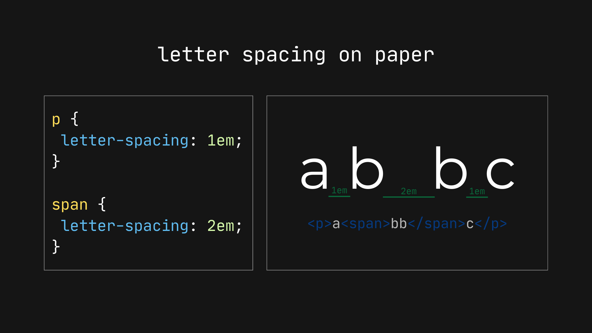
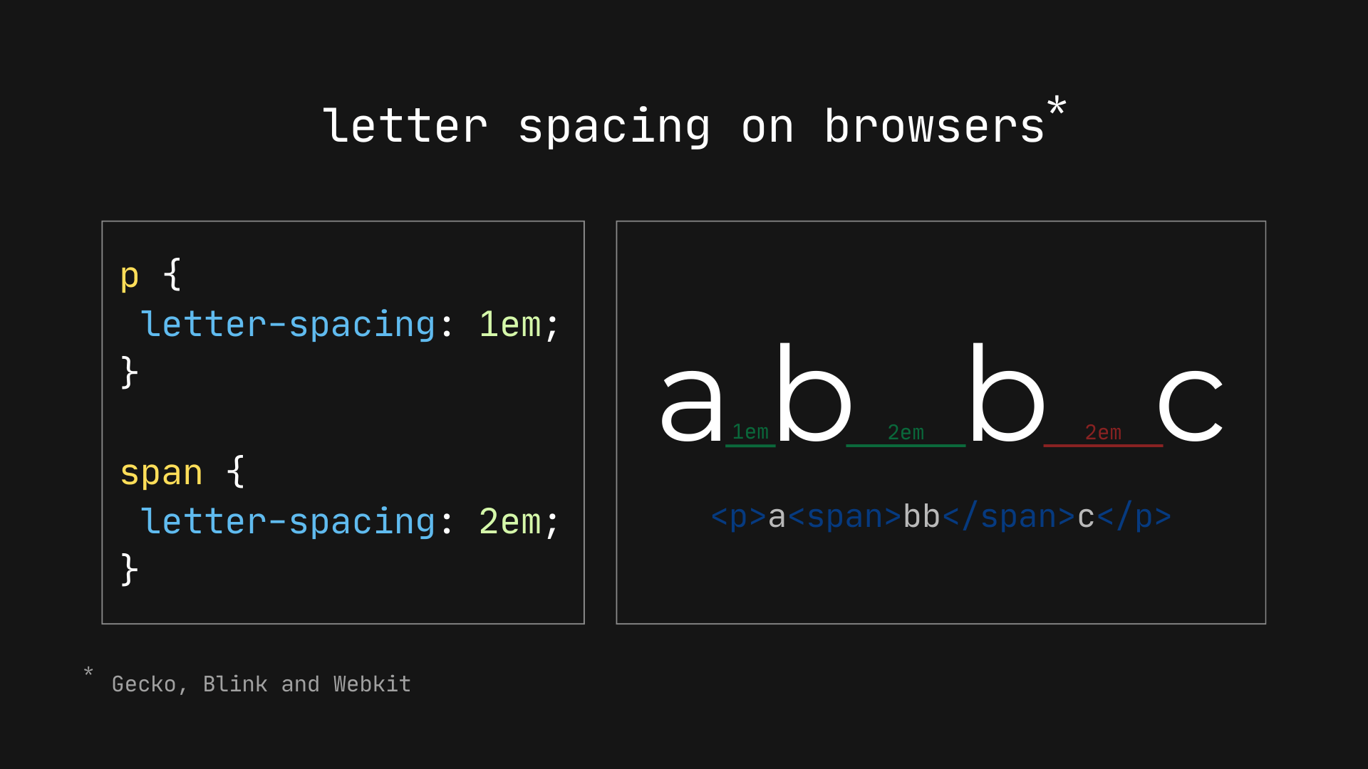
However, if we run the same code on any browser (e.g., Chrome, Firefox, or Safari), we’ll see the spacing isn’t contained between the “b” letters, but also at the end of the complete word.
What browsers do
I thought it was normal for letter-spacing to attach spacing at the end of a character and didn’t know the spec said otherwise. However, if you think about it, the current behavior does seem off… it’s just that we’re simply used to it.
Why would browsers not follow the spec on this one?
As we saw before, letter spacing isn’t straightforward for computers since they must stick to a strategy for where spacing is applied. In the case of browsers, the standard has been to apply an individual space at the end of each character, ignoring if that space goes beyond the full word. It may have not been the best choice, but it’s what the web has leaned into, and changing it now would result in all kinds of text and layout shifts across the web.
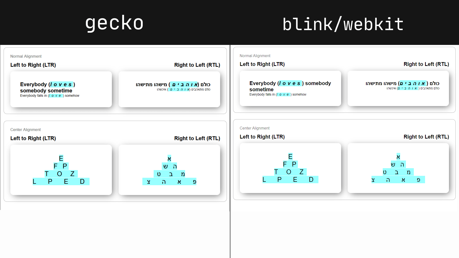
This leaves a space at the end of elements with bigger letter spacing, which is somewhat acceptable for LTR text, but it leaves a hole at the beginning of the text in an RTL writing mode.
The issue is more obvious with centered text, where the ending space pushes the text away from the element’s dead center. You’ve probably had to add padding on the opposite side of an element to make up for any letter-spacing you’ve applied to the text at least one time, like on a button.
As you can see, the blue highlight creates a symmetrical pyramid which our text sadly doesn’t follow.
What’s worse, the “end of each character” means something different to browsers, particularly when working in an RTL writing mode. Chrome and Safari (Blink/WebKit) say the end of a character is always on the right-hand side. Firefox (Gecko), on the other hand, adds space to the “reading” end — which in Hebrew and Arabic is the left-hand side. See the difference yourself:
Can this be fixed?
The first thought that comes to mind is to simply follow what the spec says and trim the unnecessary space at the ending character, but this (anti) solution brings compatibility risks that are simply too big to even consider; text measurement and line breaks would change, possibly causing breakage on lots of websites. Pages that have removed that extra space with workarounds probably did it by offsetting the element’s padding/margin, which means changing the behavior as it currently stands makes those offsets obsolete or breaking.
There are two real options for how letter-spacing can be fixed: reworking how the space is distributed around the character or allowing developers an option to choose where we want the ending space.
Option 1: Reworking the space distribution
The first option would be to change the current letter-spacing definition so it says something like this:
Specifies additional spacing applied to each typographic character unit except those with zero advance. The additional spacing is divided equally between the inline-start and -end sides of the typographic character unit. Values may be negative, but there may be implementation-dependent limits.
Simply put, instead of browsers applying the additional space at the end of the character, they would divide it equally at the start and end, and the result is symmetrical text. This would also change text measurements and line breaks, albeit to a lesser degree.
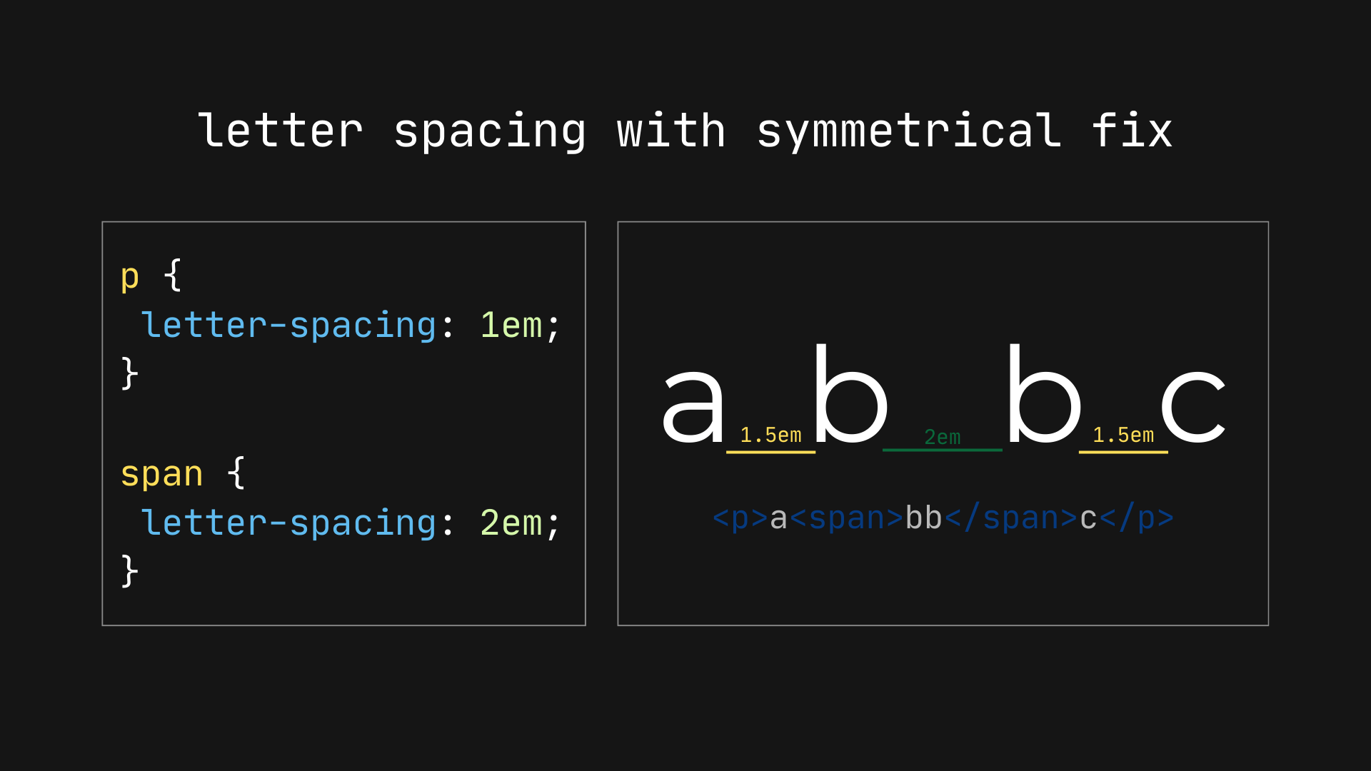
Now text that is center-aligned text is correctly aligned to the center:
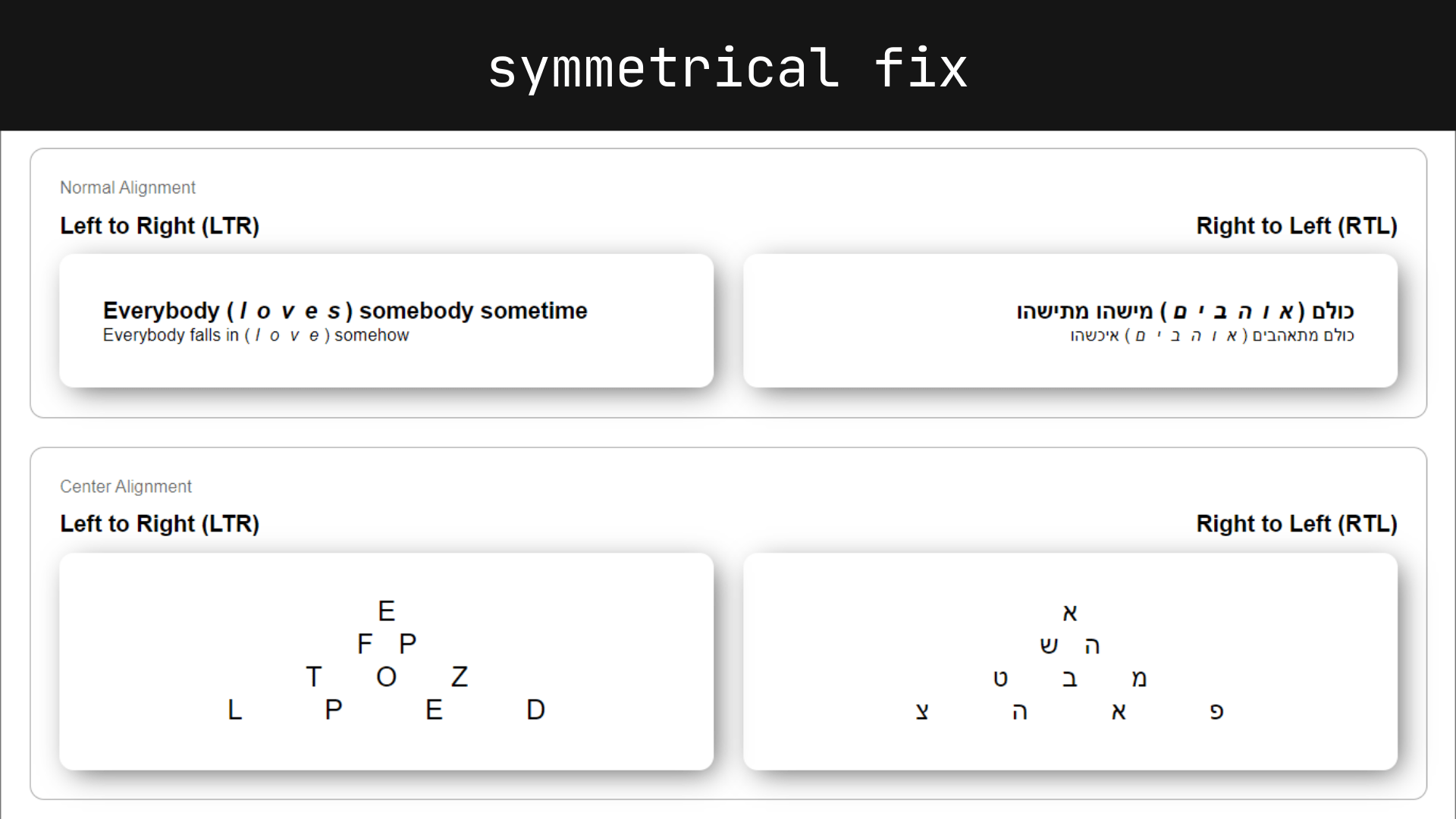
Option 2: Allowing developers an option to choose
Even if the offset is halved, it could still bring breaking layout shifts to pages which to some is still (rightfully) unacceptable. It’s a dilemma: most pages need, or at least would benefit, from leaving letter-spacing as-is, while new pages would enjoy symmetrical letter spacing. Luckily, we could do both by giving developers the option to choose how the space is applied to characters. The syntax is anybody’s guess, but we could have a new property to choose where to place the spacing:
letter-spacing-justify: [ before | after | left | right | between | around];Each value represents where the space should be added, taking into account the text direction:
before: the spacing is added at the beginning of the letter, following the direction of the language.after: the spacing is added at the end of the letter, following the direction of the language.left: the spacing is added at the left of the letter, ignoring the direction of the language.right: the spacing is added at the right of the letter, ignoring the direction of the language.between: the spacing is added between characters, following the spec.around: the spacing is divided around the letter.
Logically, the current behavior would be the default to not break anything and letter-spacing would become a shorthand for both properties (length and placing).
letter-spacing: 1px before;
letter-spacing: 1px right;
letter-spacing: 1px around;

letter-spacing: 1px;
/* same as: */
letter-spacing: 1px before;
What about a third option?
And, of course, the third option is to leave things as they are. I’d say this is unlikely since the CSSWG resolved to take action on the issue, and they’ll probably choose the second option if I had to bet the nickel in my pocket on it.
Now you know letter-spacing is broken… and we have to live with it, at least for the time being. But there are options that may help correct the problem down the road.
Equal to what?
Hi! According to the spec, it is equal to the space defined in the
letter-spacingproperty and nothing else. The space around the “b”s should also be equal between them.You said, that fixing this would not be ideal, because…
In short, two of your main points being that such fix would:
affects “lots of websites”
and the risks are big
I’m not sure what “lot” means. We would need to find out how many websites are using letter-spacing, especially in a way that fixing this would actually break the site.
And for that we need to consider what “breaking the site” means. Because we are talking about something that should not (really) affect functionality, only how things look.
And then we can discuss what you mean by risks being big.
What exactly the risk?
Worst case, some UI could actually break. A header might overflow content below, cover an important link or button.
My guess is that this would be rare, compared to more harmless readability issues, like words or paragraphs being a bit more close to each other, than expected.
I understand that this is still not ideal, but it is also not ideal having to learn one more inconsistent and broken behaviour, and one more CSS property to work around it.
I like the sentiment of the web platform wanting to keep backwards compatibility, but we are already at a point where lots of websites are already broken, many things are not rendering as they was imagined, more serious breakages and changes has happened in the past.
Hi! Thanks for your comment.
I can’t give you an exact number on how many websites could break or at least look worse if
letter-spacingis “fixed”, that is something that should be investigated if we want the “trimming” or “space around” solution to be implemented.However, as noted on this CSSWG Group Issue: A Blink developer stated that “For Blink, the same as before; the breakage is beyond what we can accept”. And on the Gecko side, the breakage was more than expected. So there isn’t a definite conclusion.
If we don’t have any compact conclusion or “know the risk”, changing how browsers handle
letter-spacingwould be reckless. Especially sinceletter-spacingis used over 60% on the web.Above all, I do understand the need to better compact data on the issue.
Thanks for reading!
The space-around would be the best, as it will work for both LTR & RTL. If you do – after or before, then you’ll have to adjust the end character spacing differently for both layouts, which will be complex.
Additionally, both negative (-1em) & larger letter spacing (10em) should be considered. You wouldn’t want a 10em gap between screen edges and the letters.
There is a problem with the current letter-spacing behavior in Arabic; It cuts the links between letters adding empty spaces, instead of extending them. The links are integral part of the written words and should not be cut. Here is an example how it should look like!
اهـلـاً عـا لـم !
Also I think letter-spacing would benefit greatly of multiplier unit. Instead of adding a fixed space, multiply the current space by it. Which keeps the intrinsic letter-spacing ratios.