There are a lot of ways to work with color on the web. I think it’s helpful to understand the mechanics behind what you’re using, and color is no exception. Let’s delve into some of the technical details of color on the web.
Color mixing
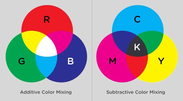
A huge part of working with color is understanding that the way that you used color as a child doesn’t work the same as how you use color on a computer because of color mixing. As a child, you’re working with paint. Paint and inks from a printer have tiny particles called pigments that mix together and reflect to present color to your eye. This is subtractive color mixing. The more colors you add to it, the darker it becomes, until we get brown. Primaries are close to what you’re used to: red, yellow, blue. But when you mix these colors with subtractive color mixing, you arrive at brown.

On a computer (or any monitor), we’re working with light. Which means that when all of the colors mix together, they make white. Before Isaac Newton’s famous prism color experiment, color was believed to be contained within objects rather than reflected and absorbed from the object. Isaac Newton used a prism to prove his theory that sunlight or bright white light was in fact several colors by using the prism to split apart the colors to make a rainbow, and then subsequently using a prism to attempt to further split the blue. The blue did not split, showing that the color wasn’t within the prism, but rather that the prism was splitting the light. This means that in additive color mixing, the type of color mixing you get in a monitor, red green and blue can be used to produce all colors, or rgb. In this type of mixing, red and green create yellow.
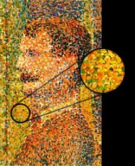
Monitors are many combinations of small bits of light combined that resonate to create a myriad of colors. Resolution refers to the number of individual dots of color, known as pixels, contained on a display. Before we had monitors, artists were using this type of light frequency. Seurat and the Pointillists used red and green to create yellow in paintings like “La Grande Jatte” (though he preferred the term chromo-luminarism. Others called it divisionism) This type of painting was created under the belief that optical mixing created more pure resonance in your eye that traditional subtractive pigment color mixing.
Monitors are made in a few different display modes that change the way we perceive color through them. We express this the term “color bit depth”. The number of colors that can be displayed at one time is determined by this color bit depth. If we have a bit depth of 1, we can produce two colors, or monochrome. Bit depth of two levels creates 4, and so on until we reach a bit-depth of 32, though commonly monitors that project the web have 24 bit-depth density and 16,777,216 colors which is True Color and Alpha Channel.
We call this True Color because our human eyes can discern 10,000,000 unique colors, so 24-bit depth will certainly allow for this. In this 24-bit depth, 8 bits are dedicated to red, green, and blue. The rest are used for transparency or alpha channels.
Let’s use this information to unpack our available color properties on the web.
Color values
RGB Values
The last section illustrates what rbga(x, x, x, y); communicates, but let’s break that down a bit more, and show some other properties and their uses. In terms of web color values in an RGB channel, we specify color on a range from 0-255.
x is a number from 0-255
y is a number from 0.0 to 1.0
rgb(x, x, x); or rgba(x, x, x, y);

Example: rbga(150, 150, 150, 0.5);
Hex Values
Hex colors are a slightly different format to represent the values in the same way. Hex values are probably the most common way developers designate color on the web.
If you recall that a byte is 8 bits, each Hex color or number represents a byte. A color is specified according to the intensity of its red, green and blue components, so we call it a triplet, with each expressed in two places. One byte represents a number in the range 00 to FF (in hexadecimal notation), or 0 to 255 in decimal notation. Byte 1 is Red, byte 2 is green, and byte 3 is blue. Hexadecimal is named this because it uses a base 16 system. The values use ranges from 0-9 and A-F, 0 being the lowest value and F being the highest, or #00000 being black and #FFFFFF being white.
For triplets with repeated values, you can eliminate the repetition by writing in shorthand, for instance, #00FFFF becomes #0FF. This system is easy for computers to understand, and it pretty short to write, which makes it useful for quick copy paste and designation in programming. If you’re going to work with colors in a more involved way, though, HSL is a little bit more human-readable.
HSL Values
Hsl values work with similar semantics and ranges as rgb, but rather than working with values as the monitor interprets the colors, hsl values work with hue, saturation, lightness values. This looks syntactically similar to rgb values but the ranges are different. This system is based on a Munsell color system (he was the first to separate out color into these three channels, or create a three dimensional system based on mathematical principles tied to actual human vision).
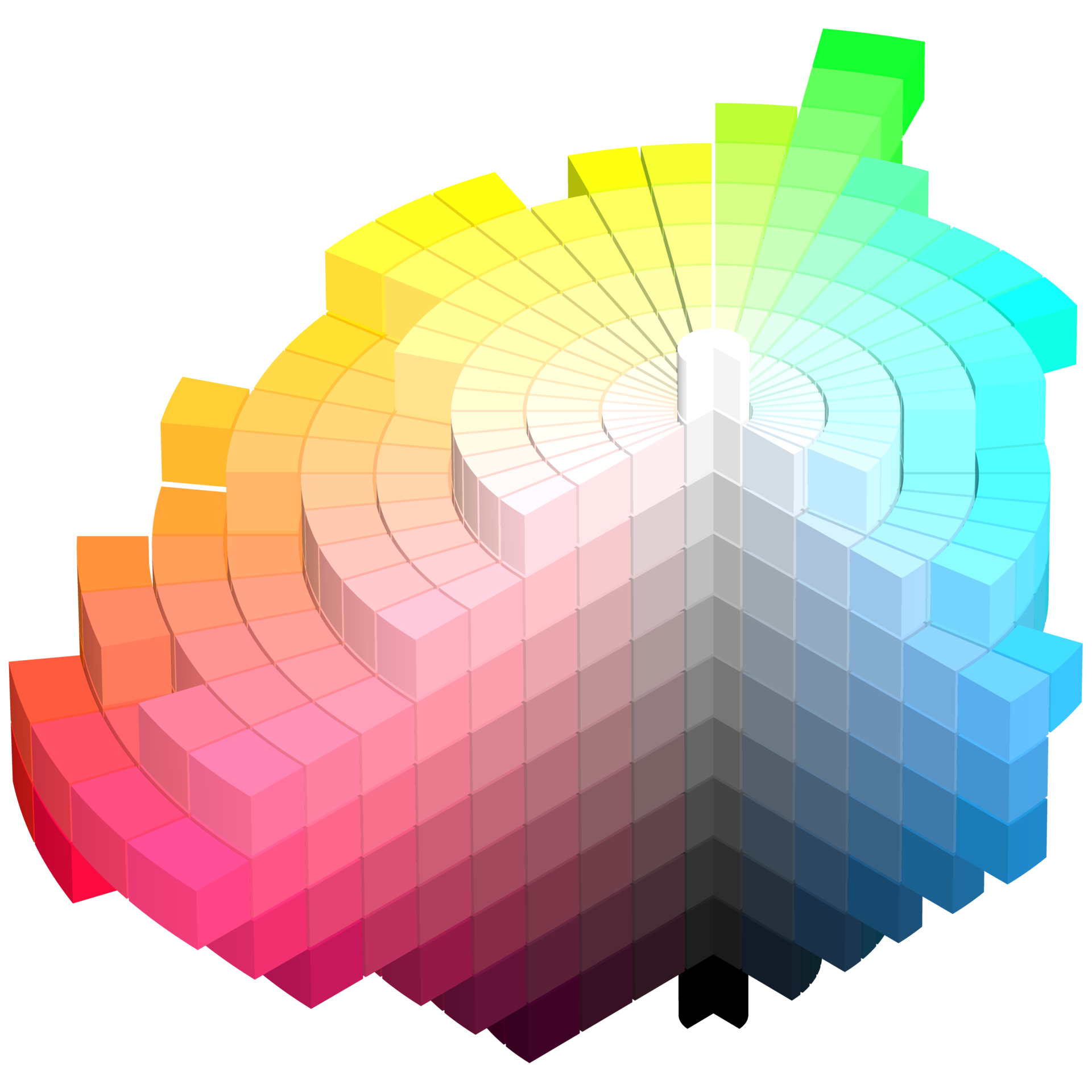
Hue rotates in 360 degrees, a full circle, while saturation and lightness are percentages from 0 to 100.
x is a number from 0 - 360
y is a percentage from 0% to 100%
z is a number from 0.0 to 1.0
hsl(x, y, y); or hsla(x, y, y, z);

Example: hsla(150, 50%, 50%, 0.5);
It’s a relatively easy change (around 11 lines of code, to be precise) for the browsers to exchange between rgb and hsl values, but for us humans, the use of hsl can be a lot easier to interpret. Imagine a wheel, with dense and saturated content at the center. This demo does a pretty good job of showing how it’s expressed.

If you don’t feel particularly skilled working with color, hsla() allows for some pretty simple rules to create nice effects for developers. We cover more about this in the generative color section below.
Named Colors
Named colors are also available to us as developers. Named colors, though, have a reputation for being difficult to work with due to their imprecision. The most notable and “famous” examples are that dark grey is actually lighter than grey and lime and limegreen are totally different colors. There’s even a game where you can try to guess named colors on the web, made by Chris Heilmann. Back in the old days, chucknorris was a blood red color (it’s only supported in HTML now as far as I can tell), but that was my favorite. Named colors can be useful for demonstrating color use quickly, but typically developers use Sass or other preprocessors to store color values by hex, rgba, or hsla and map them to color names used within the company.
Color Variables
A good practice is to store color variables and never use them directly, mapping them instead to other variables with more semantic naming schemes. CSS has native variables, like:
:root {
  --brandColor: red;
}

body {
  background: var(--brandColor);
}
But they are fairly new and haven’t made their way into Microsoft browsers at the time of this writing.
CSS preprocessors also support variables, so you can set up variables like $brandPrimary to use through your code base. Or a map:
$colors: (
  mainBrand: #FA6ACC,
  secondaryBrand: #F02A52,
  highlight: #09A6E4
);

@function color($key) {
  @if map-has-key($colors, $key) {
    @return map-get($colors, $key);
  }

  @warn "Unknown `#{$key}` in $colors.";
  @return null;
}

// _component.scss
.element {
  background-color: color(highlight); // #09A6E4
}
Remember that naming is important here. Abstract naming is sometimes useful so that if you change a variable that was representing a blue color to an orange color, you don’t have to go through and rename all of your color values. Or worse yet, put up a sign that says “$blue is orange now.” *sad trombone noise*
currentColor
currentColor is an incredibly useful value. It respects the cascade, and is useful for extending a color value to things like box shadows, outlines, borders, or even backgrounds.
Let’s say you have created a div and then inside it another div. This would create orange borders for the internal div:
.div-external { color: orange; }
.div-internal { border: 1px solid currentColor; }
This is incredibly useful for icon systems, either SVG icons for icon fonts. You can set currentColor as the default for the fill, stroke, or color, and then use semantically appropriate CSS classes to style the sucker.
Preprocessors
CSS preprocessors are great for tweaking colors. Here’s some links to different preprocessors documentation on color functions:
- Sass functions
- Less functions
- Stylus functions
- Example PostCSS plugin for color functions
Here are a few of the cool things we can specifically with Sass:
mix($color1, $color2, [$weight])
adjust-hue($color, $degrees)
lighten($color, $amount)
darken($color, $amount)
saturate($color, $amount)
There are truthfully dozens of ways to programmatically mix and alter colors with preprocessors, and we won’t go into depth for all of them, but here’s a great interactive resource for more in-depth information.
Color Properties
Color, as a CSS property, refers to font color. If you’re setting a color on a large area, you would use background-color, unless it’s an SVG element in which case you would use fill. Border is the border around an HTML element, while stroke is it’s SVG counterpart.
Box and Text Shadows
The box-shadow and text-shadow properties accept a color value. Text shadows accept 2-3 values, h-shadow (horizontal shadow), v-shadow (vertical shadow), and an optional blur-radius. Box shadows take 2-4 values, h-shadow, v-shadow, optional blur distance, and optional spread distance. You can also designate inset at the start to create an inverted shadow. This site has a great demo with easy, pasteable code.
Gradients
Linear gradients work by designating a direction. From/to (depending on the browser prefix) top, bottom, left, right, degrees, or radial-gradients. We then specify color stops and the color we want at each stop. These can accept transparency too.
Here’s an example:
Most of the syntax of gradients isn’t all that difficult to write, but I really enjoy working with this online gradient generator, because it also creates the complicated filter property for IE6-9 support. Here is also a really beautiful UI gradient creator. This one is pretty cool and it is open source and you can contribute to it.
Gradients are similarly easy to create in SVG. We define a block that you reference with an id. We can optionally define a surface area for the gradient as well.
<linearGradient id="Gradient">
  <stop id="stop1" offset="0" stop-color="white" stop-opacity="0" />
  <stop id="stop2" offset="0.3" stop-color="black" stop-opacity="1" />
</linearGradient>
These gradients also support opacity so we can have some nice effects and layer effects like animate them as as a mask.
Gradient text is also possible in webkit only, we have a really a nice code snippet for that here on CSS-Tricks.
Generative Color
There are a few cool ways to drum up a lot of staggering colors at once. I find these to be really fun to play with when creating generative art or UI elements with code.
As long as you stay within the ranges designated in the last sections, you can use for loops in either Sass (or any CSS preprocessor) or JavaScript, or Math.Random() with Math.floor() to retrieve color values. We need Math.floor() or Math.ceil() here because if we don’t return full integers, we’ll get an error and do not get a color value.
A good rule of thumb is that you shouldn’t update all three values. I’ve had good luck with a lot of deviation in one range of values, a smaller deviation in the second set of values, and no deviation for the third, not necessarily in that order. For instance, hsl is very easy to work with to step through color because you know that looping through the hue from 0 to 360 will give you a full range. Another nice grace of hue-rotate in degrees is that because it’s a full circle, you don’t need to stick to ranges of 0 – 360, even -480 or 600 is still a value a browser can interpret.
Sass
@mixin colors($max, $color-frequency) {
  $color: 300/$max;

  @for $i from 1 through $max {
    .s#{$i} {
      border: 1px solid hsl(($i - 10)*($color*1.25), ($i - 1)*($color / $color-frequency), 40%);
     }
  }
}
.demo {
  @include colors(20,2);
}
I use that to make fruit loop colors in this demo:
As well as this one, with a different range (scroll inside the list really fast):
In the code below, I’m using Math.random() within rgb values to drum up a lot of color within the same range. This demo is creating a three-dimensional VR experience with React. I could have stepped through it with a for loop as well, but I wanted the color to be randomized to reflect the movement. Sky’s the limit on this one.

JavaScript
class App extends React.Component {
  render () {
    const items = [],
          amt1 = 5,
          amt2 = 7;
    for (let i = 0; i < 30; i++) {
     let rando = Math.floor(Math.random() * (amt2 - 0 + 1)) + 0,
          addColor1 = parseInt(rando * i),
          addColor2 = 255 - parseInt(7 * i),
          updateColor = `rgb(200, ${addColor1}, ${addColor2})`;
      items.push(
	    // ...
        );
    }
    return (

       // ...
       {items}

    );
  }
}
GreenSock came out with a tool that allows you to animate relative color values, which is useful because it means you can grab a lot of elements at once and animate them relative to their current color coordinates. Here are some turtles that demonstrate the idea:
TweenMax.to(".turtle2 path, .turtle2 circle, .turtle2 ellipse", 1.5, {fill:"hsl(+=0, +=50%, +=0%)"});Other Nice Color Effects
Mix Blend Modes and Background Blend Modes
If you’ve used layer effects in Photoshop, you’re probably familiar with mix blend modes. Almost every site in the 90s used them (mine did. *blush*). Mix and background blend modes composite two different layered images together, and there are 16 modes available. Going through each is beyond the scope of this article, but here are some key examples.
The top image or color is called the source, and the bottom layer is called the destination. The area between the two is where the blending magic happens and is called the backdrop. We’re mixing both according to fairly simple mathematical formulas.
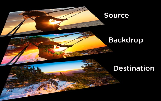
If you want to get really nerdy with me, the color formulas for the blend modes depend on the type of effect used. For instance, multiply is destination × source = backdrop. Other effects are variations of simple math using subtraction, multiplication, addition, and division. Linear is A+B−1, while Color Burn is 1−(1−B)÷A. You don’t really need to know any of these to use them, though.
Here is some more extensive documentation, and here’s a very simple demo to illustrate color working with some of these effects:
This great article by Robin demonstrates some really complex and impressive effects you can achieve from layering multiple blend modes as well. Below we’ll cover mixing them with filters. There’s really a lot you can do in the browser these days.
Filters
CSS Filters provide a lot of cool color effects, as well as the ability to take a colored image and make it greyscale. We have a great resource here on CSS-Tricks that shows how these work, and the browser support is pretty high now. Bennett Feely also has this nice filter gallery if you’re feeling explorative.
Filters and Blur modes can work together! Una Kravets created this cool tool called CSS Gram combining some effects to create typical instagram filters, she has some nice documentation at the bottom.
feColorMatrix
Una has another article exploring the creation of these images with feColorMatrix instead, which is a filter primitive in SVG that can be applied to HTML elements as well. It’s very powerful, and allows you to fine-tune and finesse color. As the name implies, the base markup of feColorMatrix uses a matrix of values, and we apply it using it’s relative id.
<filter id="imInTheMatrix">
    <feColorMatrix in="SourceGraphic"
      type="matrix"
      values="0 0 0 0 0
              1 1 1 1 0
              0 0 0 0 0
              0 0 0 1 0" />
  </filter>

  <path filter="url(#imInTheMatrix)"  … />
We can also extend this matrix and adjust the hue, saturation, etc, of these values:
<filter id="imInTheHueMatrix">
  <feColorMatrix in="SourceGraphic"
    type="hueRotate"
    values="150" />
</filter>
Una’s article goes into depth exploring all of the capabilities here, but you can get even more information on this and a lot of other crazy SVG colors and gradient tools with Amelia Belamy-Royd’s O’Reilly Book, SVG Colors, Patterns & Gradients or Mike Mullany’s exploratory demo.
Accessibility and Other Things to Note about Color
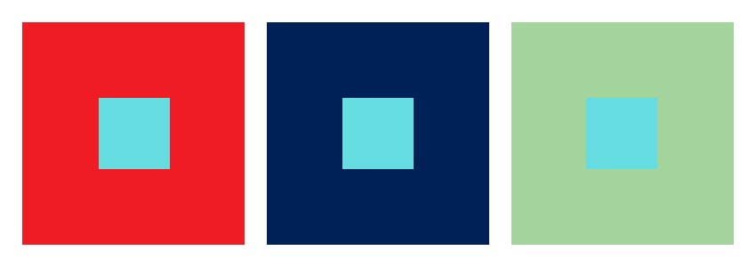
A color is only a color in reference to another color. This is part of what makes color so difficult. You’re probably a little familiar with this in terms of accessibility. A light green on a black may be accessible, but when you change it to a white background it no longer is.
Accessibility in color can be measured with a number of tools. Here are some of my favorites:
It’s also really nice to set up your palette for accessibility from the start. Color Safe is a great tool that helps with that. Once you’re all set up, WAVE (Web Accessibility Tool) will help you evaluate your web page:
Color and Atmosphere
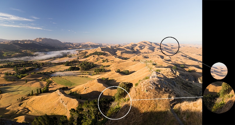
Color is affected by atmosphere, which is a pretty important thing to know if you’re going to create any kind of illusion of depth. Things that are closer to you are in higher saturation, and in more contrast. Things that are further away from you are going to look blurrier.
Shadows
Shadows are not grey, they are the compliment of the color of the light. If the light you shine on your hand has a yellow cast, the shadow will appear purple. This is useful knowledge if you’re making any super hip long shadows.

Native Color Inputs
There is a native browser color selector that you can employ to help your users select colors dynamically. You can write or if you’d like to start off with color hinting. It’s that simple to use. Good job, browsers. One thing to keep in mind is that the way that it will appear will vary slightly from browser to browser, just like any other native controls. This pen from Noah Blon shows how to use that in tandem with a hue CSS color filter to dynamically select portions of an image to change the color of. The rest of image is greyscale, so it’s not affected. Pretty clever.
Fun Developer Stuff and Other Resources
- The Color Highlighter Plugin for Sublime Text is what I use to easily see what color the browser is going to interpret. I like to use
{"ha_style": "outlined"}but I know from this article that Wes Bos prefers “filled”. - There are some different traditional palette combinations, and online web resources that can help you drum these up. For the more scientific, Paletton or Adobe Color. Benjamin Knight recreated Adobe’s color tool in d3 on CodePen, which is pretty badass and worth checking out. If you want the web to do the heavy lifting for you (who doesn’t?), Coolors is as simple as can be.
- If you need help interpreting colors, and want a quick simple tool to exchange types of color properties for you, Colorhexa has you covered in pretty much every type of color exchange you can think of.
- For the nerdiest of color nerds, you can even have your console output in colors to you. Here’s a great Pen showing how that works.
- Super Color Palette is a little playground for creating color combinations with a variety of controls and the ability to export colors in differnt image formats, including SVG, JPG, and PNG. It’s a free project with a Discord channel to share your color palettes and talk color nerdery.
Conclusion
The scope of this article is rather large, and the web has a lot of color to delve into, but hopefully this short article gives you a jumping off point for some experimentation and understanding.
This is not accurate. 24-bit color is 8 bits per RGB channel, without transparency. 32-bit color is 8 bits per channel including alpha.
Which is why HSL is a subset of 24-bit RGB color. HSL can actually only address 3,492,722 different colors (360 × 99 × 98 + 2). Technically, RGB has better fidelity, with multiple RGB values mapping to the same HSL.
I was actually in the middle of writing an article on HSL vs. RGB (http://blog.armstrongest.com/why-i-love-hsl-more-than-rgb/) when I noticed this article, but decided to publish anyhow.
Really great article. Thanks correct about rgb being 24-bit and rgba being 32-bit.
This is in response to Gary Armstrong’s comment about max colors in hsl, I just did some tests.
Just thought you’d like to know that your comment about rgb being higher fidelity than hsl is incorrect because you can use decimal percentages for saturation and lightness. But you can’t use decimal values for rgb.
eg. (on mac chrome)
hsl(290,60%,70%) = #D185E1
hsl(290,60.5%,70%) = #D284E1
It looks like you can’t have decimal hue values though.
I’m not sure if the hsl values are converted to hex or rgb. You might be maxed out at all possible hex or rgb colors if the hsl value gets rounded to one of those before getting displayed.
But i think it’s fair to say hsl has at least as many colors as rgb, if not more.
Missing a zero.
background-clip: texta.k.a. Gradient Text is soon coming to Firefox (already supported on Beta).Wow! This has to be up there with one of my favourite articles.
I love the depth you go into each sub-topic; Some enough depth to really understand how and why, and others just enough to know WHY you should be interested in reading more.
I didn’t need any breaks while reading, didn’t find myself skipping ahead. Even when you were explaining something I already have a firm grasp of, I was still interested in your overview of it.
Now that I look back through other articles written by Sarah I am noticing they are often ones I have bookmarked or committed to memory.
Thanks Sarah. Looking forward to your next article with bated breath.
WOW! Excellent piece and well written and expertly structured indeed.
Your passion for this topic certain comes through.
Indeed deserves a bookmark
Awesome article!! This should win an award or something :)
Fantastic article!
One short note. You write:
“Back in the old days,
chucknorriswas a blood red color (it’s only supported in HTML now as far as I can tell), but that was my favorite.”It’s actually more interesting than you let on.
chucknorrisisn’t a named color — the full list is here and was originally based on X11 colors.But then why does
chucknorristurn out red? The StackOverflow answer you link to explains it in detail.Browsers are trained to ignore invalid data. Missing digits and invalid hexadecimal digits are treated as
0. SoCHUCKNORRISis converted toC00C0000000. The number of hexadecimal colors’ digits has to be a multiple of three; since this has 11 we get an additional padding digit of0at the end.Browsers then divide the code into three equal chunks for RGB, so we get
C00C 0000 0000. And finally, they truncate each chunk to two characters:C0 00 00, aka#C00000, aka dark red.Commenters point out that other random strings also produce colors, including strangely appropriate ones, including
grass(green) andcrap(brown). You can use this fun tool to type random strings and discover the interpreted color.Anyway, great article!
That’s an impressive read.
One thing, regarding the
currentColorsnippet:The above might not be the best example that shows the power of
currentColorbecause in this casecurrentColoris already the default value for theborder-color.I use to dabble with oil paints and would just add black or grey to the sky color for shadows. I could always tell there was something wrong but could not figure it out; now I know. Great tips, thanks!
Great article,
I go this virus infection warning when I went to the demo mentioned early in the HSL section. I am not sure if it is legit or maybe the demo code confused my virus software, but thought I would mention it……
Infection detected!
http://www.workwithcolor.com/hsl-color-picker-01.htm
The requested URL contains malicious code that can damage your computer. If you want to access the URL anyway, turn off the Avast web shield and try it again.
Infection type: JS:Redirector-BNI [Trj]
The RGB function can also be used with 3 percentage values to represent the proportion of red, green and blue to apply, 0% = 0 (or 00 hex), 100% = 255 (or FF hex). All three values have to be percentages, they can go down to 2 decimal places (12.34%) but do not appear to work with the RGBA function.
Why am I just now finding out about console colors?!
Love the awesome blend modes demo in the article. Besides that, there’s a useful read on improving your color workflow and creating a color palette for web developers on Smashing:
https://www.smashingmagazine.com/2016/04/web-developer-guide-color/
Thanks!
— Bo
Great job! Thank you.
rbga =)