Quick guidelines on when to use each:
- Are you giving a user a way to go to another page or a different part of the same page? Use a link (
<a href="/somewhere">link</a>) - Are you making a JavaScript-powered clickable action? Use a button (
<button type="button">button</button>) - Are you submitting a form? Use a submit input (
<input type="submit" value="Submit">)
Links
Links are one of the most basic, yet deeply fundamental and foundational building blocks of the web. Click a link, and you move to another page or are moved to another place within the same page.
Table of Contents
HTML implementation
A basic link
<a href="https://css-tricks.com">CSS-Tricks</a>That’s a link to a “fully qualified” or “absolute” URL.
A relative link
You can link “relatively” as well:
<!-- Useful in navigation, but be careful in content that may travel elsewhere (e.g. RSS) -->
<a href="/pages/about.html">About</a>
That can be useful, for example, in development where the domain name is likely to be different than the production site, but you still want to be able to click links. Relative URLs are most useful for things like navigation, but be careful of using them within content — like blog posts — where that content may be read off-site, like in an app or RSS feed.
A jump link
Links can also be “hash links” or “jump links” by starting with a #:
<a href="#section-2">Section Two</a>
<!-- will jump to... -->
<section id="section-2"></section>
Clicking that link will “jump” (scroll) to the first element in the DOM with an ID that matches, like the section element above.
💥 Little trick: Using a hash link (e.g. #0) in development can be useful so you can click the link without being sent back to the top of the page like a click on a # link does. But careful, links that don’t link anywhere should never make it to production.
💥 Little trick: Jump-links can sometimes benefit from smooth scrolling to help people understand that the page is moving from one place to another.
It’s a fairly common UI/UX thing to see a “Back to top” link on sites, particularly where important navigational controls are at the top but there is quite a bit of content to scroll (or otherwise navigate) through. To create a jump link, link to the ID of an element that is at the top of the page where it makes sense to send focus back to.
<a href="#top-of-page">Back to Top</a>Jump links are sometimes also used to link to other anchor (<a>) elements that have no href attribute. Those are called “placeholder” links:
<a id="section-2"></a>
<h3>Section 2</h3>
There are accessibility considerations of these, but overall they are acceptable.
Disabled links
A link without an href attribute is the only practical way to disable a link. Why disable a link? Perhaps it’s a link that only becomes active after logging in or signing up.
a:not([href]) {
  /* style a "disabled" link */
}
When a link has no href, it has no role, no focusability, and no keyboard events. This is intentional. You could think of it like a <span>.
Do you need the link to open in a new window or tab?
You can use the target attribute for that, but it is strongly discouraged.
<a href="https://css-tricks.com" target="_blank" rel="noopener noreferrer">
  CSS-Tricks
</a>
The bit that makes it work is target="_blank", but note the extra rel attribute and values there which make it safer and faster.
Making links open in new tabs is a major UX discussion. We have a whole article about when to use it here. Summarized:
Don’t use it:
- Because you or your client prefer it personally.
- Because you’re trying to beef up your time on site metric.
- Because you’re distinguishing between internal and external links or content types.
- Because it’s your way out of dealing with infinite scroll trickiness.
Do use it:
- Because a user is doing something on the current page, like actively playing media or has unsaved work.
- You have some obscure technical reason where you are forced to (even then you’re still probably the rule, not the exception).
Need the link to trigger a download?
The download attribute on a link will instruct the browser to download the linked file rather than opening it within the current page/tab. It’s a nice UX touch.
<a href="/files/file.pdf" download>Download PDF</a>The rel attribute
This attribute is for the relationship of the link to the target.
The rel attribute is also commonly used on the <link> element (which is not used for creating hyperlinks, but for things like including CSS and preloading). We’re not including rel values for the <link> element here, just anchor links.
Here are some basic examples:
<a href="/page/3" rel="next">Next</a>
<a href="/page/1" rel="prev">Previous</a>

<a href="http://creativecommons.org/licenses/by/2.0/" rel="license">cc by 2.0</a>

<a href="/topics/" rel="directory">All Topics</a>rel="alternate": Alternate version of the document.rel="author": Author of the document.rel="help": A resource for help with the document.rel="license": License and legal information.rel="manifest": Web App Manifest document.rel="next": Next document in the series.rel="prev": Previous document in the series.rel="search": A document meant to perform a search in the current document.
There are also some rel attributes specifically to inform search engines:
rel="sponsored": Mark links that are advertisements or paid placements (commonly called paid links) as sponsored.rel="ugc": For not-particularly-trusted user-generated content, like comments and forum posts.rel="nofollow": Tell the search engine to ignore this and not associate this site with where this links to.
And also some rel attributes that are most security-focused:
rel="noopener": Prevent a new tab from using the JavaScriptwindow.openerfeature, which could potentially access the page containing the link (your site) to perform malicious things, like stealing information or sharing infected code. Using this withtarget="_blank"is often a good idea.rel="noreferrer": Prevent other sites or tracking services (e.g. Google Analytics) from identifying your page as the source of clicked link.
You can use multiple space-separated values if you need to (e.g. rel="noopener noreferrer")
And finally, some rel attributes come from the microformats standard or the indieweb like:
rel="directory": Indicates that the destination of the hyperlink is a directory listing containing an entry for the current page.rel="tag": Indicates that the destination of that hyperlink is an author-designated “tag” (or keyword/subject) for the current page.rel="payment": Indicates that the destination of that hyperlink provides a way to show or give support for the current page.rel="help": States that the resource linked to is a help file or FAQ for the current document.rel="me": Indicates that its destination represents the same person or entity as the current page.
ARIA roles
The default role of a link is link, so you do not need to do:
<a role="link" href="/">Link</a>You’d only need that if you were faking a link, which would be a weird/rare thing to ever need to do, and you’d have to use some JavaScript in addition to this to make it actually follow the link.
<span class="link" tabindex="0" role="link" data-href="/">
  Fake accessible link created using a span
</span>
Just looking above you can see how much extra work faking a link is, and that is before you consider that is breaks right-clicking, doesn’t allow opening in a new tab, doesn’t work with Windows High Contrast Mode and other reader modes and assistive technology. Pretty bad!
A useful ARIA role to indicate the current page, like:
<a href="/" aria-current="page">Home</a>
<a href="/contact">Contact</a>
<a href="/about">About/a></a>
Should you use the title attribute?
Probably not. Save this for giving an iframe a short, descriptive title.
<a title="I don't need to be here" href="/">
  List of Concerts
</a>
title provides a hover-triggered UI popup showing the text you wrote. You can’t style it, and it’s not really that accessible.
Hover-triggered is the key phrase here. It’s unusable on any touch-only device. If a link needs more contextual information, provide that in actual content around the link, or use descriptive text the link itself (as opposed to something like “Click Here”).
Icon-only links
If a link only has an icon inside it, like:
<a href="/">😃</a>

<a href="/">
  <svg> ... </svg>
</a>
That isn’t enough contextual information about the link, particularly for accessibility reasons, but potentially for anybody. Links with text are almost always more clear. If you absolutely can’t use text, you can use a pattern like:
<a href="/">
  <!-- Hide the icon from assistive technology -->
  <svg aria-hidden="true" focusable="false"> ... </svg>
  <!-- Acts as a label that is hidden from view -->
  <span class="visually-hidden">Useful link text</span>
</a>
visually-hidden is a class used to visually hide the label text with CSS:
.visually-hidden {
  border: 0;
  clip: rect(0 0 0 0);
  height: 1px;
  margin: -1px;
  overflow: hidden;
  padding: 0;
  position: absolute;
  white-space: nowrap;
  width: 1px;
}
Unlike aria-label, visually hidden text can be translated and will hold up better in specialized browsing modes.
Links around images
Images can be links if you wrap them in a link. There is no need to use the alt text to say the image is a link, as assistive technology will do that already.
<a href="/buy/puppies/now">
  <img src="puppy.jpg" alt="A happy puppy.">
</a>
Links around bigger chunks of content
You can link a whole area of content, like:
<a href="/article/">
  <div class="card">
    <h2>Card</h2>
    <img src="..." alt="...">
    <p>Content</p>
  </div>
</a>
But of course, there are UX implications. For example, it can be harder to select the text, and the entire element needs fairly complex styling to create clear focus and hover states. There are also accessibility implications, like the fact that the content of the entire card is read before it is announced as a link.
Here’s an example with two approaches. The first wraps the entire card in a link. This is valid, but remember the implications. The second has a link inside the title, and the link has a pseudo-element on it that covers the entire card. This also has implications (a bit awkward to select text, for example), but is perhaps more expected for assistive technology.
The second example also opens up the possibility of including multiple links. You can’t nest links, so things get a little tricky if you need to. It’s possible though, by making the individual links set above the card-covering link with z-index.
Styling and CSS considerations
Here’s the default look of a link:

It’s likely you’ll be changing the style of your links, and also likely you’ll use CSS to do it. I could make all my links red in CSS by doing:
a {
  color: red;
}
Sometimes selecting and styling all links on a page is a bit heavy-handed, as links in navigation might be treated entirely differently than links within text. You can always scope selectors to target links within particular areas like:
/* Navigation links */
nav a { }

/* Links in an article */
article a { }

/* Links contained in an element with a "text" class */
.text a { }
Or select the link directly to style.
.link {
  /* For styling <a class="link" href="/"> */
}

a[aria-current="page"] {
  /* You'll need to apply this attribute yourself, but it's a great pattern to use for active navigation. */
}
Link states
Links are focusable elements. In other words, they can be selected using the Tab key on a keyboard. Links are perhaps the most common element where you’ll very consciously design the different states, including a :focus state.
:hover: For styling when a mouse pointer is over the link.:visited: For styling when the link has been followed, as best as the browser can remember. It has limited styling ability due to security.:link: For styling when a link has not been visited.:active: For styling when the link is pressed (e.g. the mouse button is down or the element is being tapped on a touch screen).:focus: Very important! Links should always have a focus style. If you choose to remove the default blue outline that most browsers apply, also use this selector to re-apply a visually obvious focus style.
These are chainable like any pseudo-class, so you could do something like this if it is useful for your design/UX.
/* Style focus and hover states in a single ruleset */
a:focus:hover { }
You can style a link to look button-like
Perhaps some of the confusion between links and buttons is stuff like this:
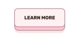
That certainly looks like a button! Everyone would call that a button. Even a design system would likely call that a button and perhaps have a class like .button { }. But! A thing you can click that says “Learn More” is very much a link, not a button. That’s completely fine, it’s just yet another reminder to use the semantically and functionally correct element.
Color contrast
Since we often style links with a distinct color, it’s important to use a color with sufficient color contrast for accessibility. There is a wide variety of visual impairments (see the tool WhoCanUse for simulating color combinations with different impairments) and high contrast helps nearly all of them.
Perhaps you set a blue color for links:
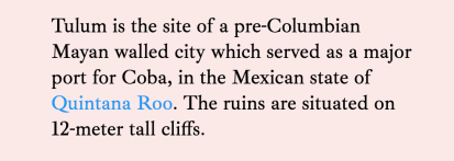
While that might look OK to you, it’s better to use tools for testing to ensure the color has a strong enough ratio according to researched guidelines. Here, I’ll look at Chrome DevTools and it will tell me this color is not compliant in that it doesn’t have enough contrast with the background color behind it.
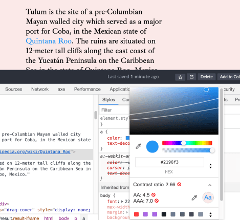
Color contrast is a big consideration with links, not just because they are often colored in a unique color that needs to be checked, but because they have all those different states (hover, focus, active, visited) which also might have different colors. Compound that with the fact that text can be selected and you’ve got a lot of places to consider contrast. Here’s an article about all that.
Styling “types” of links
We can get clever in CSS with attribute selectors and figure out what kind of resource a link is pointing to, assuming the href value has useful stuff in it.
/* Style all links that include .pdf at the end */
a[href$=".pdf"]::after {
  content: " (PDF)";
}

/* Style links that point to Google */
a[href*="google.com"] {
  color: purple;
}
Styling links for print
CSS has an “at-rule” for declaring styles that only take effect on printed media (e.g. printing out a web page). You can include them in any CSS like this:
@media print {
  /* For links in content, visually display the link */
  article a::after {
    content: " (" attr(href) ")";
  }
}
Resetting styles
If you needed to take all the styling off a link (or really any other element for that matter), CSS provides a way to remove all the styles using the all property.
.special-area a {
  all: unset;
  all: revert;

  /* Start from scratch */
  color: purple;
}
You can also remove individual styles with keywords. (Again, this isn’t really unique to links, but is generically useful):
a {
  /* Grab color from nearest parent that sets it */
  color: inherit;

  /* Wipe out style (turn black) */
  color: initial;

  /* Change back to User Agent style (blue) */
  color: revert;
}
JavaScript considerations
Say you wanted to stop the clicking of a link from doing what it normally does: go to that link or jump around the page. In JavaScript, you can usepreventDefault to prevent jumping around.
const jumpLinks = document.querySelectorAll("a[href^='#']");

jumpLinks.forEach(link => {
 link.addEventListener('click', event => {
    event.preventDefault();
    // Do something else instead, like handle the navigation behavior yourself
  });
});
This kind of thing is at the core of how “Single Page Apps” (SPAs) work. They intercept the clicks so browsers don’t take over and handle the navigation.
SPAs see where you are trying to go (within your own site), load the data they need, replace what they need to on the page, and update the URL. It’s an awful lot of work to replicate what the browser does for free, but you get the ability to do things like animate between pages.
Another JavaScript concern with links is that, when a link to another page is clicked, the page is left and another page loads. That can be problematic for something like a page that contains a form the user is filling out but hasn’t completed. If they click the link and leave the page, they lose their work! Your only opportunity to prevent the user from leaving is by using the beforeunload event.
window.addEventListener("beforeunload", function(event) {
  // Remind user to save their work or whatever.
});
A link that has had its default behavior removed won’t announce the new destination. This means a person using assistive technology may not know where they wound up. You’ll have to do things like update the page’s title and move focus back up to the top of the document.
JavaScript frameworks
In a JavaScript framework, like React, you might sometimes see links created from something like a <Link /> component rather than a native <a> element. The custom component probably creates a native <a> element, but with extra functionality, like enabling the JavaScript router to work, and adding attributes like aria-current="page" as needed, which is a good thing!
Ultimately, a link is a link. A JavaScript framework might offer or encourage some level of abstraction, but you’re always free to use regular links.
Accessibility considerations
We covered some accessibility in the sections above (it’s all related!), but here are some more things to think about.
- You don’t need text like “Link” or “Go to” in the link text itself. Make the text meaningful (“documentation” instead of “click here”).
- Links already have an ARIA role by default (
role="link") so there’s no need to explicitly set it. - Try not to use the URL itself as the text (
<a href="google.com">google.com</a>) - Links are generally blue and generally underlined and that’s generally good.
- All images in content should have
alttext anyway, but doubly so when the image is wrapped in a link with otherwise no text.
Unique accessible names
Some assistive technology can create lists of interactive elements on the page. Imagine a group of four article cards that all have a “Read More”, the list of interactive elements will be like:
- Read More
- Read More
- Read More
- Read More
Not very useful. You could make use of that .visually-hidden class we covered to make the links more like:
<a href="/article">
  Read More
  <span class="visually-hidden">
    of the article "Dancing with Rabbits".
  <span>
</a>
Now each link is unique and clear. If the design can support it, do it without the visually hidden class to remove the ambiguity for everyone.
Buttons
Buttons are for triggering actions. When do you use the <button> element? A good rule is to use a button when there is “no meaningful href.” Here’s another way to think of that: if clicking it doesn’t do anything without JavaScript, it should be a <button>.
A <button> that is within a <form>, by default, will submit that form. But aside from that, button elements don’t have any default behavior, and you’ll be wiring up that interactivity with JavaScript.
Table of Contents
HTML implementation
<button>Buy Now</button>Buttons inside of a <form> do something by default: they submit the form! They can also reset it, like their input counterparts. The type attributes matter:
<form action="/" method="POST">
  <input type="text" name="name" id="name">
  <button>Submit</button>

  <!-- If you want to be more explicit... -->
  <button type="submit">Submit</button>

  <!-- ...or clear the form inputs back to their initial values -->
  <button type="reset">Reset</button>

  <!-- This prevents a `submit` action from firing which may be useful sometimes inside a form -->
  <button type="button">Non-submitting button</button>
</form>
Speaking of forms, buttons have some neat tricks up their sleeve where they can override attributes of the <form> itself.
<form action="/" method="get">

  <!-- override the action -->
  <button formaction="/elsewhere/" type="submit">Submit to elsewhere</button>

  <!-- override encytype -->
  <button formenctype="multipart/form-data" type="submit"></button>

  <!-- override method -->
  <button formmethod="post" type="submit"></button>

  <!-- do not validate fields -->
  <button formnovalidate type="submit"></button>

  <!-- override target e.g. open in new tab -->
  <button formtarget="_blank" type="submit"></button>

</form>
Autofocus
Since buttons are focusable elements, we can automatically focus on them when the page loads using the autofocus attribute:
<div class="modal">

  <h2>Save document?</h2>

  <button>Cancel</button>
  <button autofocus>OK</button>
</div>
Perhaps you’d do that inside of a modal dialog where one of the actions is a default action and it helps the UX (e.g. you can press Enter to dismiss the modal). Autofocusing after a user action is perhaps the only good practice here, moving a user’s focus without their permission, as the autofocus attribute is capable of, can be a problem for screen reader and screen magnifier users.
Note thatautofocus may not work if the element is within an <iframe sandbox> for security reasons.
Disabling buttons
To prevent a button from being interactive, there is a disabled attribute you can use:
<button disabled>Pay Now</button>
<p class="error-message">Correct the form above to submit payment.</p>
Note that we’ve included descriptive text alongside the disabled button. It can be very frustrating to find a disabled button and not know why it’s disabled. A better way to do this could be to let someone submit the form, and then explain why it didn’t work in the validation feedback messaging.
Regardless, you could style a disabled button this way:
/* Might be good styles for ANY disabled element! */
button[disabled] {
  opacity: 0.5;
  pointer-events: none;
}
We’ll cover other states and styling later in this guide.
Buttons can contain child elements
A submit button and a submit input (<input type="submit">) are identical in functionality, but different in the sense that an input is unable to contain child elements while a button can.
<button>
   <svg aria-hidden="true" focusable="false">
     <path d="..." />
   </svg>
   <span class="callout">Big</span>
   Sale!
</button>

<button type="button">
  <span role="img" aria-label="Fox">
    🦊
  </span>
  Button
</button>
Note the focusable="false" attribute on the SVG element above. In that case, since the icon is decorative, this will help assistive technology only announce the button’s label.
Styling and CSS considerations
Buttons are generally styled to look very button-like. They should look pressable. If you’re looking for inspiration on fancy button styles, you’d do well looking at the CodePen Topic on Buttons.
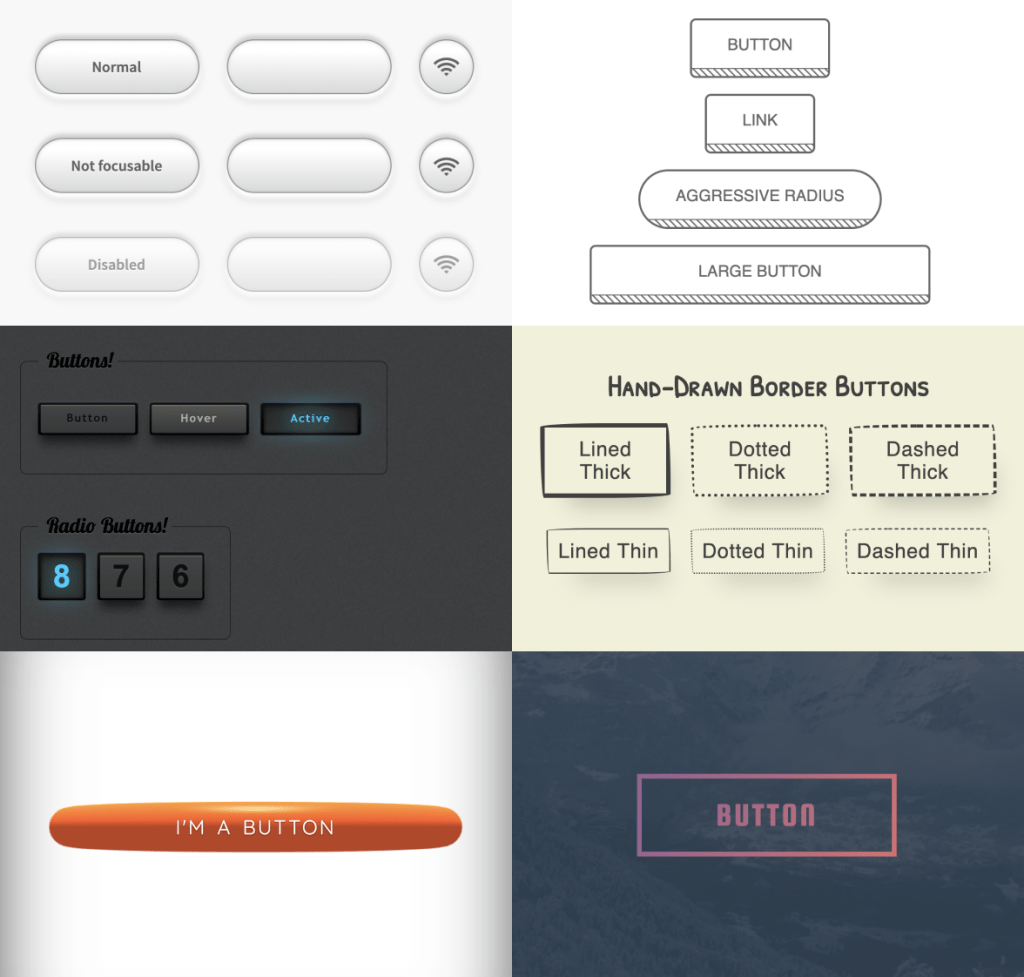
Cross-browser/platform button styles
How buttons look by default varies by browser and platform.
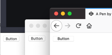
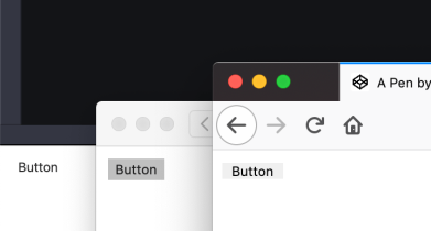
border: 0; to those same buttons as above, and we have different styles entirely.While there is some UX truth to leaving the defaults of form elements alone so that they match that browser/platform’s style and you get some affordance for free, designers typically don’t like default styles, particularly ones that differ across browsers.
Resetting the default button style
Removing all the styles from a button is easier than you think. You’d think, as a form control, appearance: none; would help, but don’t count on that. Actually all: revert; is a better bet to wipe the slate clean.
You can see how a variety of properties are involved
And that’s not all of them. Here’s a consolidated chunk of what Normalize does to buttons.
button {
  font-family: inherit; /* For all browsers */
  font-size: 100%; /* For all browsers */
  line-height: 1.15; /* For all browsers */
  margin: 0; /* Firefox and Safari have margin */
  overflow: visible; /* Edge hides overflow */
  text-transform: none; /* Firefox inherits text-transform */
  -webkit-appearance: button; /* Safari otherwise prevents some styles */
}

button::-moz-focus-inner {
  border-style: none;
  padding: 0;
}

button:-moz-focusring {
  outline: 1px dotted ButtonText;
}
A consistent .button class
In addition to using reset or baseline CSS, you may want to have a class for buttons that gives you a strong foundation for styling and works across both links and buttons.
.button {
  border: 0;
  border-radius: 0.25rem;
  background: #1E88E5;
  color: white;
  font-family: -system-ui, sans-serif;
  font-size: 1rem;
  line-height: 1.2;
  white-space: nowrap;
  text-decoration: none;
  padding: 0.25rem 0.5rem;
  margin: 0.25rem;
  cursor: pointer;
}
Check out this Pen to see why all these properties are needed to make sure it works correctly across elements.
Button states
Just as with links, you’ll want to style the states of buttons.
button:hover { }
button:focus { }
button:active { }
button:visited { } /* Maybe less so */
You may also want to use ARIA attributes for styling, which is a neat way to encourage using them correctly:
button[aria-pressed="true"] { }
button[aria-pressed="false"] { }
Link-styled buttons
There are always exceptions. For example, a website in which you need a button-triggered action within a sentence:
<p>You may open your <button>user settings</button> to change this.</p>We’ve used a button instead of an anchor tag in the above code, as this hypothetical website opens user settings in a modal dialog rather than linking to another page. In this situation, you may want to style the button as if it looks like a link.
This is probably rare enough that you would probably make a class (e.g. .link-looking-button) that incorporates the reset styles from above and otherwise matches what you do for anchor links.
Breakout buttons
Remember earlier when we talked about the possibility of wrapping entire elements in links? If you have a button within another element, but you want that entire outer element to be clickable/tappable as if it’s the button, that’s a “breakout” button. You can use an absolutely-positioned pseudo-element on the button to expand the clickable area to the whole region. Fancy!
JavaScript considerations
Even without JavaScript, button elements can be triggered by the Space and Enter keys on a keyboard. That’s part of what makes them such appealing and useful elements: they are discoverable, focusable, and interactive with assistive technology in a predictable way.
Perhaps any <button> in that situation should be inserted into the DOM by JavaScript. A tall order! Food for thought. 🤔
“Once” handlers
Say a button does something pretty darn important, like submitting a payment. It would be pretty scary if it was programmed such that clicking the button multiple times submitted multiple payment requests. It is situations like this where you would attach a click handler to a button that only runs once. To make that clear to the user, we’ll disable the button on click as well.
document.querySelector("button").addEventListener('click', function(event) {
  event.currentTarget.setAttribute("disabled", true);
}, {
    once: true
});
Then you would intentionally un-disable the button and reattach the handler when necessary.
Inline handlers
JavaScript can be executed by activating a button through code on the button itself:
<button onclick="console.log('clicked');">
  Log it.
</button>

<button onmousedown="">
</button>

<button onmouseup="">
</button>
That practice went from being standard practice to being a faux pas (not abstracting JavaScript functionality away from HTML) to, eh, you need it when you need it. One advantage is that if you’re injecting this HTML into the DOM, you don’t need to bind/re-bind JavaScript event handlers to it because it already has one.
JavaScript frameworks
It’s common in any JavaScript framework to make a component for handling buttons, as buttons typically have lots of variations. Those variations can be turned into an API of sorts. For example, in React:
const Button = ({ className, children }) => {
  const [activated, setActivated] = React.useState(false);
  return (
    <button
      className={`button ${className}`}
      aria-pressed={activated ? "true" : "false"}
      onClick={() => setActivated(!activated)}
    >
      {children}
    </button>
  );
};
In that example, the <Button /> component ensures the button will have a button class and handles a toggle-like active class.
Accessibility considerations
The biggest accessibility consideration with buttons is actually using buttons. Don’t try to replicate a button with a <div> or a <span>, which is, unfortunately, more common than you might think. It’s very likely that will cause problems. (Did you deal with focusability? Did you deal with keyboard events? Great. There’s still probably more stuff you’re forgetting.)
Focus styles
Like all focusable elements, browsers apply a default focus style, which is usually a blue outline.

While it’s arguable that you should leave that alone as it’s a very clear and obvious style for people that benefit from focus styles, it’s also not out of the question to change it.
What you should not do is button:focus { outline: 0; } to remove it. If you ever remove a focus style like that, put it back at the same time.
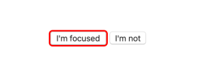
button:focus {
  outline: 0; /* Removes the default blue ring */

  /* Now, let's create our own focus style */
  border-radius: 3px;
  box-shadow: 0 0 0 2px red;
}
The fact that a button may become focused when clicked and apply that style at the same time is offputting to some. There is a trick (that has limited, but increasing, browser support) on removing focus styles from clicks and not keyboard events:
:focus:not(:focus-visible) {
  outline: 0;
}
ARIA
Buttons already have the role they need (role="button"). But there are some other ARIA attributes that are related to buttons:
aria-pressed: Turns a button into a toggle, betweenaria-pressed="true"andaria-pressed="false". More on button toggles, which can also be done withrole="switch"andaria-checked="true".aria-expanded: If the button controls the open/closed state of another element (like a dropdown menu), you apply this attribute to indicate that likearia-expanded="true".aria-label: Overrides the text within the button. This is useful for labeling buttons that otherwise don’t have text, but you’re still probably better off using avisually-hiddenclass so it can be translated.aria-labelledby: Points to an element that will act as the label for the button.
For that last one:
<button aria-labelledby="buttonText">
  Time is running out!
  <span id="buttonText">Add to Cart</span>
</button>
Deque has a deeper dive blog post into button accessibility that includes much about ARIA.
Dialogs
If a button opens a dialog, your job is to move the focus inside and trap it there. When closing the dialog, you need to return focus back to that button so the user is back exactly where they started. This makes the experience of using a modal the same for someone who relies on assistive technology as for someone who doesn’t.
Focus management isn’t just for dialogs, either. If clicking a button runs a calculation and changes a value on the page, there is no context change there, meaning focus should remain on the button. If the button does something like “move to next page,” the focus should be moved to the start of that next page.
Size
Don’t make buttons too small. That goes for links and any sort of interactive control. People with any sort of reduced dexterity will benefit.
The classic Apple guideline for the minimum size for a touch target (button) is 44x44pt.
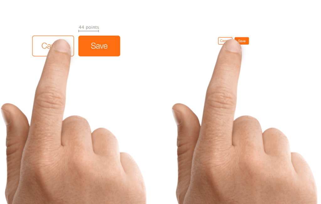
Here’s some guidelines from other companies. Fitt’s Law tells us smaller targets have greater error rates. Google even takes button sizes into consideration when evaluating the SEO of a site.
In addition to ample size, don’t place buttons too close each other, whether they’re stacked vertically or together on the same line. Give them some margin because people experiencing motor control issues run the risk of clicking the wrong one.
Activating buttons
Buttons work by being clicked/touched, pressing the Enter key, or pressing the Space key (when focused). Even if you add role="button" to a link or div, you won’t get the spacebar functionality, so at the risk of beating a dead horse, use <button> in those cases.
This is a slam dunk of an article! A ton of information presented in an easy to read way and backed-up by other people’s work. Thanks for writing it!
I think you mixing up something here:
It doesn’t make sense because you can use
idattribute on<h3>to achieve the same result. But there used to benameattribute and the following pattern:But
nameis deprecated in favor toidnow. I’d suggest expanding logical links section with a different example featuring current links in menu or paging. This is where they’re are super convenient.Key handling note on native controls:
events triggered by the space bar fire when the key is released (or
onkeyup);events triggered by the Enter key will fire the event as soon as you press the key down (or
onkeydown).I have done testing with keyboard-only and screen reader users and while they may not know this behavior, they generally react with a bit of surprise when it is not followed. If you are trying to re-create a native control, make sure the keyboard handlers correspond. A pen where you can try it yourself.
Thanks for this fantastic article!
It is absolutely astounding how many times I run into fake links. It seems every codebase I inherit is full of them. Not only that, but Google does it all the time on their nifty little applications baked into search results. It really drives me crazy.
Is there a reason the quick guidelines only recommend
<input type="submit" />for forms? I thought<button type="submit" />and<input type="submit" />were interchangeable. The only difference the article mentions between the two that I found is that<button>can have child content, so it’s not obvious to me why you couldn’t use either an<input>or a<button>for form submissions.Thank you for the article. I’ve done my share of research on links/buttons, navigation/commands, but it looks like I’ve missed a few things. This will help fuel our discussions as we create our web development standards and try to get consistency across all of our products.
According to the spec (https://html.spec.whatwg.org/multipage/links.html#link-type-noreferrer) you shouldn’t have to put
noopenerandnoreferrertogether:Wow, thanks for sharing!
Heihei
I have a one page but with three href=”test.html”
Whem I am on test.html is it possible to return on index.php#about or index.php#contact which are some parts of the main page.
The question is about the # that when the user clicks on contact, that it jumps back to the main page and there directly to #contact.
What should it be when we have sometimes button, sometimes link…? I have a form and back button – when the form is not filled out this is a link to previous page. When it is filled out it is a button to open a modal with question ‘Are you sure?’ hmmm
I think you said the answer right there: a link to another page of a form is still a link if it’s going to another URL. And is that modal button triggered with JS? If so,
<button>it up. The general guidelines at the top of the guide are a good litmus test between links, buttons, and form submissions.