I have to thank Jeremy Keith and his wonderfully insightful article from late last year that introduced me to the concept of HTML Web Components. This was the “a-ha!” moment for me:
When you wrap some existing markup in a custom element and then apply some new behaviour with JavaScript, technically you’re not doing anything you couldn’t have done before with some DOM traversal and event handling. But it’s less fragile to do it with a web component. It’s portable. It obeys the single responsibility principle. It only does one thing but it does it well.
Until then, I’d been under the false assumption that all web components rely solely on the presence of JavaScript in conjunction with the rather scary-sounding Shadow DOM. While it is indeed possible to author web components this way, there is yet another way. A better way, perhaps? Especially if you, like me, advocate for progressive enhancement. HTML Web Components are, after all, just HTML.
While it’s outside the exact scope of what we’re discussing here, Adny Bell has a recent write-up that offers his (excellent) take on what progressive enhancement means.
Let’s look at three specific examples that show off what I think are the key features of HTML Web Components — CSS style encapsulation and opportunities for progressive enhancement — without being forced to depend on JavaScript to work out of the box. We will most definitely use JavaScript, but the components ought to work without it.
The examples can all be found in my Web UI Boilerplate component library (built using Storybook), along with the associated source code in GitHub.
Example 1: <webui-disclosure>

I really like how Chris Ferdinandi teaches building a web component from scratch, using a disclosure (show/hide) pattern as an example. This first example extends his demo.
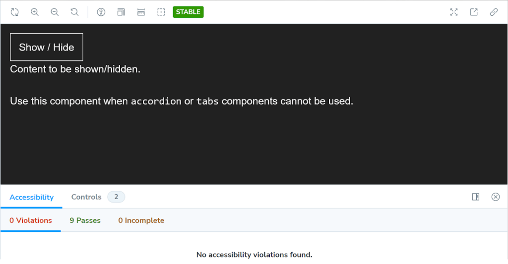
Let’s start with the first-class citizen, HTML. Web components allow us to establish custom elements with our own naming, which is the case in this example with a <webui-disclosure> tag we’re using to hold a <button> designed to show/hide a block of text and a <div> that holds the <p> of text we want to show and hide.
<webui-disclosure
  data-bind-escape-key
  data-bind-click-outside
>
  <button
    type="button"
    class="button button--text"
    data-trigger
    hidden
  >
    Show / Hide
  </button>

  <div data-content>
    <p>Content to be shown/hidden.</p>
  </div>
</webui-disclosure>
If JavaScript is disabled or doesn’t execute (for any number of possible reasons), the button is hidden by default — thanks to the hidden attribute on it— and the content inside of the div is simply displayed by default.
Nice. That’s a really simple example of progressive enhancement at work. A visitor can view the content with or without the <button>.
I mentioned that this example extends Chris Ferdinandi’s initial demo. The key difference is that you can close the element either by clicking the keyboard’s ESC key or clicking anywhere outside the element. That’s what the two [data-attribute]s on the <webui-disclosure tag are for.
We start by defining the custom element so that the browser knows what to do with our made-up tag name:
customElements.define('webui-disclosure', WebUIDisclosure);Custom elements must be named with a dashed-ident, such as <my-pizza> or whatever, but as Jim Neilsen notes, by way of Scott Jehl, that doesn’t exactly mean that the dash has to go between two words.
I typically prefer using TypeScript for writing JavaScript to help eliminate stupid errors and enforce some degree of “defensive” programming. But for the sake of simplicity, the structure of the web component’s ES Module looks like this in plain JavaScript:
default class WebUIDisclosure extends HTMLElement {
  constructor() {
    super();
    this.trigger = this.querySelector('[data-trigger]');
    this.content = this.querySelector('[data-content]');
    this.bindEscapeKey = this.hasAttribute('data-bind-escape-key');
    this.bindClickOutside = this.hasAttribute('data-bind-click-outside');

    if (!this.trigger || !this.content) return;

    this.setupA11y();
    this.trigger?.addEventListener('click', this);
  }

  setupA11y() {
    // Add ARIA props/state to button.
  }

  // Handle constructor() event listeners.
  handleEvent(e) {
    // 1. Toggle visibility of content.
    // 2. Toggle ARIA expanded state on button.
  }

  // Handle event listeners which are not part of this Web Component.
  connectedCallback() {
    document.addEventListener('keyup', (e) => {
      // Handle ESC key.
    });

    document.addEventListener('click', (e) => {
      // Handle clicking outside.
    });
  }

  disconnectedCallback() {
    // Remove event listeners.
  }
}
Are you wondering about those event listeners? The first one is defined in the constructor() function, while the rest are in the connectedCallback() function. Hawk Ticehurst explains the rationale much more eloquently than I can.
This JavaScript isn’t required for the web component to “work” but it does sprinkle in some nice functionality, not to mention accessibility considerations, to help with the progressive enhancement that allows the <button> to show and hide the content. For example, JavaScript injects the appropriate aria-expanded and aria-controls attributes enabling those who rely on screen readers to understand the button’s purpose.
That’s the progressive enhancement piece to this example.
For simplicity, I have not written any additional CSS for this component. The styling you see is simply inherited from existing global scope or component styles (e.g., typography and button).
However, the next example does have some extra scoped CSS.
Example 2: <webui-tabs>
That first example lays out the progressive enhancement benefits of HTML Web Components. Another benefit we get is that CSS styles are encapsulated, which is a fancy way of saying the CSS doesn’t leak out of the component. The styles are scoped purely to the web component and those styles will not conflict with other styles applied to the current page.
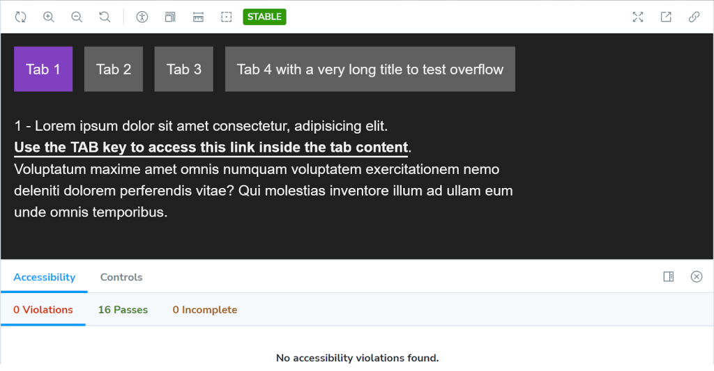
Let’s turn to a second example, this time demonstrating the style encapsulating powers of web components and how they support progressive enhancement in user experiences. We’ll be using a tabbed component for organizing content in “panels” that are revealed when a panel’s corresponding tab is clicked — the same sort of thing you’ll find in many component libraries.

Starting with the HTML structure:
<webui-tabs>
  <div data-tablist>
    <a href="#tab1" data-tab>Tab 1</a>
    <a href="#tab2" data-tab>Tab 2</a>
    <a href="#tab3" data-tab>Tab 3</a>
  </div>

  <div id="tab1" data-tabpanel>
    <p>1 - Lorem ipsum dolor sit amet consectetur.</p>
  </div>

  <div id="tab2" data-tabpanel>
    <p>2 - Lorem ipsum dolor sit amet consectetur.</p>
  </div>

  <div id="tab3" data-tabpanel>
    <p>3 - Lorem ipsum dolor sit amet consectetur.</p>
  </div>
</webui-tabs>
You get the idea: three links styled as tabs that, when clicked, open a tab panel holding content. Note that each [data-tab] in the tab list targets an anchor link matching a tab panel ID, e.g., #tab1, #tab2, etc.
We’ll look at the style encapsulation stuff first since we didn’t go there in the last example. Let’s say the CSS is organized like this:
webui-tabs {
  [data-tablist] {
    /* Default styles without JavaScript */
  }

  [data-tab] {
    /* Default styles without JavaScript */
  }

  [role='tablist'] {
    /* Style role added by JavaScript */
  }

  [role='tab'] {
    /* Style role added by JavaScript */
  }

  [role='tabpanel'] {
    /* Style role added by JavaScript */
  }
}
See what’s happening here? We have two style rules — [data-tablist] and [data-tab] — that contain the web component’s default styles. In other words, these styles are there regardless of whether JavaScript loads or not. Meanwhile, the other three style rules are selectors that are injected into the component as long as JavaScript is enabled and supported. This way, the last three style rules are only applied if JavaScript plops the **role** attribute on those elements in the HTML. Right there, we’re already supplying a touch of progressive enhancement by setting styles only when JavasScript is needed.
All these styles are fully encapsulated, or scoped, to the <webui-tabs> web component. There is no “leakage” so to speak that would bleed into the styles of other web components, or even to anything else on the page within the global scope. We can even choose to forego classnames, complex selectors, and methodologies like BEM in favour of simple descendent selectors for the component’s children, allowing us to write styles more declaratively on semantic elements.
Quickly: “Light” DOM versus Shadow DOM
For most web projects, I generally prefer to bundle CSS (including the web component Sass partials) into a single CSS file so that the component’s default styles are available in the global scope, even if the JavaScript doesn’t execute.
However, it is possible to import a stylesheet via JavaScript that is only consumed by this web component if JavaScript is available:
import styles from './styles.css';

class WebUITabs extends HTMLElement {
  constructor() {
    super();
    this.adoptedStyleSheets = [styles];
  }
}

customElements.define('webui-tabs', WebUITabs);
Alternatively, we could inject a <style> tag containing the component’s styles instead:
class WebUITabs extends HTMLElement {
  connectedCallback() {
    this.attachShadow({ mode: 'open' }); // Required for JavaScript access
    this.shadowRoot.innerHTML = `
      <style> <!-- styles go here --> </style>
      // etc.
    `;
  }
}

customElements.define('webui-tabs', WebUITabs);
Whichever method you choose, these styles are scoped directly to the web component, preventing component styles from leaking out, but allowing global styles to be inherited.
Now consider this simple example. Everything we write in between the component’s opening and closing tags is considered part of the “Light” DOM.
<my-web-component>
  <!-- This is Light DOM -->
  <div>
    <p>Some content... styles are inherited from the global scope</p>
  </div>

  ----------- Shadow DOM Boundary -------------
  | <!-- Anything injected by JavaScript -->  |
  ---------------------------------------------
</my-web-component>
Dave Rupert has an excellent write-up that makes it really easy to see how external styles are able to “pierce” the Shadow DOM and select an element in the Light DOM. Notice how the <button> element that is written in between the custom element’s tags receives the button selector’s styles in the global CSS, while the <button> injected via JavaScript is left untouched.
If we want to style the Shadow DOM <button> we’d have to do that with internal styles like the examples above for importing a stylesheet or injecting an inline <style> block.
That doesn’t mean that all CSS style properties are blocked by the Shadow DOM. In fact, Dave outlines 37 properties that web components inherit, mostly along the lines of text, list, and table formatting.
Progressively enhance the tabbed component with JavaScript
Even though this second example is more about style encapsulation, it’s still a good opportunity to see the progressive enhancement we get practically for free from web components. Let’s step into the JavaScript now so we can see how we can support progressive enhancement. The full code is quite lengthy, so I’ve abbreviated things a bit to help make the points a little clearer.
default class WebUITabs extends HTMLElement {
  constructor() {
    super();
    this.tablist = this.querySelector('[data-tablist]');
    this.tabpanels = this.querySelectorAll('[data-tabpanel]');
    this.tabTriggers = this.querySelectorAll('[data-tab]');

    if (
      !this.tablist ||
      this.tabpanels.length === 0 ||
      this.tabTriggers.length === 0
    ) return;

    this.createTabs();
    this.tabTriggers.forEach((tabTrigger, index) => {
      tabTrigger.addEventListener('click', (e) => {
        this.bindClickEvent(e);
      });
      tabTrigger.addEventListener('keydown', (e) => {
        this.bindKeyboardEvent(e, index);
      });
    });
  }

  createTabs() {
    // 1. Hide all tabpanels initially.
    // 2. Add ARIA props/state to tabs & tabpanels.
  }

  bindClickEvent(e) {
    e.preventDefault();
    // Show clicked tab and update ARIA props/state.
  }
  bindKeyboardEvent(e, index) {
    e.preventDefault();
    // Handle keyboard ARROW/HOME/END keys.
  }
}

customElements.define('webui-tabs', WebUITabs);
The JavaScript injects ARIA roles, states, and props to the tabs and content blocks for screen reader users, as well as extra keyboard bindings so we can navigate between tabs with the keyboard; for example, the TAB key is reserved for accessing the component’s active tab and any focusable content inside the active tabpanel, and the tabs can be traversed with the ARROW keys. So, if JavaScript fails to load, the default experience is still an accessible one where the tabs still anchor link to their respective panels, and those panels naturally stack vertically, one on top of the other.
And if JavaScript is enabled and supported? We get an enhanced experience, complete with updated accessibility considerations.
Example 3: <webui-ajax-loader>

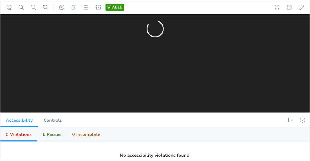
This final example differs from the previous two in that it is entirely generated by JavaScript, and uses the Shadow DOM. This is because it is only used to indicate a “loading” state for Ajax requests, and is therefore only needed when JavaScript is enabled.
The HTML markup is just the opening and closing component tags:
<webui-ajax-loader></webui-ajax-loader>The simplified JavaScript structure:
default class WebUIAjaxLoader extends HTMLElement {
  constructor() {
    super();
    const shadow = this.attachShadow({ mode: 'open' });
    shadow.innerHTML = `
      <svg role="img" part="svg">
        <title>loading</title>
        <circle cx="50" cy="50" r="47" />
      </svg>
    `;
  }
}

customElements.define('webui-ajax-loader',WebUIAjaxLoader);
Notice right out of the gate that everything in between the <webui-ajax-loader> tags is injected with JavaScript, meaning it’s all in the Shadow DOM, encapsulated from other scripts and styles not directly bundled with the component.
But also notice the part attribute that’s set on the <svg> element. Here’s where we’ll zoom in:
<svg role="img" part="svg">
  <!-- etc. -->
</svg>
That’s yet another way we have to style the custom element: named parts. Now we can style that SVG from outside of the template literal we used to establish the element. There’s a ::part pseudo-selector to make that happen:
webui-ajax-loader::part(svg) {
  // Shadow DOM styles for the SVG...
}
And here’s something cool: that selector can access CSS custom properties, whether they are scoped globally or locally to the element.
webui-ajax-loader {
  --fill: orangered;
}

webui-ajax-loader::part(svg) {
  fill: var(--fill);
}
As far as progressive enhancement goes, JavaScript supplies all of the HTML. That means the loader is only rendered if JavaScript is enabled and supported. And when it is, the SVG is added, complete with an accessible title and all.
Wrapping up
That’s it for the examples! What I hope is that you now have the same sort of epiphany that I had when reading Jeremy Keith’s post: HTML Web Components are an HTML-first feature.
Of course, JavaScript does play a big role, but only as big as needed. Need more encapsulation? Want to sprinkle in some UX goodness when a visitor’s browser supports it? That’s what JavaScript is for and that’s what makes HTML Web Components such a great addition to the web platform — they rely on vanilla web languages to do what they were designed to do all along, and without leaning too heavily on one or the other.
l want to learn more from you keep the great work going
Be careful putting so much in the constructor, you’ll end up with a lot of errors if you programmatically create that web component. Those children may not be there to query.
Thanks for the warning… but I do already code defensively so that I exit if the children don’t exist:
https://github.com/basher/Web-UI-Boilerplate/blob/master/ui/src/javascript/web-components/webui-disclosure.ts#L15
https://github.com/basher/Web-UI-Boilerplate/blob/master/ui/src/javascript/web-components/webui-tabs.ts#L13
Remember, too, that the examples in this article (well, 2 of them) are HTML Web Components, so the HTML is not being programatically generated.