Dark mode has gained a lot of traction recently. Like Apple, for instance, has added dark mode to its iOS and MacOS operating systems. Windows and Google have done the same.

Let’s get into dark mode in the context of websites. We’ll delve into different options and approaches to implementing a dark mode design and the technical considerations they entail. We’ll also touch upon some design tips along the way.
Toggling Themes
The typical scenario is that you already have a light theme for your site, and you’re interested in making a darker counterpart. Or, even if you’re starting from scratch, you’ll have both themes: light and dark. One theme should be defined as the default that users get on first visit, which is the light theme in most cases (though we can let the user’s browser make that choice for us, as we’ll see). There also should be a way to switch to the other theme (which can be done automatically, as we’ll also see) — as in, the user clicks a button and the color theme changes.
There several approaches to go about doing this:
Using a Body Class
The trick here is to swap out a class that can be a hook for changing a style anywhere on the page.
<body class="dark-theme || light-theme">Here’s a script for a button that will toggle that class, for example:
// Select the button
const btn = document.querySelector('.btn-toggle');

// Listen for a click on the button
btn.addEventListener('click', function() {
  // Then toggle (add/remove) the .dark-theme class to the body
  document.body.classList.toggle('dark-theme');
})
Here’s how we can use that idea:
<body>
  <button class="btn-toggle">Toggle Dark Mode</button>
  <h1>Hey there! This is just a title</h1>
  <p>I am just a boring text, existing here solely for the purpose of this demo</p>
  <p>And I am just another one like the one above me, because two is better than having only one</p>
  <a href="#">I am a link, don't click me!</a>
</body>
The general idea of this approach is to style things up as we normally would, call that our “default” mode, then create a complete set of color styles using a class set on the <body> element we can use as a “dark” mode.
Let’s say our default is a light color scheme. All of those “light” styles are written exactly the same way you normally write CSS. Given our HTML, let’s apply some global styling to the body and to links.
body {
  color: #222;
  background: #fff;
}
a {
  color: #0033cc;
}
Good good. We have dark text (#222) and dark links (#0033cc) on a light background (#fff). Our “default” theme is off to a solid start.
Now let’s redefine those property values, this time set on a different body class:
body {
  color: #222;
  background: #fff;
}
a {
  color: #0033cc;
}


/* Dark Mode styles */
body.dark-theme {
  color: #eee;
  background: #121212;
}
body.dark-theme a {
  color: #809fff;
}
Dark theme styles will be descendants of the same parent class — which is .dark-theme in this example — which we’ve applied to the <body> tag.
How do we “switch” body classes to access the dark styles? We can use JavaScript! We’ll select the button class (.btn-toggle), add a listener for when it’s clicked, then add the dark theme class (.dark-theme) to the body element’s class list. That effectively overrides all of the “light” colors we set, thanks to the cascade and specificity.
Here’s the complete code working in action. Click the toggle button to toggle in and out of dark mode.
Using Separate Stylesheets
Rather than keeping all the styles together in one stylesheet, we could instead toggle between stylesheets for each theme. This assumes you have full stylesheets ready to go.
For example, a default light theme like light-theme.css:
/* light-theme.css */


body {
  color: #222;
  background: #fff;
}
a {
  color: #0033cc;
}
Then we create styles for the dark theme and save them in a separate stylesheet we’re calling dark-theme.css.
/* dark-theme.css */


body {
  color: #eee;
  background: #121212;
}
body a {
  color: #809fff;
}
This gives us two separate stylesheets — one for each theme — we can link up in the HTML <head> section. Let’s link up the light styles first since we’re calling those the default.
<!DOCTYPE html>
<html lang="en">
<head>
  <!-- Light theme stylesheet -->
  <link href="light-theme.css" rel="stylesheet" id="theme-link">
</head>


<!-- etc. -->


</html>
We are using a #theme-link ID that we can select with JavaScript to, again, toggle between light and dark mode. Only this time, we’re toggling files instead of classes.
// Select the button
const btn = document.querySelector(".btn-toggle");
// Select the stylesheet <link>
const theme = document.querySelector("#theme-link");

// Listen for a click on the button
btn.addEventListener("click", function() {
  // If the current URL contains "ligh-theme.css"
  if (theme.getAttribute("href") == "light-theme.css") {
    // ... then switch it to "dark-theme.css"
    theme.href = "dark-theme.css";
  // Otherwise...
  } else {
    // ... switch it to "light-theme.css"
    theme.href = "light-theme.css";
  }
});Using Custom Properties
We can also leverage the power of CSS custom properties to create a dark theme! It helps us avoid having to write separate style rulesets for each theme, making it a lot faster to write styles and a lot easier to make changes to a theme if we need to.
We still might choose to swap a body class, and use that class to re-set custom properties:
// Select the button
const btn = document.querySelector(".btn-toggle");


// Listen for a click on the button
btn.addEventListener("click", function() {
  // Then toggle (add/remove) the .dark-theme class to the body
  document.body.classList.toggle("dark-theme");
});
First, let’s define the default light color values as custom properties on the body element:
body {
  --text-color: #222;
  --bkg-color: #fff;
  --anchor-color: #0033cc;
}
Now we can redefine those values on a .dark-theme body class just like we did in the first method:
body.dark-theme {
  --text-color: #eee;
  --bkg-color: #121212;
  --anchor-color: #809fff;
}
Here are our rulesets for the body and link elements using custom properties:
body {
  color: var(--text-color);
  background: var(--bkg-color);
}
a {
  color: var(--anchor-color);
}
We could just as well have defined our custom properties inside the document :root. That’s totally legit and even common practice. In that case, all the default theme styles definitions would go inside :root { } and all of the dark theme properties go inside :root.dark-mode { }.
Using Server-Side Scripts
If we’re already working with a server-side language, say PHP, then we can use it instead of JavaScript. This is a great approach if you prefer working directly in the markup.
<?php
$themeClass = '';
if (isset($_GET['theme']) && $_GET['theme'] == 'dark') {
  $themeClass = 'dark-theme';
}


$themeToggle = ($themeClass == 'dark-theme') ? 'light' : 'dark';
?>
<!DOCTYPE html>
<html lang="en">
<!-- etc. -->
<body class="<?php echo $themeClass; ?>">
  <a href="?theme=<?php echo $themeToggle; ?>">Toggle Dark Mode</a>
  <!-- etc. -->
</body>
</html>
We can have the user send a GET or POST request. Then, we let our code (PHP in this case) apply the appropriate body class when the page is reloaded. I am using a GET request (URL params) for the purpose of this demonstration.
And, yes, we can swap stylesheets just like we did in the second method.
<?php
$themeStyleSheet = 'light-theme.css';
if (isset($_GET['theme']) && $_GET['theme'] == 'dark') {
  $themeStyleSheet = 'dark-theme.css';
}


$themeToggle = ($themeStyleSheet == 'dark-theme.css') ? 'light' : 'dark';
?>
<!DOCTYPE html>
<html lang="en">
<head>
  <!-- etc. -->
  <link href="<?php echo $themeStyleSheet; ?>" rel="stylesheet">
</head>


<body>
  <a href="?theme=<?php echo $themeToggle; ?>">Toggle Dark Mode</a>
  <!-- etc. -->
</body>
</html>
This method has an obvious downside: the page needs to be refreshed for the toggle to take place. But a server-side solution like this is useful in persisting the user’s theme choice across page reloads, as we will see later.
Which method should you choose?
The “right” method comes down to the requirements of your project. If you are doing a large project, for example, you might go with CSS properties to help wrangle a large codebase. On the other hand, if your project needs to support legacy browsers, then another approach will need to do instead.
Moreover, there’s nothing saying we can only use one method. Sometimes a combination of methods will be the most effective route. There may even be other possible methods than what we have discussed.
Dark Mode at the Operating System Level
So far, we’ve used a button to toggle between light and dark mode but we can simply let the user’s operating system do that lifting for us. For example, many operating systems let users choose between light and dark themes directly in the system settings.
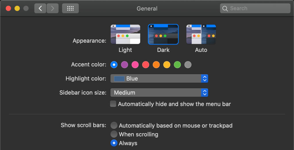
Pure CSS
Details
Fortunately, CSS has a prefers-color-scheme media query which can be used to detect user’s system color scheme preferences. It can have three possible values: no preference, light and dark. Read more about it on MDN.
@media (prefers-color-scheme: dark) {
  /* Dark theme styles go here */
}


@media (prefers-color-scheme: light) {
  /* Light theme styles go here */
}
To use it, we can put the dark theme styles inside the media query.
@media (prefers-color-scheme: dark) {
  body {
    color: #eee;
    background: #121212;
  }


  a {
    color: #809fff;
  }
}
Now, if a user has enabled dark mode from the system settings, they will get the dark mode styles by default. We don’t have to resort to JavaScript or server-side scripts to decide which mode to use. Heck, we don’t even need the button anymore!
JavaScript
Details
We can turn to JavaScript to detect the user’s preferred color scheme. This is a lot like the first method we worked with, only we’re using matchedMedia() to detect the user’s preference.
const prefersDarkScheme = window.matchMedia('(prefers-color-scheme: dark)');nnif (prefersDarkScheme.matches) {n document.body.classList.add('dark-theme');n} else {n document.body.classList.remove('dark-theme');n}There is a downside to using JavaScript: there will likely be a quick flash of the light theme as JavaScript is executed after the CSS. That could be misconstrued as a bug.
And, of course, we can swap stylesheets instead like we did in the second method. This time, we link up both stylesheets and use the media query to determine which one is applied.
Overriding OS Settings
We just looked at how to account for a user’s system-wide color scheme preferences. But what if users want to override their system preference for a site? Just because a user prefers dark mode for their OS doesn’t always mean they prefer it on a website. That’s why providing a way to manually override dark mode, despite the system settings, is a good idea.
View Code
Let’s use the CSS custom properties approach to demonstrate how to do this. The idea is to define the custom properties for both themes like we did before, wrap dark styles up in the prefers-color-scheme media query, then define a .light-theme class inside of that we can use to override the dark mode properties, should the user want to toggle between the two modes.
/* Default colors */
body {
  --text-color: #222;
  --bkg-color: #fff;
}
/* Dark theme colors */
body.dark-theme {
  --text-color: #eee;
  --bkg-color: #121212;
}

/* Styles for users who prefer dark mode at the OS level */
@media (prefers-color-scheme: dark) {
  /* defaults to dark theme */
  body {
    --text-color: #eee;
    --bkg-color: #121212;
  }
  /* Override dark mode with light mode styles if the user decides to swap */
  body.light-theme {
    --text-color: #222;
    --bkg-color: #fff;
  }
}
Now we can turn back to our trusty button to toggle between light and dark themes. This way, we’re respecting the OS color preference by default and allowing the user to manually switch themes.
// Listen for a click on the button
btn.addEventListener("click", function() {
  // If the OS is set to dark mode...
  if (prefersDarkScheme.matches) {
    // ...then apply the .light-theme class to override those styles
    document.body.classList.toggle("light-theme");
    // Otherwise...
  } else {
    // ...apply the .dark-theme class to override the default light styles
    document.body.classList.toggle("dark-theme");
  }
});Browser Support
The prefers-color-scheme media query feature enjoys support by major browsers, including Chrome 76+, Firefox 67+, Chrome Android 76+, Safari 12.5+ (13+ on iOS), and Samsung Internet Browser. It doesn’t support IE.
That’s a promising amount of support! Can I Use estimates 80.85% of user coverage.
Operating systems that currently support dark mode include MacOS (Mojave or later), iOS (13.0+), Windows (10+), and Android (10+).
Storing a User’s Preference
What we’ve looked at so far definitely does what it says in the tin: swap themes based on an OS preference or a button click. This is great, but doesn’t carry over when the user either visits another page on the site or reloads the current page.
We need to save the user’s choice so that it will be applied consistently throughout the site and on subsequent visits. To do that, we can save the user’s choice to the localStorage when the theme is toggled. Cookies are also well-suited for the job.
Let’s look at both approaches.
Using localStorage
We have a script that saves the selected theme to localStorage when the toggle takes place. In other words, when the page is reloaded, the script fetches the choice from localStorage and applies it. JavaScript is often executed after CSS, so this approach is prone to a “flash of incorrect theme” (FOIT).
View Code
// Select the button
const btn = document.querySelector(".btn-toggle");
// Select the theme preference from localStorage
const currentTheme = localStorage.getItem("theme");


// If the current theme in localStorage is "dark"...
if (currentTheme == "dark") {
  // ...then use the .dark-theme class
  document.body.classList.add("dark-theme");
}


// Listen for a click on the button
btn.addEventListener("click", function() {
  // Toggle the .dark-theme class on each click
  document.body.classList.toggle("dark-theme");

  // Let's say the theme is equal to light
  let theme = "light";
  // If the body contains the .dark-theme class...
  if (document.body.classList.contains("dark-theme")) {
    // ...then let's make the theme dark
    theme = "dark";
  }
  // Then save the choice in localStorage
  localStorage.setItem("theme", theme);
});Using Cookies with PHP
To avoid FLIC, we can use a server-side script like PHP. Instead of saving the user’s theme preference in localStorage, we will create a cookie from JavaScript and save it there. But again, this may only be feasible if you’re already working with a server-side language.
View Code
// Select the button
const btn = document.querySelector(".btn-toggle");


// Listen for a click on the button
btn.addEventListener("click", function() {
  // Toggle the .dark-theme class on the body
  document.body.classList.toggle("dark-theme");

  // Let's say the theme is equal to light
  let theme = "light";
  // If the body contains the .dark-theme class...
  if (document.body.classList.contains("dark-theme")) {
    // ...then let's make the theme dark
    theme = "dark";
  }
  // Then save the choice in a cookie
  document.cookie = "theme=" + theme;
});
We can now check for the existence of that cookie and load the appropriate theme by applying the proper class to the <body> tag.
<?php
$themeClass = '';
if (!empty($_COOKIE['theme']) && $_COOKIE['theme'] == 'dark') {
  $themeClass = 'dark-theme';
}
?>


<!DOCTYPE html>
<html lang="en">
<!-- etc. -->
<body class="<?php echo $themeClass; ?>">
<!-- etc. -->
</body>
</html>
Here is how to do that using the separate stylesheets method:
<?php
$themeStyleSheet = 'light-theme.css';
if (!empty($_COOKIE['theme']) && $_COOKIE['theme'] == 'dark') {
  $themeStyleSheet = 'dark-theme.css';
}
?>


<!DOCTYPE html>
<html lang="en">
<head>
  <!-- etc. -->
  <link href="<?php echo $themeStyleSheet; ?>" rel="stylesheet" id="theme-link">
</head>
<!-- etc. -->
If your website has user accounts — like a place to log in and manage profile stuff — that’s also a great place to save theme preferences. Send those to the database where user account details are stored. Then, when the user logs in, fetch the theme from the database and apply it to the page using PHP (or whatever server-side script).
There are various ways to do this. In this example, I am fetching the user’s theme preference from the database and saving it in a session variable at the time of login.
<?php
// Login action
if (!empty($_POST['login'])) {
  // etc.


  // If the uuser is authenticated...
  if ($loginSuccess) {
    // ... save their theme preference to a session variable
    $_SESSION['user_theme'] = $userData['theme'];
  }
}


// Pick the session variable first if it's set; otherwise pick the cookie
$themeChoice = $_SESSION['user_theme'] ?? $_COOKIE['theme'] ?? null;
$themeClass = '';
if ($themeChoice == 'dark') {
  $themeClass = 'dark-theme';
}
?>


<!DOCTYPE html>
<html lang="en">
<!-- etc. -->
<body class="<?php echo $themeClass; ?>">
<!-- etc. -->
</body>
</html>
I am using PHP’s null coalesce operator (??) to decide where to pick the theme preference: from the session or from the cookie. If the user is logged in, the value of the session variable is taken instead that of the cookie. And if the user is not logged in or has logged out, the value of cookie is taken.
Handling User Agent Styles
To inform the browser UA stylesheet about the system color scheme preferences and tell it which color schemes are supported in the page, we can use the color-scheme meta tag.
For example, let’s say the page should support both “dark” and “light” themes. We can put both of them as values in the meta tag, separated by spaces. If we only want to support a “light” theme, then we only need to use “light” as the value. This is discussed in a CSSWG GitHub issue, where it was originally proposed.
<meta name="color-scheme" content="dark light">When this meta tag is added, the browser takes the user’s color scheme preferences into consideration when rendering UA-controlled elements of the page (like a <button>). It renders colors for the root background, form controls, and spell-check features (as well as any other UA-controlled styles) based on the user’s preference.
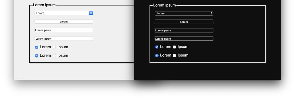
Although themes are manually styled for the most part (which overrides the UA styles), informing the browser about the supported themes helps to avoid even the slightest chance of a potential FOIT situation. This is true for those occasions where HTML has rendered but CSS is still waiting to load.
We can also set this in CSS:
:root {
  color-scheme: light dark; /* both supported */
}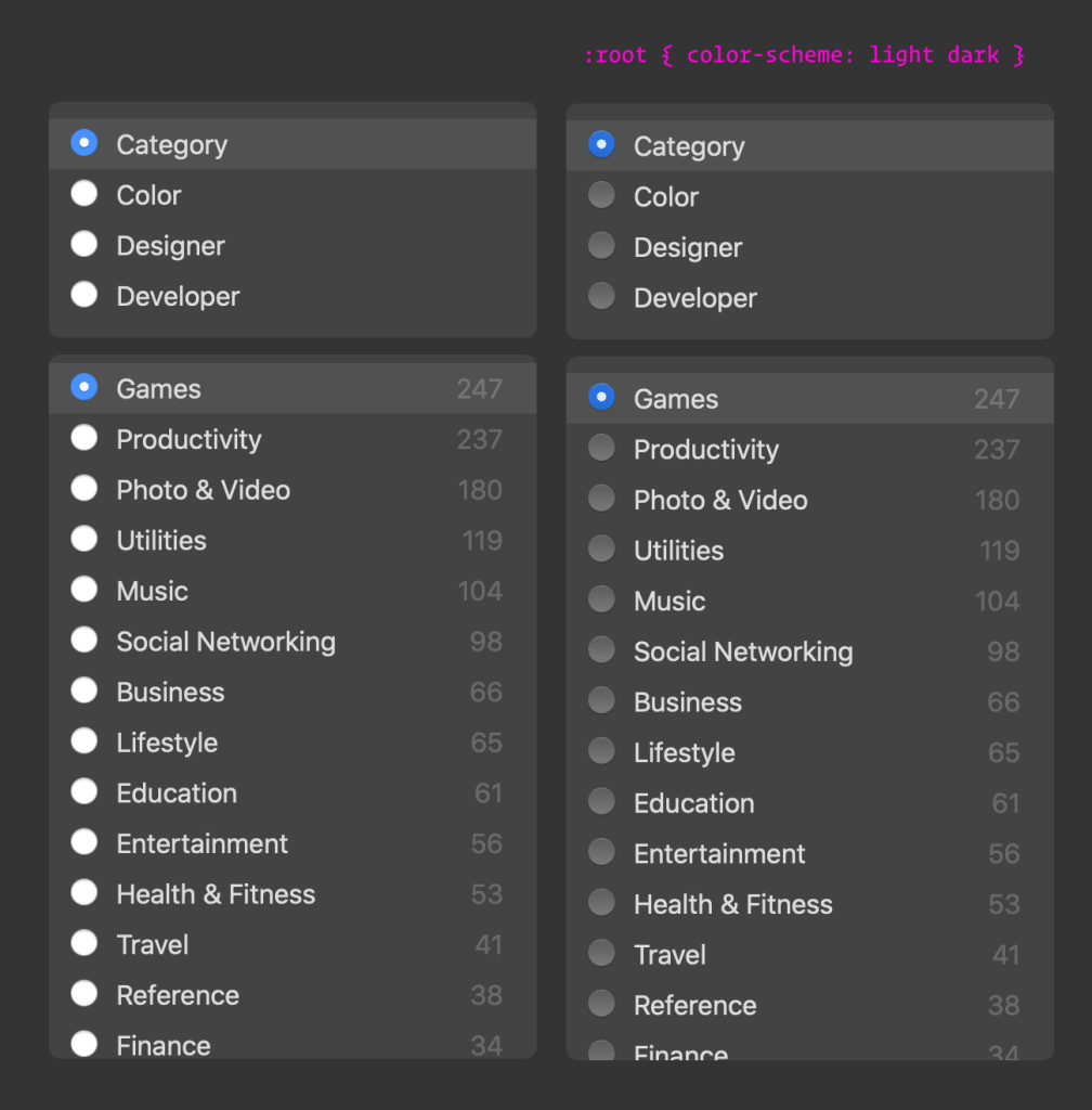
At the time of writing, the color-scheme property lacks broad browser support, though Safari and Chrome both support it.
Combining all the things!
Let’s combine everything and create a working demo that:
- Automatically loads a dark or light theme based on system preferences
- Allows the user to manually override their system preference
- Maintains the user’s preferred theme on page reloads
Using JavaScript & Local Storage
// Select the button
const btn = document.querySelector(".btn-toggle");
// Check for dark mode preference at the OS level
const prefersDarkScheme = window.matchMedia("(prefers-color-scheme: dark)");


// Get the user's theme preference from local storage, if it's available
const currentTheme = localStorage.getItem("theme");
// If the user's preference in localStorage is dark...
if (currentTheme == "dark") {
  // ...let's toggle the .dark-theme class on the body
  document.body.classList.toggle("dark-mode");
// Otherwise, if the user's preference in localStorage is light...
} else if (currentTheme == "light") {
  // ...let's toggle the .light-theme class on the body
  document.body.classList.toggle("light-mode");
}


// Listen for a click on the button
btn.addEventListener("click", function() {
  // If the user's OS setting is dark and matches our .dark-mode class...
  if (prefersDarkScheme.matches) {
    // ...then toggle the light mode class
    document.body.classList.toggle("light-mode");
    // ...but use .dark-mode if the .light-mode class is already on the body,
    var theme = document.body.classList.contains("light-mode") ? "light" : "dark";
  } else {
    // Otherwise, let's do the same thing, but for .dark-mode
    document.body.classList.toggle("dark-mode");
    var theme = document.body.classList.contains("dark-mode") ? "dark" : "light";
  }
  // Finally, let's save the current preference to localStorage to keep using it
  localStorage.setItem("theme", theme);
});
Using PHP & Cookies
<?php
$themeClass = '';
if (!empty($_COOKIE['theme'])) {
  if ($_COOKIE['theme'] == 'dark') {
    $themeClass = 'dark-theme';
  } else if ($_COOKIE['theme'] == 'light') {
    $themeClass = 'light-theme';
  }
}
?>


<!DOCTYPE html>
<html lang="en">
<!-- etc. -->
<body class="<?php echo $themeClass; ?>">
<!-- etc. -->
<script>
  const btn = document.querySelector(".btn-toggle");
  const prefersDarkScheme = window.matchMedia("(prefers-color-scheme: dark)");

  btn.addEventListener("click", function() {
    if (prefersDarkScheme.matches) {
      document.body.classList.toggle("light-mode");
      var theme = document.body.classList.contains("light-mode") ? "light" : "dark";
    } else {
      document.body.classList.toggle("dark-mode");
      var theme = document.body.classList.contains("dark-mode") ? "dark" : "light";
    }
    document.cookie = "theme=" + theme;
  });
</script>
</body>
</html>
Design Considerations
I often hear that implementing dark mode is easier than designing one. While I’ll refrain from judgement, let’s look at some considerations for designing a dark theme.
You already know the basic task: swap lighter color values for darker ones and vice versa. But there are some UI elements and enhancements that are more nuanced and require more attention. Let’s take a look at those.
Dark Mode Images
A good rule is to decrease the brightness and contrast of images a bit so that it looks comfortable to the eyes when it’s against a dark background. A super bright image on a super dark background can be jarring and dimming the image reduces some of that heavy contrast.


The CSS filter() function is more than capable of handling this for us:
/* Apply the filter directly on the body tag */
body.dark-theme img {
  filter: brightness(.8) contrast(1.2);
}


/* Or apply it via media query */
@media (prefers-color-scheme: dark) {
  img {
    filter: brightness(.8) contrast(1.2);
  }
}
We can do the same sort of thing directly in the markup using the <picture> element to load different versions of an image:
<picture>
  <!-- Use this image if the user's OS setting is light or unset -->
  <source srcset="photo-light.png" media="(prefers-color-scheme: light) or (prefers-color-scheme: no-preference)">
  <!-- Use this image if the user's OS setting is dark -->
  <source srcset="photo-dark.png" media="(prefers-color-scheme: dark)">
</picture>
The downside here is that it requires supplying two files where we only have to deal with one when using CSS. This also doesn’t fully account for the user toggling the color theme on the site.
Dark Mode Shadows
Dark mode shadows are tricky. If we simply invert a dark shadow using light colors, then we get this funky thing with a light shadow on a dark background… and it’s not a good look.
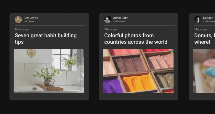
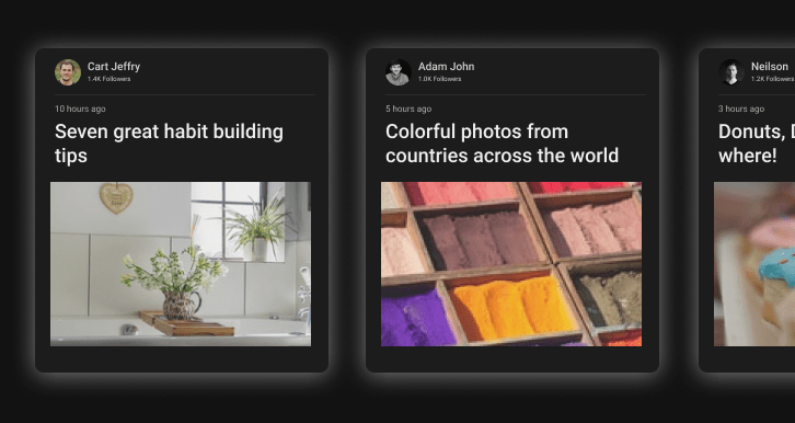
It’s possible to use a dark shadow in dark mode, but the background color has to be “light” enough (like a dark gray) to provide enough contrast to actually see the shadow against it.
🔥 When implementing dark mode, don’t throw away the visual cues in the light version by naively inverting the color scheme.
— Steve Schoger (@steveschoger) July 16, 2019
Close elements should still be lighter and distant elements should still be darker – even in a dark UI. pic.twitter.com/RNxgIppDmn
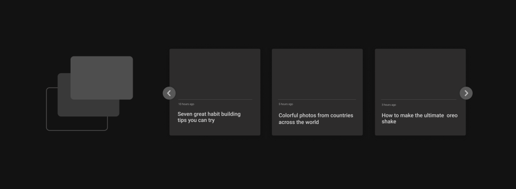
Use opacity to convey depth, with high opacity regions having a lower depth. That’s to say, elements that have a higher elevation should have a lower opacity than elements that are “closer” in depth to the background.
Dark Mode Typography
The trick here is a lot like images: we’ve gotta balance the contrast. Use too heavy of a font and we get blaring text that’s makes us want to move away from the screen. Use too light of a font and we’ll strain our eyes while inching toward the screen to get a closer look.
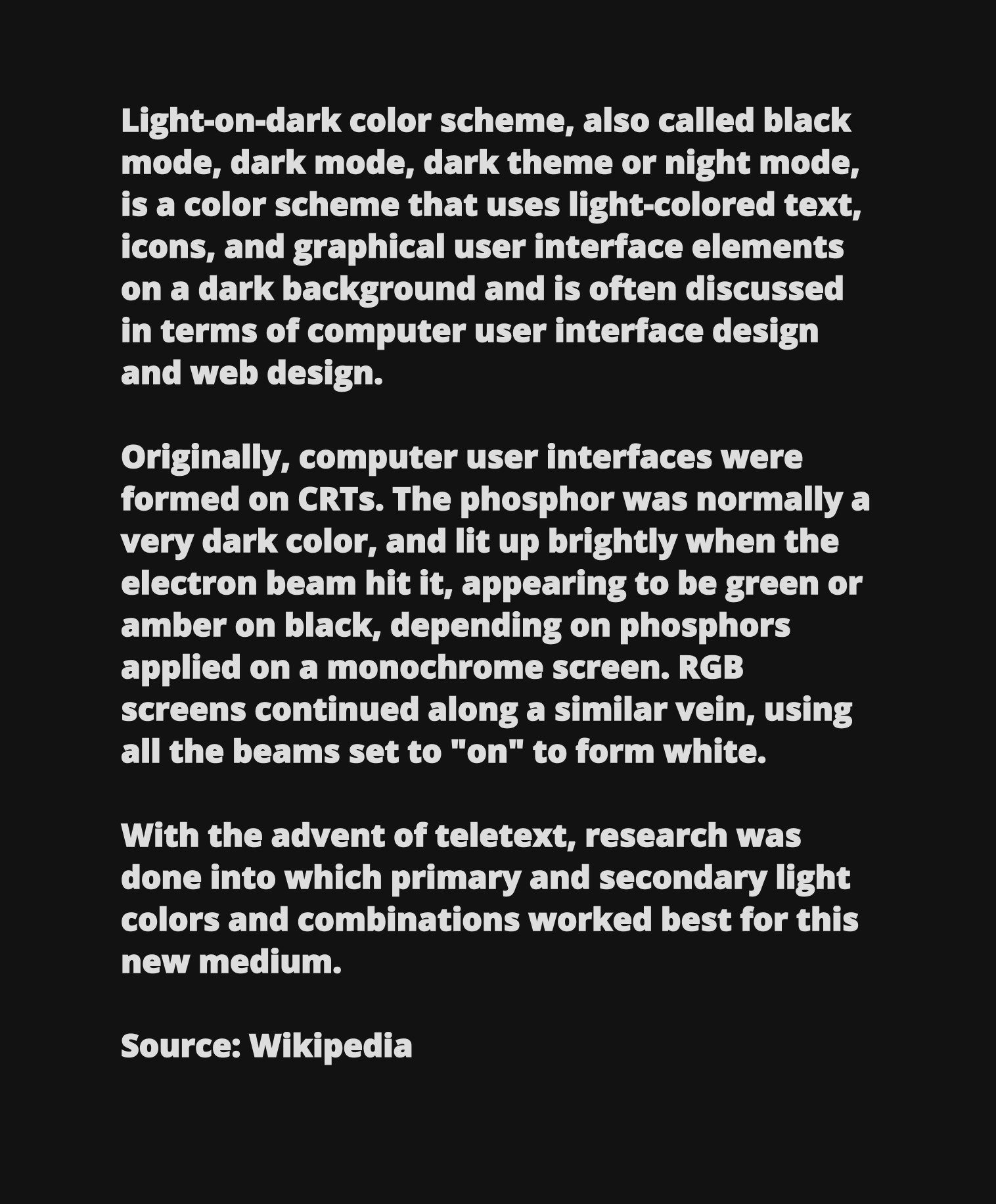
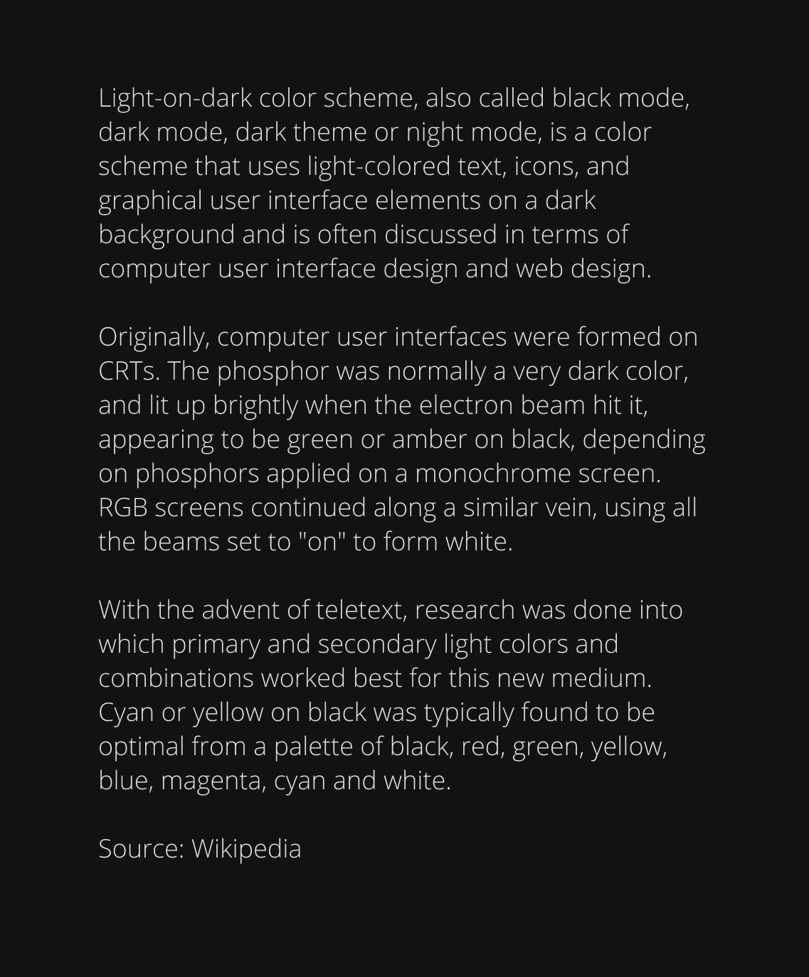
The balance is somewhere in the middle. Robin has a nice write-up where he suggests a small bit of CSS that makes a big difference in legibility.
Dark Mode Icons
Icons fall into this “tricky” category because they’re sort of a cross between text and images. If we’re working with SVG icons, though, we can change the fill with CSS. On the other hand, if we’re using font icons, we can simply change the color property instead.
/* SVG icon */
body.dark-theme svg.icon path {
  fill: #efefef;
}
/* Font icon (using Font Awesome as an example) */
body.dark-theme .fa {
  color: #efefef;
}
A lot of the same design considerations that are true for text, are also generally applicable to icons. For example, we ought to avoid using full white and heavy outlines.
Dark Mode Colors
Pure white text on a pure black background will look jarring. The trick here is to use an off-white for the text and off-black for the background. Material Design Guidelines for example recommends #121212 for the background.
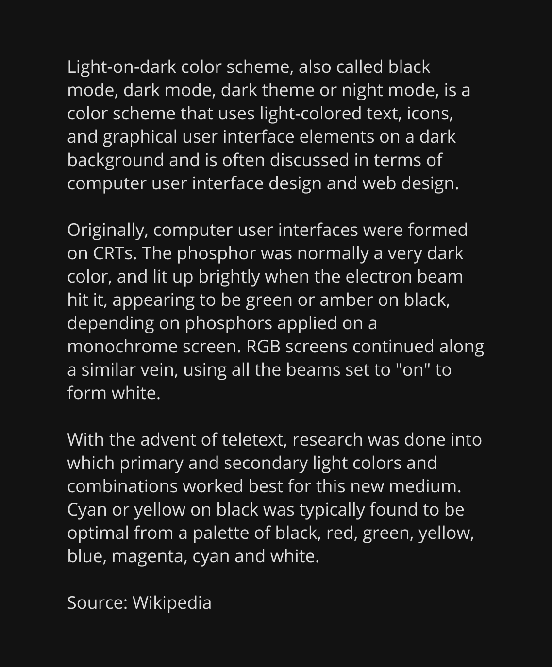
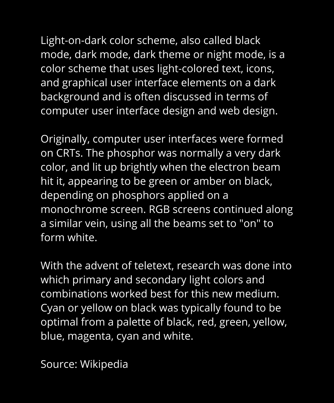
Dark Mode Color Palettes
We’ve seen the difference using off-white and off-black colors makes for text and images. Let’s expand on that a bit with tips on how to develop a full color palette.
Most things boil down to one thing: contrast. That’s why the first tip before settling on any color is to run ideas through a contrast checker to ensure color ratios conform to WCAG’s guidelines for at least a AA rating, which is a contrast ratio of 4.5:1.
That means desaturated colors are our friends when working with a dark mode design. They help prevent overbearingly bright images and still give us plenty of room to create an effective contrast ratio.


Next, remember that accent colors are meant to be enhancements. They’re likely brighter than the dark theme background color, so using them like a primary color or the background color of a large container is just as jarring and hard on the eyes as a bright image or heavy white text.
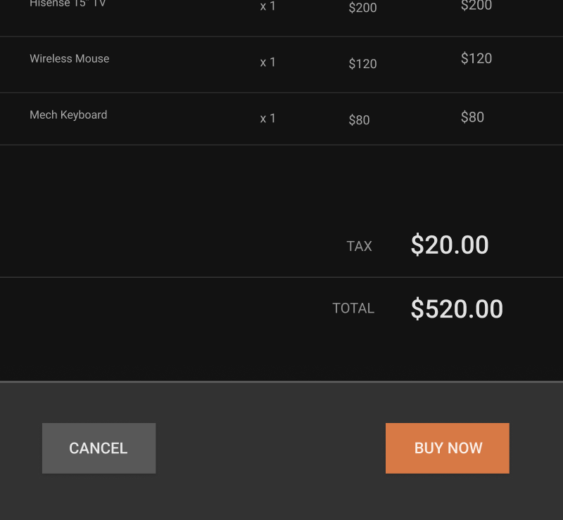
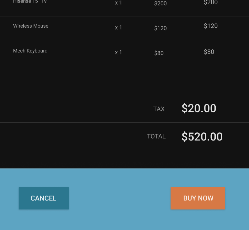
If contrast is the balance we’re trying to strike, then remember that dark mode is more than blacks and grays. What about dark blue background with pale yellow text? Or dark brown with tan? There’s an entire (and growing) spectrum of color out there and we can leverage any part of it to fuel creativity.
A few examples of colors that are dark without resorting to full-on black:
#232B32
#152028
#202945
Material Design’s guidelines on dark mode is a handy resource on best practices for dark mode design. It’s definitely worth a read for more tips to keep in mind.
Dark Mode in the Wild
YouTube uses the CSS variables technique. They’ve defined all their colors in variables under the html selector while dark mode colors are defined under html:not(.style-scope)[dark]. When dark mode is enabled, YouTube adds a dark="true" attribute to the <html> tag. This is what they use to override the variables defined in the HTML.
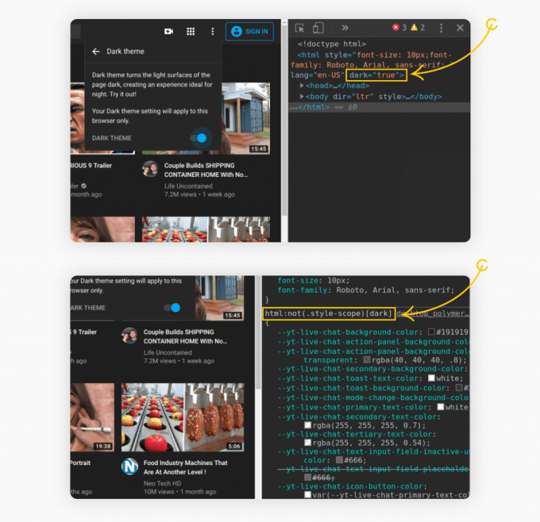
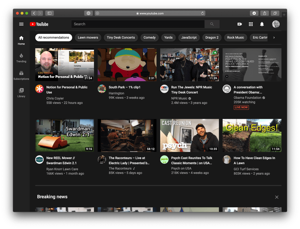
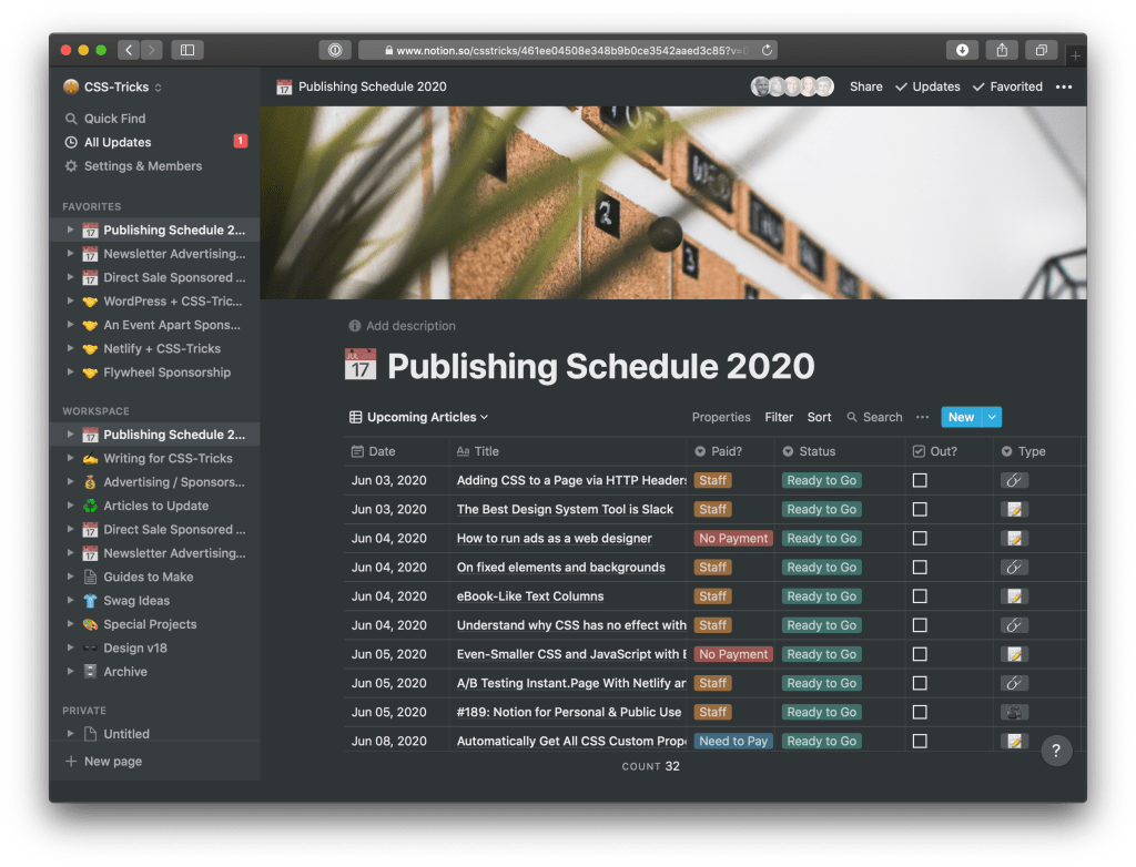
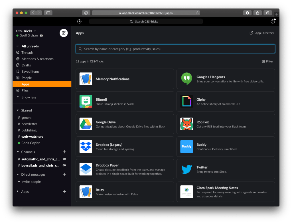
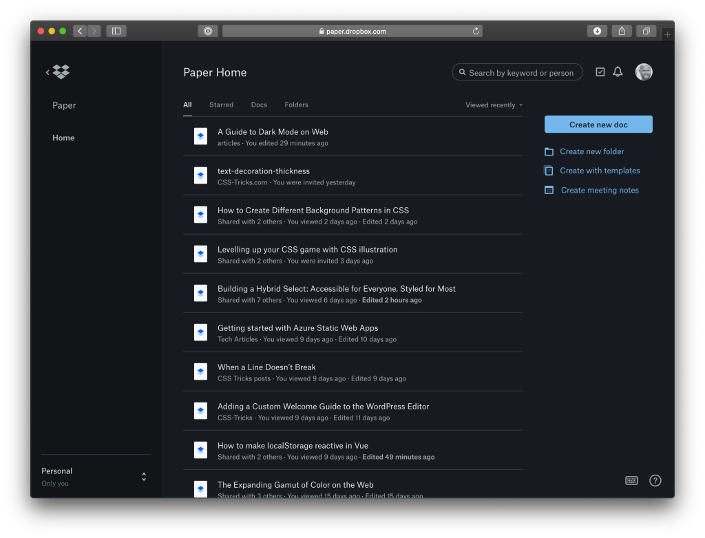
dark=true attribute to the <html> when it switches to the dark mode.In the wild, the CSS custom properties approach seems to be most popular. It’s being used by Dropbox Paper, Slack, and Facebook.
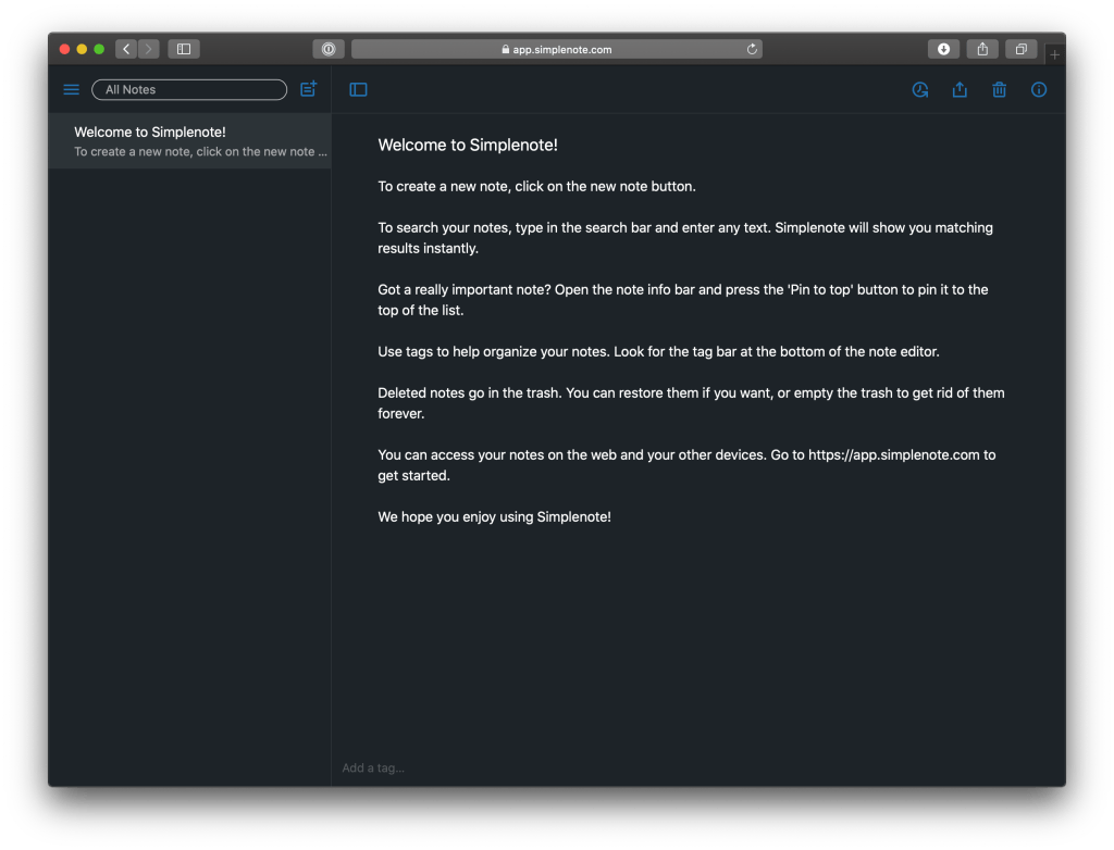
Simplenote uses the class-swapping method where all light style rules are descendants of a .theme-light parent class and all the dark styles fall under a .theme-dark class. When the theme is toggled, the appropriate class is applied to the <body> tag.
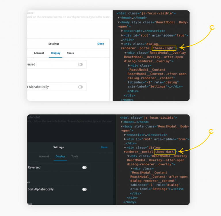
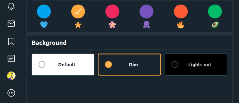
.light-theme and .dark-theme to style the themes.Twitter goes the extra mile and offers several themes to choose from: “Default,” “Dim,” and “Lights out.” The “Dim” option employs dark blue for a background color. Compare that to “Lights out” which uses a stark black.
Dark mode or no dark mode? That is the question.
There are perfectly valid reasons on both sides. Some of those reasons even go beyond the scope of user experience and include things like timing, budget and resources.
While being considerate of why you might not want to implement a dark mode, here are reasons why you might want to have one:
- It’s cool and trendy (although that’s not a reason alone to do it)
- It enhances accessibility by supporting users who are sensitive to eye strain in starkly bright themes.
- It allows users to decide the most comfortable way to consume content while providing us a way to maintain control over the look and feel of things. Remember, we want to beat the Reader Mode button!
- It helps to preserve battery life for devices with OLED screen where brighter colors consume more energy.
- It’s extremely popular and appears to be going nowhere. It’s possible that your users who prefer a dark mode (like me!) will expect your site to have one. Might as well be ready for it.

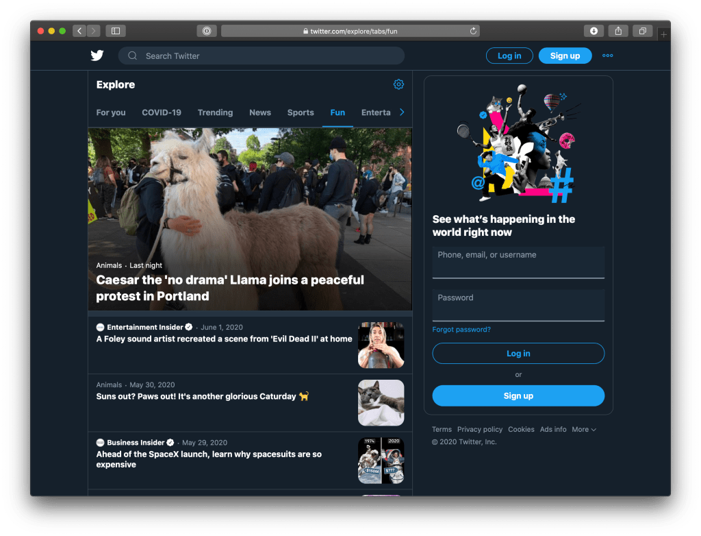
Also worth mentioning that developer tools have an option to toggle dark and light mode without having to change the operating system if you want to check if your detection works.
In Chromium Based browsers (Microsoft Edge/Chrome/Brave…) you can do that in the rendering menu or with a keyboard shortcut:
https://docs.microsoft.com/en-us/microsoft-edge/devtools-guide-chromium/accessibility/preferred-color-scheme-simulation
Yeah! That would be really handy.
There’s a major problem with this article: all of the options described require JavaScript to take effect.
A much better technique for client-side resolution of dark mode is to use the actual media query, and then have your toggle modify the media query, rather than adding or removing classes.
The end result is that dark mode will work even if JavaScript is disabled, and that you’re even less likely to get a flash of incorrect theme than before.
I use this technique on my own website and wrote about it at https://chrismorgan.info/blog/dark-theme-implementation/.
One other matter: this example is incorrect:
<picture>MUST have one<img>child, so that if none of the sources match there’s still something to show. As it is, older browsers that don’t support(prefers-color-scheme)would get no image at all. Also more values could be added in the future; sonot all and (prefers-color-scheme: dark)would be better than(prefers-color-scheme: light)anyway. (no-preferencegot dropped from the spec, BTW; UAs default tolightnow.)So the example should be this instead:
Hey Chris,
That’s an interesting technique. Thanks for sharing. :)
Unfortunately, I don’t quite understand how that would exactly prevent FLIC situation, as you still have to use JavaScript for query modification and everything. Maybe I am missing something?!
The article do talk about using
prefers-color-schememedia query to account for system preferences–which should work even if JS is disabled. But still, JS comes into play when you need to give the user manual control over their theme preference (ie. overriding the system preference).You’re right about the
<picture>. That looks much better! Thanks for pointing out.Why doesn’t this article have a dark mode option? Pfft… :)
No. This is dark mode.
https://tonsky.me
:)
That’s a clever dark mode implementation alright!
That is the greatest dark mode I have ever seen :-)
Really great and detailed article! :)
I think it’s missing a way to switch themes using CSS only, however. Might be useful since not everyone has access to JavaScript, or just for the fun of it!
I wrote a post sometime ago on how one can achieve this, which might be interesting to some readers: https://alexandersandberg.com/theme-switcher/
Here’s the source code: https://github.com/alexandersandberg/theme-switcher
It’s a technique using checkboxes (or radio buttons if more than 2 themes) and some CSS selector magic to switch between the themes. It’s accessible as well, which is a huge plus.
To store the user’s theme preference, a little bit of JavaScript is still required, sadly.
Excellent comprehensive article there fellah!
Unfortunately the “Combining all the things!” demo works in Firefox, but not in Chrome.
I already had OS set to dark mode (in case its part of the issue).
My take: [Light & dark mode, with user-switch button](https://codepen.io/2kool2/pen/abzgPzJ)
For a “complete” guide the high contrast mode is missing. The forced-color query is our friend here.
Just call it ultra dark mode and an a11y topic sound cool and fits to the article
Awesome article, I love CSS tricks!
I wrote a blog post on how to accomplish dark mode using react and react hooks along with styled components.
Check out the post here if it would be helpful to you.
Some Dark Mode links I’ve had saved up…
Your pure CSS method works perfectly with Safari on my iPhone. Not sure why the second example, JavaScript, doesn’t. I don’t have anything disabled on my browser. Anyway I appreciate this concise article!
The Javascript example does not work because it cannot detect theme change by itself in the way the code is written. The class-toggling part would just run once. To toggle every time theme changes, add the class-toggling code to “onchange” event of object “prefersDarkScheme” as callback and everything would work nicely.
Can you code it down, pls?
So we could switch from device more than once)
Also i’m curious why css-tricks still doesn’t have this feature to let users switch manually..((
Hi! Very helpful article. Now I’m trying to add night mode to my website and I get stuck on storing a user’s preference.
In article storing a user’s preference with localStorage work only with method #1 “Using a body class”, but how to make it work with method #2 “Using separate stylesheets”?
I’m trying to make it, but nothing changes, as my knowledges in JS are very poor. Can you help me?
Great article!
I applied the technique of cookies and server side on my WordPress website. This worked great – until I activated page caching.
The website clearly benefited a lot from page caching, but this meant that the theme was not ‘stored’, e.g. for each new page, you’d start plain again with the cached version.
So I was wondering if there could be an other JavaScript method without FOIT. Because tags are executed when they are encountered, one of my ideas is to add a tag before the whole page is loaded, which gets the cookie value and adds adds a class if needed. Do you know if such a thing is feasible?
Thanks a lot!
Ralph
This might not be a question related to the dark mode. But can any one point me what’s the tool used in the demo that you can slide the vertical bar to see left/right comparison? I think that’s a very cool effect to demo.
I believe the one on this page is based on Juxtapose ( https://juxtapose.knightlab.com ) but there are quite a few of these Before / After slider things on the web like Cocoen and TwentyTwenty.
To prevent that “FLIC” , you could use some kind of transition. I’ve saw that a few weeks ago but can’t remember on what page it was. Still. I think that may be a good solution – as long as the user didn’t turn on reduce-motion…
What is “FLIC”? I couldn’t find what “FLIC” stands for anywhere..
Hey!
Is it possible to detect power saving as well?
There are videos that don’t load when my iphone is in economy mode.
It would be interesting to add a bodyclass when the device is in power saving.
Thanks for this, a really excellent article which had everything I needed for my current site build.
Is there anyway to avoid duplicating the css code for the media query with: “prefers-color-scheme: dark”?
I’d like to know this as well Tomás. Messy when you have half a dozen properties, a nightmare when you have 100! There must be a better way…
Pure CSS: https://codepen.io/mori79/pen/ExwqNVv
Related post: https://stackoverflow.com/a/70811865/478018
Can you write an article on how the brave browser changes the complete color palette when we switch the force dark mode on?
How would I edit a table in dark mode, im trying to get the border of the table to be a different color other than black, but cant seem to get the output I want. Thanks!
Check that the table’s border isn’t getting set in the HTML itself, then style it up in CSS:
Why doesn’t css-tricks itself respect dark color preference? There are several articles about enabling it here, including some that go into quite some detail, but as of now the main content is a blinding white rectangle.
It’s not that far off either. There could be about 8 lines of CSS in a @media query and it would just work. I have it working pretty well right now with just a couple tweaks in devtools. Replace the .wp-block-column background with a translucent tint, turn off a couple resets, and then you don’t have to do much work at all.
Well now you’ve done it. Just created a dark theme with switch for a site but I did not know
prefers-color-schemeAlso just swapped dark mode browser addon for one that allows custom colors/css.
Now I can have my color scheme set for system/browser dark mode. I can have every website I visit use the same and it just so happens that it’s not to different than my desktop theme in Plasma.
Unification. Just need to remember to turn it off occasionally so I can see what the real world looks like.