DigitalOcean provides cloud products for every stage of your journey. Get started with $200 in free credit!
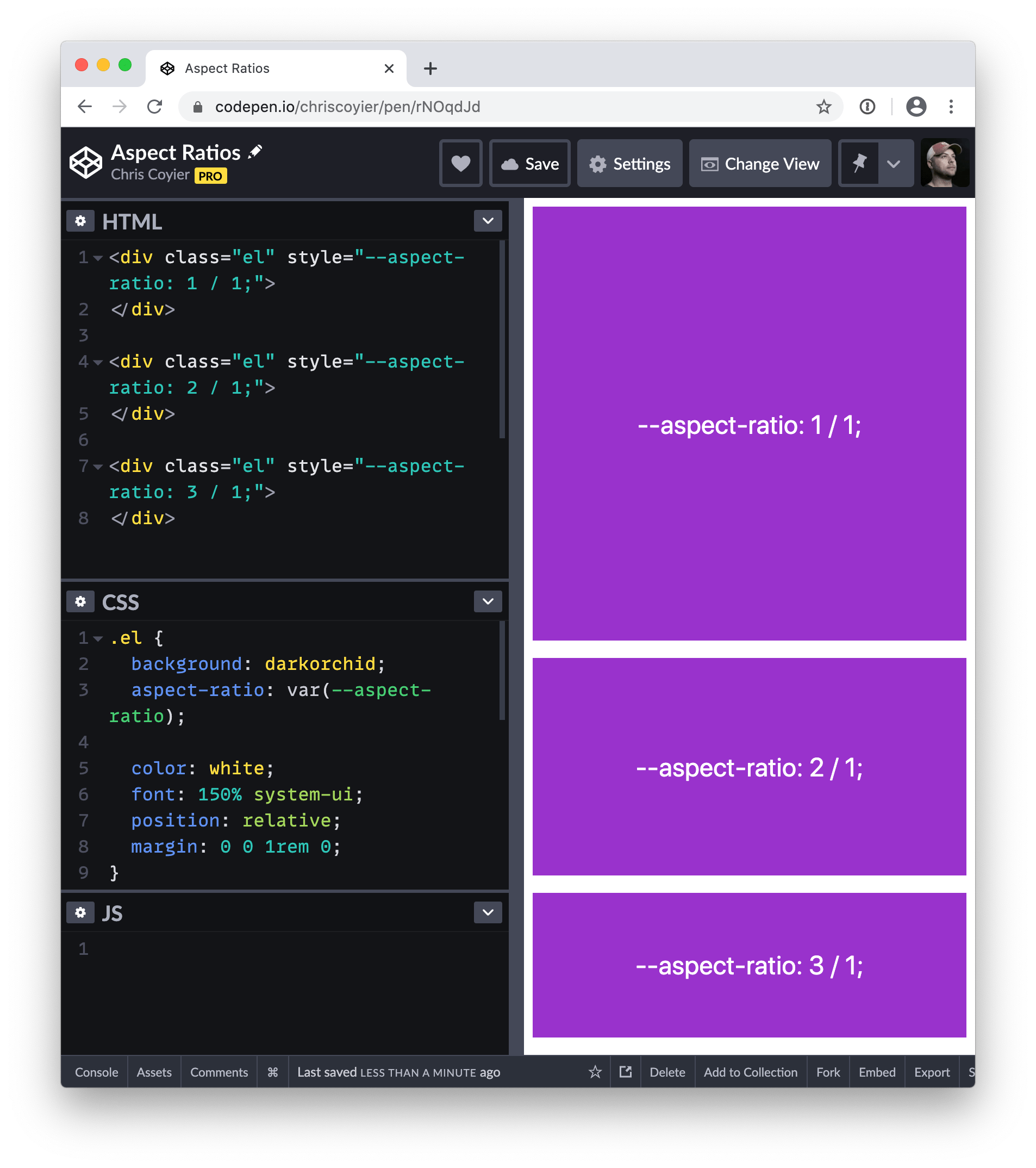
The CSS property aspect-ratio lets you create boxes that maintain proportional dimensions where the height and width of a box are calculated automatically as a ratio. It’s a little math-y, but the idea is that you can divide one value by another on this property and the calculated value ensures a box stays in that proportion.
In other words, this property helps us to size elements consistently, so the ratio of an element stays the same as it grows or shrinks.
.element {
  aspect-ratio: 2 / 1; /* ↔️ is double the ↕️ */
}

.element {
  aspect-ratio: 1 / 1; /* ⏹ a perfect square */
}
aspect-ratio is defined in the CSS Box Sizing Module Level 4 specification, which is currently in Working Draft. That means it’s still in progress and has a chance of changing. But with Chrome and Firefox supporting it behind an experimental flag, and Safari Technology Preview adding support for it in early 2021, there are strong signals that aspect-ratio is gaining a lot of momentum.
Syntax
aspect-ratio: auto || <ratio>;In plain English: aspect-ratio is either assumed to be auto by default, or accepts a <ratio> as a value where <width / height>.
- Initial value:
auto - Applies to: all elements except inline boxes and internal ruby or table boxes
- Inherited: no
- Percentages: n/a
- Computed value: specified keyword or a pair of numbers
- Animation type: discrete
Safari Technology Preview 153 shipped on September 7, 2022. In the release, the initital value of aspect-ratio replaces auto with default.
Values
/* Keyword values */
aspect-ratio: auto; /* default */

/* Ratio values */
aspect-ratio: 1 / 1; /* width and height are equal proportion */
aspect-ratio: 2 / 1; /* width is twice the height*/
aspect-ratio: 1 / 2; /* width is half the height */
aspect-ratio: 16 / 9  /* typical video aspect ratio */
aspect-ratio: auto 4 / 3; /* width:height, unless it's a replaced element */
aspect-ratio: 0.5; /* float value */

/* Global values */
aspect-ratio: inherit;
aspect-ratio: initial;
aspect-ratio: unset;auto: The default value, which specifies that the element has no preferred aspect ratio and should size itself as it normally would. Therefore, replaced elements, like images with an intrinsic aspect ratio, use that aspect ratio.<ratio>: Two positive numeric values separated by a forward slash (/) with or without space around them, targeting the width and height of the element. In the case of a single value, the second value is considered to be 1. Size calculations involving preferred aspect ratio work with the dimensions of the box specified bybox-sizing.initial: Applies the property’s default setting, which isauto.inherit: Adopts theaspect-ratiovalue of the parent.unset: Removes the current aspect ratio from the element.
It can take two values
This property can take two values at the same time, one being auto, and the other a <ratio>:
.element {
  aspect-ratio: auto 1 / 1;
}
If both auto and a <ratio> are specified together, the preferred aspect ratio is the specified ratio of width divided by height, unless it is a replaced element with an intrinsic aspect ratio, in which case that aspect ratio is used instead.
As you can see in the following demo, the same values are set for a div and an <img> (a replaced element), the div element is using the <ratio> and becomes a square, but the image follows its intrinsic aspect ratio. If you remove auto from the values, you can see that the image is forced to be a square:
It works on replaced and non-replaced content
If you’re thinking, “Uhm, yeah, doesn’t the browser already do this for us on images?” the answer is: absolutely. Browsers do some fancy aspect ratio calculations on replaced content like images. So, if an image has, say, a width of 500px, the browser flexes its CSS layout algorithms to maintain the image’s intrinsic or “natural” dimensions. The aspect-ratio property can be used to effectively override those natural dimensions.
But non-replaced content does not have a natural proportion. That’s most of the stuff we work with, like divs. Rather than try to maintain the element’s natural proportions, aspect-ratio sets a “preferred” sizing.
Now, the spec currently notes that older CSS specifications, notably CSS 2.1, does not contain a clear distinction between replaced and non-replaced content. That means we could see some additional special cases added to the spec to help clarify them. For the time being, we’re seeing browsers rolling out support for setting preferred aspect ratios on replaced and non-replaced separately, where some of the browsers with early support behind an experimental flag might only support aspect-ratio for non-replaced content. Definitely worth keeping an eye on the browser support as it evolves.
It works on its own without specifying a width or height
So, yeah, we can simply drop it on an element like this:
.element {
  aspect-ratio: 16 / 9;
}
…and the element’s default width: auto kicks in implicitly to set the element’s dimensions.

It changes when width or height are on the same element
Let’s say we have an element with a width of 300px and an aspect-ratio of 3/1.
.element {
  aspect-ratio: 3 / 1;
  width: 300px;
}
By nature, aspect-ratio wants to calculate the element’s dimensions on its own and will do so based on the context where it’s used. But with that width tossed in, it tells aspect-ratio to calculate the element’s aspect ratio box using 300px as the width. As a result, it’s like we’ve just written:
.element {
  height: 100px;
  width: 300px;
}
This makes sense! Remember, when no width or height are specified, the browser assumes those are auto and goes from there. When we provide explicit width and height values, those are what get used.
It’s ignored in some situations
This is where things get a little mind-bendy because there are cases where aspect-ratio is overlooked or it’s calculations are affected by other properties. That includes:
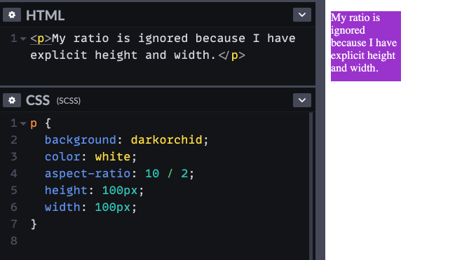
When both width and height are declared on the element
We just saw how declaring either width or height on and element will affect the calculation of aspect-ratio. But if the element already has both a width and height, those get used instead of aspect-ratio. It requires both properties to override aspect-ratio; setting either height or width alone will not break the element’s aspect ratio.

aspect-ratio is ignored when both width and height are set on the same element.Makes senes, right? If using either width or height forces the aspect-ratio to use that value in the calculation, then it logically follows that using both would completely override aspect-ratio altogether since both values are already provided and set.
When content breaks out of the ratio
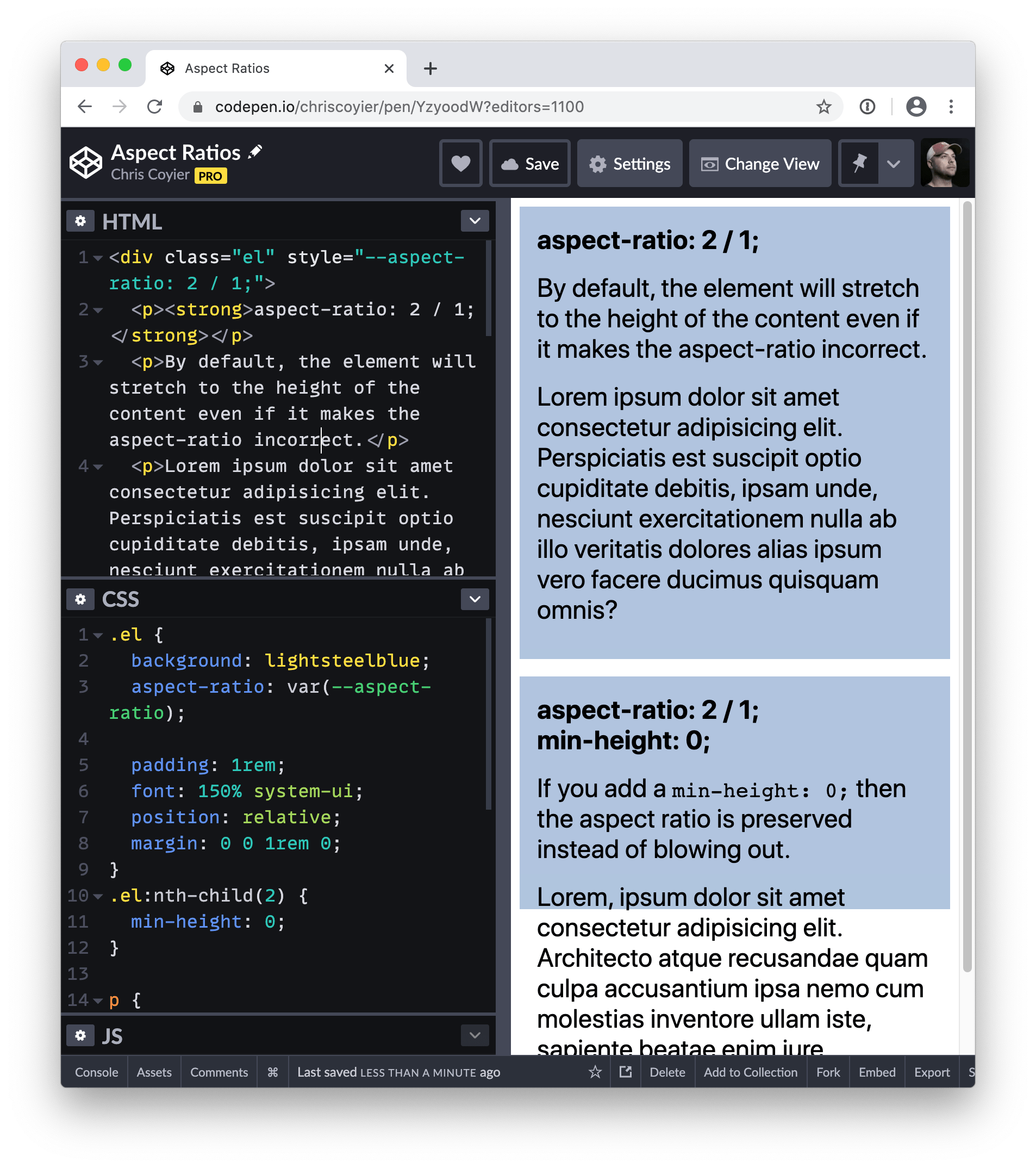
Simply put, if you have an element with an aspect ratio and the content is so long such that it forces the element to expand, then the element will expand. And if the element expands, its dimensions change and, thus, no more aspect ratio. This is why the spec says the property sets the “preferred” aspect ratio. It’s preferred, but not prescribed.
Don’t like how that works? Setting min-height: 0; on the element will allow the content to overflow the preferred aspect ratio instead of expanding it.

When it “loses” to min-* and max-* properties
We just sort of saw how that works, right? When content exceeds the dimensions of the box, the aspect-ratio is effectively gone because the box expands with the content. We can override that with min-width: 0.
That’s because all of the min-* and max-* properties typically battle width and height for supremacy in the war over Box Model calculations. For example:
.element {
  min-width: 500px; /* 🏆 Winner! */
  width: 100px;
}
But:
.element {
  min-width: 500px;
  width: 700px; /* 🏆 Winner! */
}
That’s because min-width is either preventing width from going below a specific value, or it is ignored because the width has set already set the element beyond the minimum width it needs to be. The same thing goes for min-height, max-width, and max-height.
The point of all this: if we set both a min-* or max-* property on the same element as aspect-ratio and they “win” over width or height, then those will override aspect-ratio. Told you it was a little mind-bendy. 🤯
Use cases
Replaced elements like images or videos already have an intrinsic aspect ratio, therefore when they grow or shrink, they maintain their aspect ratio, but non-replaced elements don’t have that luxury and sometimes you need that behavior for them.
Here are some examples where aspect-ratio becomes handy.
Responsive iframes
A very common use case is when you want to embed an iframe for displaying a video from another site like YouTube. In this case if you set the width to 100% and you set a height, the video is going to be deformed.
In order to have a responsive iframe that preserves its aspect ratio you can do as following:
iframe {
  aspect-ratio: 16 / 9;
  width: 100%;
  height: auto;
}If the iframe has width and height attributes set like this:
<iframe src="https://example.com" width="800" height="600"></iframe>…then you can automatically set the aspect-ratio like this:
iframe[width][height] {
  aspect-ratio: attr(width) / attr(height);
}
Hero images
Setting a background-image to an element doesn’t have any effect on the size of that element. So for creating a hero image, if the image is in the background, you need to set a height on the element and having a fixed height is not very responsive!
Here you can use aspect-ratio property In order to have a hero that preserve the aspect ratio of its background-image:
.hero {
  aspect-ratio: 4 / 3;
  background: url(background.png);
}Consistency in a grid layout
Imagine, In a flexbox or a grid layout with auto-fill mechanism, you may want items to stay square, but items width and height can shrink or grow based on their content or their parent’s size and as a result it’s most likely that items don’t stay square.
Setting aspect-ratio to 1 / 1 changes the height dynamically while your item’s width scales:
.grid-container {
  display: grid;
  grid-template-columns: repeat(auto-fill, minmax(180px, 1fr));
}

.grid-item {
  aspect-ratio: 1 / 1;
}
In the following image gallery, since images have random sizes, the aspect-ratio property is used in order to keep their height consistent. Remove aspect-ratio on the item list and see the effect.
Also, with using object-fit, you can fit the images into the right dimensions.
Browser support
Dealing with legacy browser support
Before having this property one way of dealing with this issue was padded-box technique and now thanks to CSS @supports we can use that technique for older browsers.
In the following example, the pseudo-element tactic is used to add fallback for aspect ratio property in older browsers:
.element {
  aspect-ratio: 1 / 1;
}

@supports not (aspect-ratio: 1 / 1) {
  .element::before {
    float: left;
    padding-top: 100%;
    content: "";
  }

  .element::after {
    display: block;
    content: "";
    clear: both;
  }
}