DigitalOcean provides cloud products for every stage of your journey. Get started with $200 in free credit!
The grid-template-areas CSS property allows you to define and name the cells (or “areas”) in a CSS grid container.
.grid-container {
  display: grid;
  grid-template-areas: "header header" "sidebar main";
}
So, that example above? We get a two-by-two grid where the top row reserves two columns for an area named header. The bottom row also gets two columns, but reserves them for grid areas called sidebar and main, respectively.
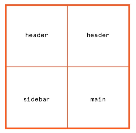
That means our grid is established and we’ve defined grid areas, but there’s nothing actually assigned to those grid areas. If we want to place an element in a grid area, we’ve gotta explicitly declare it with the grid-area property on that element:
.grid-container {
  display: grid;
  grid-template-areas: "header header" "sidebar main";
}
.grid-header {
  grid-area: header;
}
.grid-sidebar {
  grid-area: sidebar;
}
.grid-content {
  grid-area: main;
}
Something to keep in mind is that a grid area has to either be a single cell in the grid container or a group of adjoining cells in a rectangular shape. That means all of the following examples are valid:
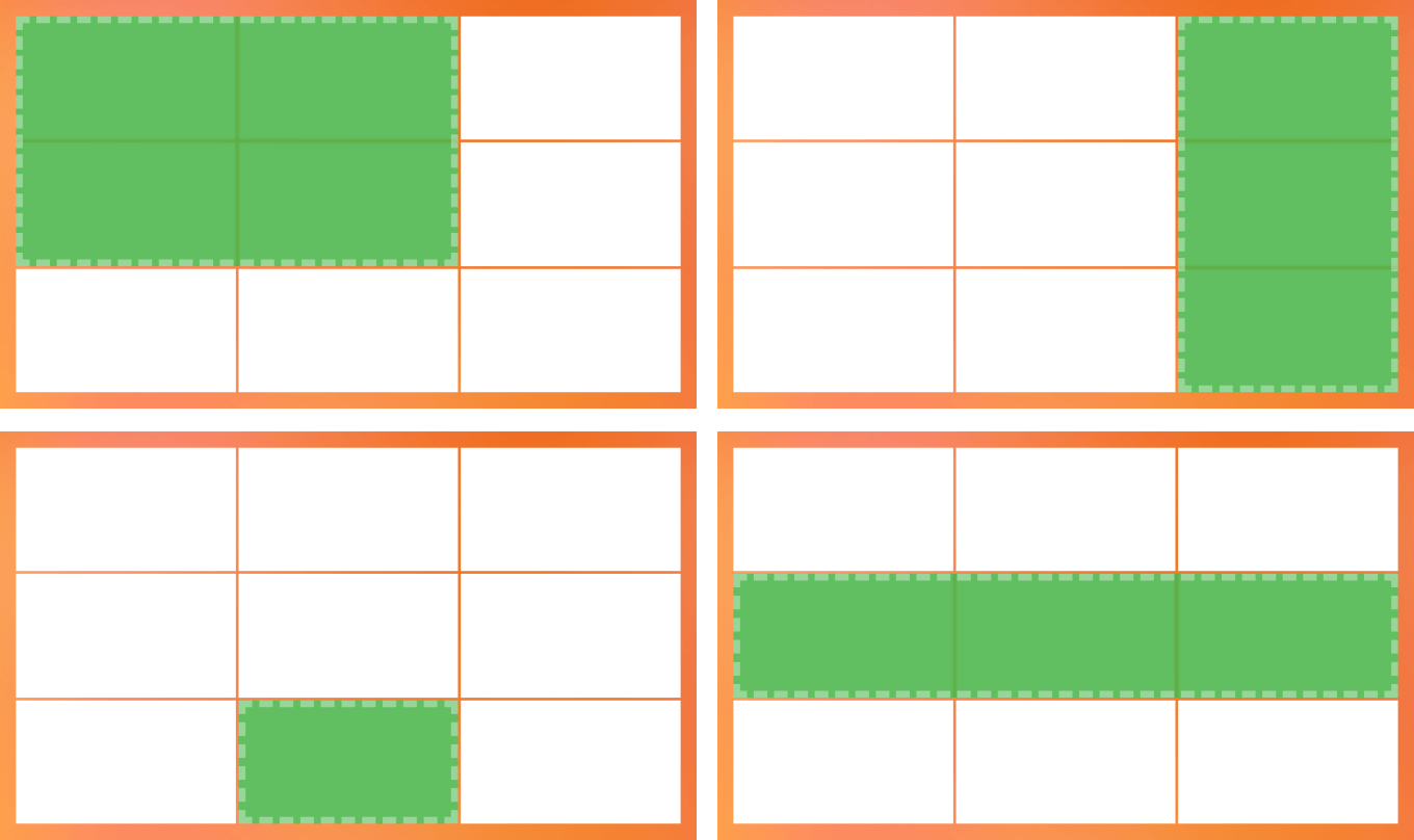
But what we’re unable to do is form non-rectangular grid areas. So, no luck if the area you want to define is more in the shape of a “T” or an “L”.

Syntax
grid-template-areas: none | <string>- Initial value:
none - Applies to: grid containers
- Inherited: no
- Computed value: as specified, the keyword
noneor a list of string values - Animation type: discrete
Values
/* Keyword value */
grid-template-areas: none;

/* <string> values */
grid-template-areas: "col-1 col-2 col-3";
grid-template-areas: "header header header" "sidebar main main";
grid-template-areas: "header header header"
                      "sidebar main main"
                      ". footer footer";

/* Global values */
grid-template-areas: inherit;
grid-template-areas: initial;
grid-template-areas: revert;
grid-template-areas: unset;
none
This is the default value. And, as you might have guessed, none means that no named grid areas and no explicit grid tracks are set on the grid container. That also means the grid tracks are implicitly generated and their sizes are defined by the grid-auto-columns and grid-auto-rows properties.
There’s actually another way to create explicit grid tracks than using grid-template-areas, and that’s to use the grid-template-columns and grid-template-rows properties instead. We’ll cover that in greater detail later in the article.
<string>
A string can be any name you want to give to a specific grid template area. So, if you have a top row in your grid container and you want the header of your layout to go in there, you can name the area “header” or “page-top” or literally whatever you want. In fact, if there are multiple columns in that row, we can make each one a differently named grid area.
.grid {
  grid-template-areas: "logo menu utility-nav";
}
Notice that the entire three-column row in that example is wrapped in quotes. That’s crucial because name grid template areas wrapped in quotes indicates a new row. So, if we have two rows, we’d see two groups of quoted areas:
.grid {
  grid-template-areas: "logo menu utility-nav" "sidebar-1 content sidebar-2";
}
Better yet, we can make this a little easier to understand by writing each row on its own line:
.grid {
  grid-template-areas:
    "logo menu utility-nav"
    "sidebar-1 content sidebar-2";
}
The syntax for strings is capable of things like spanning and skipping cells in the grid container. We’ll get to that in just a bit.
Basic usage
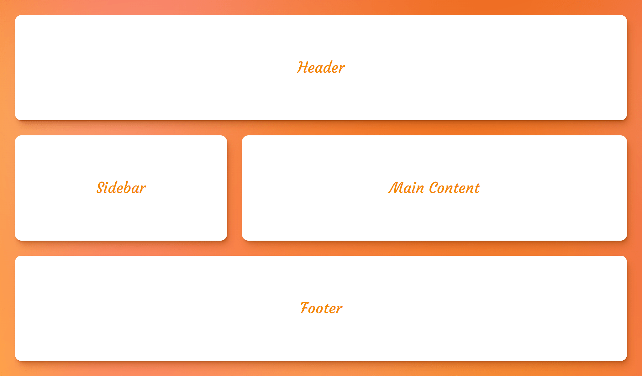
First, let’s define the grid template areas by using the grid-template-areas property on the parent grid container:
.grid {
  display: grid;
  grid-template-areas:
    "header header header"
    "sidebar main main"
    "footer footer footer";
}
As it currently stands, the grid container has named areas, but nothing in them. To place elements in there, we need to assign the named grid area to an element using the grid-area property on the element we’re placing:
header {
  grid-area: header;
}

aside {
  grid-area: sidebar;
}

main {
  grid-area: main;
}

footer {
 grid-area: footer;
}
This is the result based on the grid-template-areas we defined on the parent grid container:
Sizing a grid’s named areas
The size of the grid’s tracks can be set using the grid-template-columns and grid-template-rows properties on the parent grid container.
Say we have a layout requirement that our grid needs two columns, and the second column takes up two times the amount of space that the first column does. We can use the fractional (fr) unit for that:
.grid {
  display: grid;
  gap: 1rem;
  grid-template-columns: 1fr 2fr;
  grid-template-areas: "sidebar main";
}
It’s the same sort of deal for rows. Let’s say now that we need the following layout in a three-by-three grid:
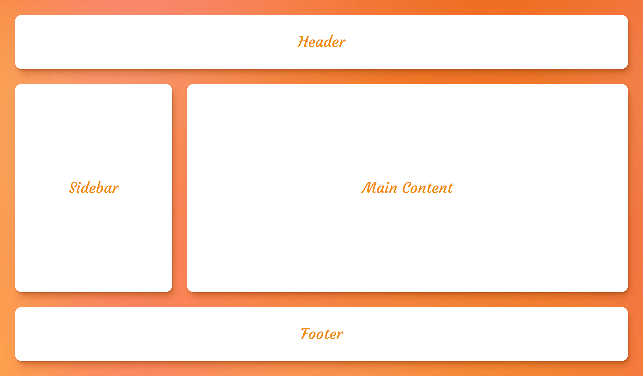
This time, let’s make the first and third rows the same fixed height of 250px, but size the middle row so that it takes up as much space as the content needs:
.grid {
  display: grid;
  gap: 1rem;
  grid-template-rows: 250px auto 250px;
  grid-template-areas:
    "header header header"
    "sidebar main main"
    "footer footer footer";
}
If you’re asking yourself what the heck is up with all of those repeated named grid template areas, that’s all about…
Spanning cells and rows
Repeating a named area connects cells. So, if the goal is to create a named area called feature and for it to take up two columns in the top row, we can do something like this:
/* Valid declaration */
grid-template-areas: "feature feature widget";
Cool, and we can do the same sort of thing in the vertical direction if the same named area starts each row:
/* Valid declaration */
grid-template-areas:
  "feature aside widget-1"
  "feature aside widget-2";
Of course, we can combine the two to get a grid template area that spans both directions:
/* Valid declaration */
grid-template-areas:
  "feature feature widget-1"
  "feature feature widget-2";
As mentioned earlier, grid template areas need to be rectangular. That means the following variation of the last example is invalid:
/* Invalid declaration */
grid-template-areas:
  "feature feature widget-1"
  "feature aside widget-2";
We can create gaps (or hard “stops”) between cells
That’s possible by using a dot (.) notation:
grid-template-areas:
  "header header header"
  "sidebar main main"
  ". footer footer"; /* first cell is empty */
}
The number of dots is unimportant. We could have done this instead:
grid-template-areas:
  "header  header header"
  "sidebar main   main"
  "....... footer footer"; /* first cell is empty */
}
Both declarations create the same grid:

White spaces are a good way to visualize the grid
The following declarations are equivalent but the second one is easier to visualize the structure of the grid because we’re using empty whitespace to line up the names:
grid-template-areas:
  "header header header"
  "sidebar main main"
  ". footer footer";

grid-template-areas:
  "header  header header"
  "sidebar main   main"
  ".       footer footer";
If you’re looking for an another way to visualize a grid container, Chris has a clever idea to “draw” it in a sort of ASCII format visualize the grid in a sort of ASCII format in your CSS comments.
Rows must have the same number of columns
All lists must have the same number of values, otherwise the declaration is invalid.
/* 👍 */
grid-template-areas:
  "name name-2 name-3"
  "name name-2 name-3"
  "name name-2 name-3";

/* 👍 */
grid-template-areas:
  "header header"
  ". main"
  "footer footer";

/* 👎 */
grid-template-areas:
  "name name-2 name-3"
  "name name-2 name-3"
  "name name-3";
Using Unicode characters for named grid areas
According to specifications, any name that does not match the <ident> syntax requires escaping when referencing that area by name in other properties. For instance, in the following declaration, the first area’s name starts with a number and, therefore, does not match the <ident> syntax:
.grid {
  grid-template-areas: "1st b c";
}
The workaround is to declare the unescaped hex code for the the 1 digit. In this case, the hex is U+0031, which we escape in the CSS as \31st. So, that’s what we use to assign an element to that named grid area:
.grid-item {
  grid-area: \31st;
}
Implicitly assigned line names
Defining tracks with the grid-template-areas property gives us line names for free based on the assigned names. That’s different from the grid-template-rows and grid-template-columns properties where we need to provide line names when defining columns and rows. Not so much with the grid-template-areas property because it takes the names we provide it and it spits out track names for us.
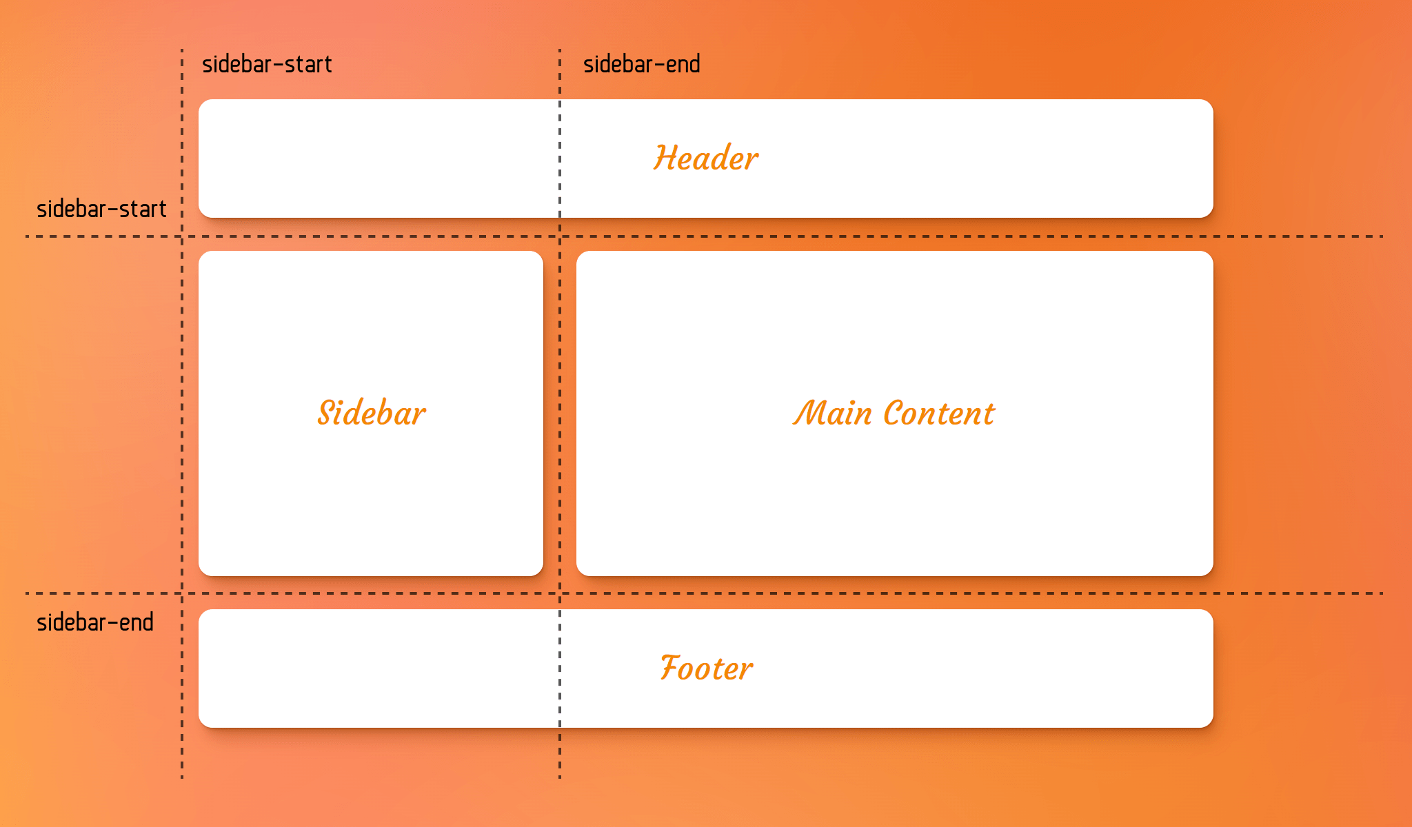
Four grid lines are created for each grid template area name. If we have a grid template area named sidebar, we get two pairs of track lines named sidebar-start and sidebar-end — one pair for the column direction, and one pair for the row direction:
You might be wondering what happens if we were to explicitly define track names and use the same name we’d get if they were implicitly defined instead — like explicitly defining a grid line named sidebar-start for a sidebar named area. The two lines can coexist and be assigned to different elements. In other words, the explicit value is still valid and both lines can be used.
Implicitly named areas
Another way to name grid areas in a grid container is to let CSS Grid name them implicitly for us when setting up track names on the grid-template-columns and grid-template-rows properties.
All we need to do is choose a name for the grid area and append -start and -end to it for the track names. Here, for example, we get a grid template area called sidebar without even declaring the grid-template-areas property:
.grid-container {
  display: grid;
  grid-template-columns: [sidebar-start] 250px [sidebar-end] 1fr;
}

aside {
  grid-area: sidebar;
}
As you see in the above example, although there is no grid-template-areas property to explicitly define an area named “sidebar”, but that area can still be referenced by the grid-placement properties like grid-area, grid-row, grid-column or their longhand equivalents.
Example: Responsive Holy Grail layout
In the following demo, we use grid-template-areas property to create the infamous Holy Grail layout with CSS Grid:
This layout got its name due to the fact that it was incredibly difficult to accomplish back in the days of using floats for layouts. Thank heavens we have CSS Grid to make it almost trivial.
First, our HTML:
<div class="grid">
  <header>Header</header>
  <main>Main Content</main>
  <aside class="left-sidebar">Left Sidebar</aside>
  <aside class="right-sidebar">Right Sidebar</aside>
  <footer>Footer</footer>
</div>
Pretty simple so far, right? We want the header across the top, the footer across the bottom, and the main content to be one of three columns in the middle row.
We can set up the named grid template areas in CSS, and span rows where needed:
.container {
  grid-template-columns: 12rem auto 12rem;
  grid-template-areas:
    "header header header"
    "left-sidebar main right-sidebar"
    "footer footer footer";
}
Now we need to assign each element to a named grid area:
header {
  grid-area: header;
}
main {
  grid-area: main;
}
footer {
  grid-area: footer;
}
.left-sidebar {
  grid-area: left-sidebar;
}
.right-sidebar {
  grid-area: right-sidebar;
}
Um, we’re technically done! That’s really all it takes. We can take this one step further by stacking the grid areas vertically be default, then build the Holy Grail on larger screens where it looks much better:
.container {
  display: grid;
  grid-template-areas:
    /* Each area is a row */
    "header"
    "nav"
    "article"
    "sidebar"
    "footer";
}

@media (min-width: 600px) {
  .container {
    grid-template-columns: 12rem auto 12rem;
    grid-template-areas:
      /* Build the Holy Grail layout */
      "header header header"
      "nav article article"
      "sidebar article article"
      "footer footer footer";
  }
}
Browser support
More information
- CSS Grid Layout Module Level 2
- Simple Named Grid Areas (Chris Coyier)
- The Difference Between Explicit and Implicit Grids (Manuel Matuzovic)
- Things I’ve Learned About CSS Grid Layout (Oliver Williams)