DigitalOcean provides cloud products for every stage of your journey. Get started with $200 in free credit!
The background-blend-mode property defines how an element’s background-image should blend with its background-color:
.container {
  background-image: url('image.jpg');
  background-color: red;
  background-blend-mode: screen;
}In the demo above, the default background-image on the left has no blend mode set and so the image overlaps the background-color. On the right however, the blend mode has modified the background-image with the red background-color underneath. But notice that the text color has not been affected by this additional property.
Values
initial: the default value with no blending.inherit: inherits the blend mode of the parent element.<blend-mode>: a value that will change the background-image depending on itsbackground-color.
The value can be set as any of the following (in the demos below the background-color is red):

normal: as shown above, the background-color will not bleed through the background-image.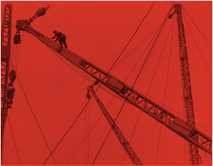
multiply: the background-image and background-color are multiplied and typically this leads to a darker image than before.
screen: both image and color is inverted, multiplied and then inverted again.
overlay: the background-color is mixed with the background-image to reflect the lightness or darkness of the backdrop.
darken: if the background-image is darker than the background-color then the image is replaced, otherwise it is left as it was.
lighten: if the background-image is lighter than the background-color then the image is replaced, otherwise it is left as it was.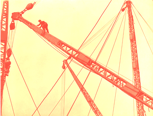
color-dodge: the background-color is divided by the inverse of the background-image. This is very similar to the screen blend mode.
color-burn: the background-color is inverted, divided by the background-image and inverted again. This is similar to multiply.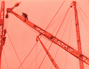
hard-light: if the background-image is lighter than the background-color then the result is muliply or if it is lighter then the result is screen.
soft-light: the final result is similar to hard-light but softer in that it looks like a diffused spotlight has been placed on the image.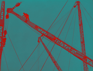
difference: the result by subtracting the darker color of the background-image and the background-color from the lightest one. Often the image will have a very high contrast.
exclusion: the result is very similar to difference yet with a little lower contrast.
hue: the result is the hue of the background-image combined with the luminosity and saturation of the background-color.
saturation: keeps the saturation of the background-image whilst mixing the hue and luminosity of the background-color.
color: keeps hue and saturation of background-image and the luminosity of the background-color. In this example because the image is gray and the effect preserves gray levels all we get is a big gray blob.
luminosity: luminosity of the top color is preserved whilst using the saturation and hue of the background-color.Chaining multiple blend modes
Each background layer can only have a single blend mode, however if we’re using multiple linear gradients for instance, each of them can have their own blend mode which makes for an interesting display:
This is achieved by listing these values in order of the background layer that you’d like to effect:
.container {
  background:
    linear-gradient(purple 0%, red 90%),
    linear-gradient(to right, purple 0%, yellow 90%),
    url('image.jpg') 30px,
    url('image.jpg') 20px;
  background-blend-mode: screen, difference, lighten;
}
The first linear gradient has the screen blend mode, followed by the second linear gradient which has difference and the first background image which has lighten applied to it.
Demo
Here’s a working example of how those values are interpreted depending on the background-color:
Browser support
This browser support data is from Caniuse, which has more detail. A number indicates that browser supports the feature at that version and up.
Desktop
| Chrome | Firefox | IE | Edge | Safari |
|---|---|---|---|---|
| 35 | 30 | No | 79 | 10.1 |
Mobile / Tablet
| Android Chrome | Android Firefox | Android | iOS Safari |
|---|---|---|---|
| 127 | 127 | 127 | 10.3 |
Is there a way to pull this off in IE?
Is there a way to pull this off in IE?
Or a solution which works in all ie versions? So far I have not found a solution, Microsoft does not want Support the blend-mode. On this way we can not use blend-mode. I have found solutions with javascript, most have trouble with ie 11 and Edge and the color is different in the browser.
Rene
I found the only and best working solution by Matt Slack:
http://collectiveidea.com/blog/archives/2016/06/02/fun-with-svg-css-background-blend-mode-fallback
I didn’t use the java script part (beside the feature detection) since I was able to included the image path directly into the svg via my cms template
The only thing that took some time to figure out was the usage of the
<base href="">which interferes with thefilter="url(#myFilter)"attribute. In those cases I had to add the path to the current pagefilter="url(/mypage.html#myFilter)".Here is Matt’s js version +
<base>tag (http://codepen.io/localhorst/pen/QGEMmE)