DigitalOcean provides cloud products for every stage of your journey. Get started with $200 in free credit!
The outline-style CSS property specifies the style of an element’s outline. What’s an outline? An outline is a line that is drawn around elements — outside the border edge — that is used for accessibility or decoration purposes when that element is in focus.
button {
  outline-style: dashed;
}
outline-style is a constituent property in the outline shorthand and is defined in the CSS Basic User Interface Module Level 4 specification which is currently in Editor’s Draft status.
Usage
We usually set the outline of an element using the shorthand property:
a:focus {
  outline: 5px dashed black;
}
Accessibility
By default, different user agents provide different outline styling on focused elements to help indicate non-mouse interactions for accessibility reasons, but that visual is generally beneficial to everyone. This styling is typically an outline around the element.

There are some reasons why you would want to change the default outline style:
- You can set that style to match your brand.
- You can make the outline more noticeable.
- You can bring more attention to the user by changing the outline style on the element’s focus.
And this is when outline-style comes in handy. But make sure your custom style is, at the very least, as accessible as the default style. That means making it clear and noticeable, while not trying to steer too far that it no longer resembles a focus state. Eric Bailey has a lot of great advice on this in his “Focusing on Focus Styles” article.
Syntax
outline-style: auto | <outline-line-style>

/* where */
<outline-line-style> = none | dotted | dashed | solid | double | groove | ridge | inset | outset- Initial value:
none - Applies to: all elements
- Inherited: no
- Computed value: as specified
- Animation type: discrete
Values
/* Keyword values */
outline-style: auto;
outline-style: none;
outline-style: dotted;
outline-style: dashed;
outline-style: solid;
outline-style: double;
outline-style: groove;
outline-style: ridge;
outline-style: inset;
outline-style: outset;

/* Global values */
outline-width: initial;
outline-width: inherit;
outline-width: unset;

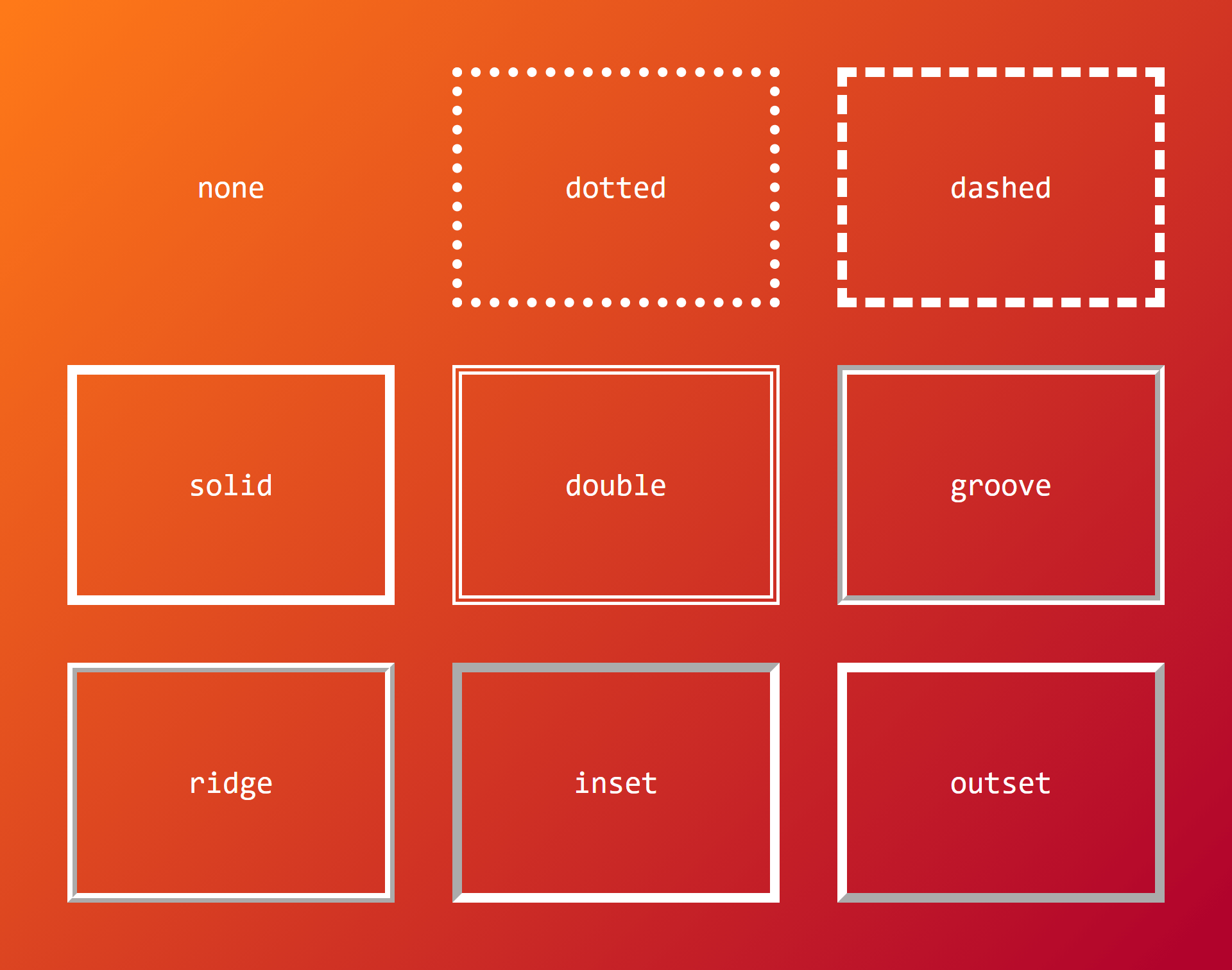
auto: Allows user agents to draw a custom outline style on elements.none: The default value. Outline is not drawn. The computed value ofoutline-widthis0.dotted: Draws a bunch of round dots around the element.dashed: Draws square-ended dashes around the element.solid: A single line wraps around the element.double: Draws two parallel solid lines along the element’s edge, with space between them. The thickness of the two lines and the gap between them is equal to theoutline-widthvalue. Theoutline-widthmust be at least 3px wide for the double outline to be visible.groove: The outline looks like it’s carved in the page. This carved effect usually comes from the color specified using theoutline-colorproperty, plus a slightly darker version of it that the browser figures out on its own.ridge: The opposite ofgroove, where the outline looks as if it’s coming off of the page.inset: Gives the element’s box an embedded appearance, as if the content inside of the outline is sinking into the page.outset: The opposite ofinset, giving the element’s box an embossed appearance, as if the content inside of the outline is coming out of the page.initial: Applies the property’s default setting, which isnone.inherit: Adopts theoutline-stylevalue of the parent.unset: Removes the currentoutline-stylefrom the element.
Example
The following example makes the outline of the button double once it’s focused:
button {
  outline-width: 1px;
  outline-style: solid;
  outline-color: lightblue;
}

button:focus {
  outline-style: double;
}
Demo
You can play around this property in the following demo:
Browser support
| IE | Edge | Chrome | Firefox | Safari | Opera |
|---|---|---|---|---|---|
| 8+ | All | All | All | All | All |
| iOS Safari | Android Chrome | Android Firefox | Android Browser | Opera Mobile |
|---|---|---|---|---|
| All | All | All | All | All |