DigitalOcean provides cloud products for every stage of your journey. Get started with $200 in free credit!
The grid-template CSS property is a shorthand that allows you to define grid columns, rows, and areas in a CSS grid container with one declaration.
.grid-container {
  display: grid;
  grid-template:
    "header  header"
    "sidebar main"   1fr
    "footer  footer" min-content
    / 250px   1fr;
}
Constituent properties
As mentioned, grid-template is a shorthand that combines multiple properties. Which properties, you ask? These are the three:
grid-template-columns
.element { grid-template-columns: 300px 1fr; }
grid-template-rows
.element { grid-template-rows: minmax(auto, 1fr) 3fr; }
grid-template-areas
.element { grid-template-areas: "header header" "sidebar main"; }
Syntax
The grid-template has multiple syntax comes in different flavors, but is defined as:
grid-template: none | [ <'grid-template-rows'> / <'grid-template-columns'> ] | [ <line-names>? <string> <track-size>? <line-names>? ]+ [ / <explicit-track-list> ]?- Initial value: as each of the properties of the shorthand, which is
nonefor all. - Applies to: grid containers
- Inherited: no
- Computed value: as specified, but with relative lengths converted into absolute lengths for
grid-template-columnsandgrid-template-rowsproperties. - Animation type: simple list of length, percentage, or calc, provided the only differences are in the values of the length, percentage, or calc components in the list for
grid-template-columnsandgrid-template-rowsand discrete forgrid-template-areas.
Values
/* Keyword value */
grid-template: none;
grid-template: "col-1 col-2 col-3";
grid-template: "header header header" "sidebar main main";
grid-template:
  "header header header"
  "sidebar main main"
  ". footer footer";

/* grid-template-rows / grid-template-columns values */
grid-template: 100px 1fr / 300px 1fr;
grid-template: min-content 1fr / 200px 1fr 200px;
grid-template: [line1] 100px / [sidebar] 250px [content] 1fr;
grid-template: repeat(4, auto) / repeat(4, minmax(100px, 1fr));

/* grid-template-areas grid-template-rows / grid-template-column values */
grid-template:
  "header header"
  "sidebar main"
  "footer footer";
grid-template:
  "header header header" min-content
  "main main main" 1fr;
grid-template:
  [row1-top] "header header" 100px [row1-bottom]
  "sidebar main" 1fr [row2-bottom] / [col1-start] 300px [col1-end] 1fr;

/* Global values */
grid-template: inherit;
grid-template: initial;
grid-template: revert;
grid-template: unset;
none
This is the default value. none sets all three properties to their initial values which means there are no named grid areas, and no explicit grid tracks that this property defines on the grid container. It also means that grid tracks are implicitly generated and sized by the grid-auto-columns and grid-auto-rows properties.
Note that the grid-template property is not the only way to create explicit grid tracks. We can also do that using the grid-template-columns and grid-template-rows properties.
<'grid-template-rows'> / <'grid-template-columns'>
This form of the grid-template syntax defines rows and columns on a grid container in a single declaration while setting the grid-template-areas value to none. We split the values with a slash / in between them like so:
.grid-container {
  display: grid;
  grid-template: min-content 1fr / 200px 1fr 200px;
}
…which is equivalent to writing this without shorthand:
.grid-container {
  display: grid;
  grid-template-rows: min-content 1fr;
  grid-template-columns: 200px 1fr 200px;
  grid-template-areas: none;
}
The order matters. The values before the slash set the grid-template-rows and the values after the slash set the grid-template-columns property.
Here is another example where explicit line names are used to our grid:
/* One row of 100px and two columns of 250px and 1fr: */
.grid-container {
  display: grid;
  grid-template: [line1] 100px / [sidebar] 250px [content] 1fr;
}
…which, again, is equivalent to writing it this way without the shorthand:
.grid-container {
  display: grid;
  grid-template-rows: [line1] 100px;
  grid-template-columns: [sidebar] 250px [content] 1fr;
  grid-template-areas: none;
}
[ <line-names>? <string> <track-size>? <line-names>? ]+ [ / <explicit-track-list> ]?
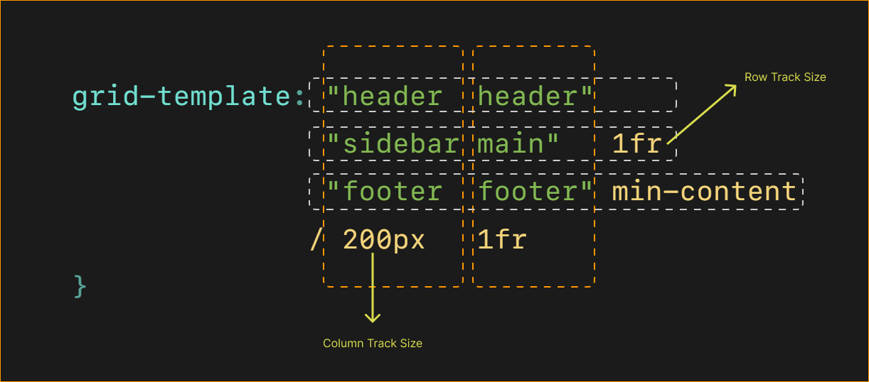
The grid-template property also accepts a syntax that lets us explicitly specify the grid columns, rows and areas at the same time.
grid-template:
  "header  header"
  "sidebar main"   1fr
  "footer  footer" min-content
/ 200px 1fr;header, sidebar, main, and footer are the names of the grid areas for a grid container. The number of names inside each string specifies the number of columns (which is two on each row in the example above).
The values after the columns — like 1fr and min-content above — represent the <track-size> for each row. If we don’t specify a track size on a row, as in the first row of the example above, the size of that row is set to auto.
The last line of the example contains a forward slash (/) followed by two length values. Those set the column sizes. And since we have two columns on each row, we need to provide two sizes. We’ve set the first column to 200px wide and the second row to 1fr.

Basic usage
.grid {
  display: grid;
  gap: 1rem;
  grid-template: "header  header"
                  "sidebar main"   1fr
                  "footer  footer" min-content
                / 200px   1fr;
}
Above code is equivalent to the following:
.grid {
  display: grid;
  gap: 1rem;
  grid-template-columns: 200px 1fr;
  grid-template-rows: auto 1fr min-content;
  grid-template-areas: "header header"
                        "sidebar main"
                        "footer footer";
}
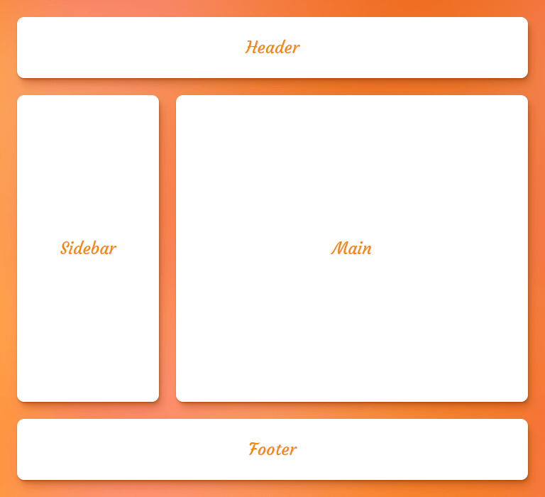
And it has the following result:

It’s a shorthand for explicit grid properties, not implicit ones
The grid-template property rests only the explicit grid properties to their initial values and it doesn’t have any effects on the implicit grid properties such as grid-auto-columns, grid-auto-rows, and grid-auto-flow, for that, there is another shorthand called grid which has the same syntax, but also resets the implicit grid properties.
Here is what happens when you set grid-template property to none:
grid-template: none;

/* is equivalent to: */
grid-template-rows: none;
grid-template-columns: none;
grid-template-areas: none;
There are lots of ways to define grid lines
Naming grid lines is a popular way to to make writing them easier, but there are multiple ways to go about it. One way is to give each line multiple names as a way to think of things having starting and ending lines:
.grid {
  grid-template-columns: [col1-start] 1fr [col1-end col2-start] 1fr [col2-end];
}
A cool thing about CSS Grid is that it auto-numbers things for us. That means we can ditch the numbers when placing grid items on a grid container’s lines. So, instead of writing col1 and col2 like we did above, we can simply write col followed by the line number we want to align to:
.grid-item {
  grid-column-start: col 2;
}
It’s even cooler when we use that technique on grids with lots of columns:
.grid {
  grid-template-columns: repeat(4, [col] 100px);
}
Now we have four columns that are 100px wide and have auto-numbered grid lines named col we can use to place items on the grid:
.grid-item {
  grid-column: col 2 / col 4;
}
Of course, we have the span keyword which means we can simplify things a bit more:
.grid-item {
  grid-column: col 2 / span 2;
}
Here’s an example where we’re have two grid lines. line-1 is the grid line between the first and the second row and line-2 is the line between the second and the last row.
grid-template:
  "header  header"
  [line-1] "sidebar main" 1fr [line-2]
  "footer  footer" min-content
/ 200px   1fr;
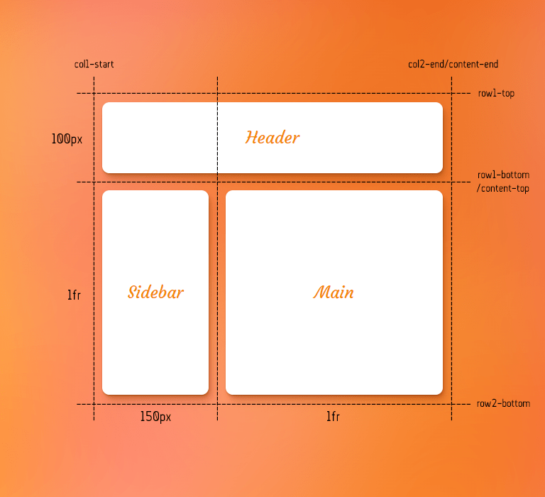
We can also set the size of grid lines between columns:
grid-template:
  [row1-top]    "header  header" 100px [row1-bottom]
  [content-top] "sidebar main"   1fr [row2-bottom]
/ [col1-start]  150px    1fr     [col2-end content-end];
Notice how using whitespace can help make the code easier to read by aligning the columns in each row.
- Row 1:
100pxtall with grid lines namedrow1-topandrow1-bottom - Row 2: Takes up the remaining space, thanks to
1fr, with grid lines namedcontent-topandrow2-bottom. - Column 1:
150pxwide with acol1-startline name - Column 2: Takes up the remaining space with
1frand a line given two names,col2-endadcontent-end
Sometimes an illustration can be helpful to see what’s going on.

Be cautious when using the repeat() function
It wasn’t designed to work with the grid-template property! The idea is that repeat() would get in the way of being able to write things cleanly where everything can be lined up with whitespace — sort of like a simple visualization of the grid.
.grid {
  display: grid;
  grid-template: "header  header"
                  "sidebar main"   1fr
                  "footer  footer" min-content
                / 200px   1fr;
}
Demo
Let’s create a responsive layout for a webpage using grid-template property. First, some default CSS Grid for a stack of items in a single column:
/* Define the grid */
.grid {
  min-height: 100vh;
  display: grid;
  grid-template-areas:
    "header"
    "main"
    "left-sidebar"
    "right-sidebar"
    "footer";
  gap: 1rem;
}

/* Place the items on the grid */
header {
  grid-area: header;
}

.left-sidebar {
  grid-area: left-sidebar;
}

.right-sidebar {
  grid-area: right-sidebar;
}

main {
  grid-area: main;
}

footer {
  grid-area: footer;
}
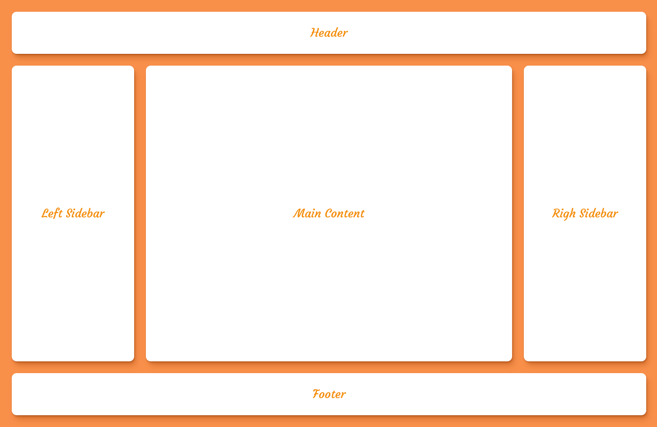
Cool cool. But what we really want is a 3⨉3 grid on larger screens. Something like this:

So, let’s create that layout inside of a media query using grid-template:
@media (min-width: 600px) {
  .grid {
    grid-template:
      "header             header             header"         min-content
      "left-sidebar       main               right-sidebar"  1fr
      "footer             footer             footer"         min-content
    / minmax(auto, 250px) minmax(250px, 1fr) minmax(auto, 250px);
  }
}Browser support
More information
- CSS Grid Layout Module Level 2
- The
grid-templateShorthand (Rachel Andrew) - Use Grid Shorthand to Visualize Explicit CSS Grid Tracks (thoughtbot)