DigitalOcean provides cloud products for every stage of your journey. Get started with $200 in free credit!
The border-image-source CSS property creates borders around elements using an image file or CSS gradient as the source.
.container {
  border-width: 2rem;
  border-style: dotted;
  border-color: grey;
  border-image-source: url('path/to/image.jpg');
  border-image-repeat: repeat;
  border-image-slice: 100;
}Notice in this example that border-image-source is one of three border-image-* properties:
border-image-source: Specifies the image file or gradient used for the border.border-image-repeat: Specifies whether to repeat the image when drawing the border or to display it once.border-image-slice: Splits the border image into regions used for spacing and sizing the image.
The border-image-source property is defined in the CSS Backgrounds and Borders Module Level 3 specification.
Syntax
border-image-source = none | <image>;
where
  <image> = <url> | <gradient>
…where <image> can be expressed as a URL that points to an image file, or a CSS gradient.
- Initial value:
none - Applies to: All elements, except internal table elements when
border-collapseis collapse - Inherited: no
- Computed value:
noneor the computed<image> - Percentages: N/A
- Animation type: discrete
Values
/* Keyword values */
border-image-source: none;
border-image-source: <image>;

/* <image> values */
border-image-source: url('image.png');
border-image-source: url('svg-file.svg');
border-image-source: <gradient>;

/* <gradient> values */
border-image-source: linear-gradient(to bottom left, lightblue, #00000);
border-image-source: repeating-linear-gradient(15deg, #900000, #ee2400, #ffb09c 2rem );
border-image-source: radial-gradient(to top right, #7AD7F0, #92DFF3 0.5rem, #F5FCFF);
border-image-source: repeating-radial-gradient(to right, #B7E9F7, #DBF3FA);
border-image-source: conic-gradient(#FFFEE9, #FFFBC8, #FFF59E, #FFF157);

/* Global values */
border-image-source: inherit;
border-image-source: initial;
border-image-source: revert;
border-image-source: revert-layer;
border-image-source: unset;
none
This is the default value for the border-image-source CSS property. It indicates that there will be no image or gradient color set on the selected element.
The <gradient> syntax allows you to set a group of colors and have them overlap. It represents 5 gradient functions which are:
linear-gradient()radial-gradient()conic-gradient()repeating-linear-gradient()repeating-radial-gradient()
<image> as url()
<image> accepts the url() function with its valid inputs including an image with a valid extension, an svg, or an external link to the image. It’s basically the same way background-image accepts the url() function and displays the image file it targets. The example below creates a border from a JPG image file provided in the url() function:
.container {
  border-image-source: url("path/to/image.jpg");
  border-image-repeat: repeat;
  border-image-slice: 150 75;
  /* etc */
}<image> as <gradient>
The <image> value can also be expressed as a CSS <gradient>. Gradients are merely images drawn by the browser, which is why they are considered a valid <image> value. And any type of CSS gradient is supported:
linear-gradient()radial-gradient()conic-gradient()repeating-linear-gradient()repeating-radial-gradient()
We set it the same way we would set as if it was set using the background-image property:
.container{
  border-image-source: repeating-linear-gradient(
    15deg,
    #900000,
    #ee2400,
    #ffb09c 2rem
  );
  border-image-repeat: repeat;
  border-image-slice: 100 75;
  /* etc */
}Oh, you want to animate the gradient? Sure! It does require using a custom CSS @property — which is only supported in Chrome at the time of this writing — but it’s totally possibly to, say, rotate the angle of the gradient:
Learn more about using @property in “Interpolating Numeric CSS Variables”.
Border images can be SVG
Other than images with a valid image extension, svg files can also be used as borders. Link up the SVG file as you normally would in the url() function:
.container {
  border-width: 3rem;
  border-style: solid;
  border-image-source: url("path/to/image.svg");
  /* etc. */
}Encoded SVG also works if that’s how you prefer to roll:
If you want to get super tricky with SVG as a border image, give “Creative Background Patterns Using Gradients, CSS Shapes, and Even Emojis” by Preethi a read. The examples in there use the background-image property, but they work with border-image-source as well.
Border radius is a no-go
The short story is that the border-image-source property does not work with the border-radius property. You can set border-radius on the same element, but the corners of the border image will maintain its sharp edges.
If you really need those rounded corners, then you might consider using a background-image on the element’s ::before pseudo-element and applying border-radius on it instead.
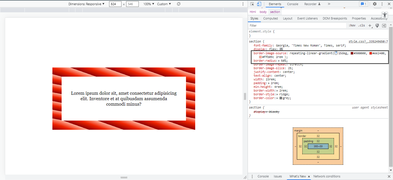
Here’s the longer story. During my research, The following example uses the border-image-source property to create a repeating-linear-gradient border with a border-radius set to 50%. Notice how the corners remain sharp even though DevTools shows a border-radius declaration:

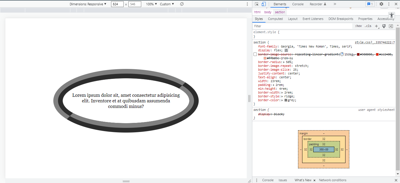
Here’s how it looks without border-image-source:

An issue has been opened in the specification’s repo, but there’s no indication of when, or if, it will be resolved at the time of this writing.
Performance
Take note when using images or external urls to your images in the border-image-source without taking measures to reduce their size before use because loading heavy images greatly increases the overall page size which results in a slower website. It’s always worth optimizing your images before calling them with the url() function and leaning toward modern image formats that tend to be lighter.
Demo
Browser support
Support looks good across all major browsers. It’s also great to set your border-color in case your image fails to load or the resource is unable to load due to server issues:
section {
  border-color: grey; /* fallback color */
  border-width: 2rem;
  border-image-source: url("image.png");
}
More information
- CSS Backgrounds and Borders Module Level 3 (W3C specification)
border-image-source(MDN)- How To Add Border Images and Gradient Borders with Pure CSS (DigitalOcean)
Related tricks!
Understanding border-image
Using CSS for Image Borders
How to Make Repeating Border Images
Gradient Borders in CSS
Animating a CSS Gradient Border
Stacked “Borders”
Related
border
.element { border: 3px solid #f8a100; }
border-block
.element { border-block: 5px solid #f8a100; }
border-collapse
.element { border-collapse: separate; }
border-boundary
.element { border-boundary: display; }
border-image
.element { border-image: url(border.png) 25 25 round; }
border-inline
.element { border-inline: 5px solid #f8a100; }
border-radius
.element { border-radius: 10px; }
border-spacing
.element { border-spacing: 5px; }