DigitalOcean provides cloud products for every stage of your journey. Get started with $200 in free credit!
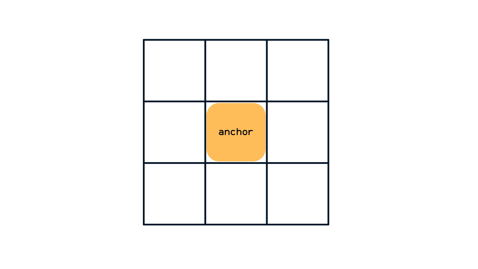
The inset-area property creates an imaginary 3×3 grid surrounding an anchor element by declaring rows and columns, and uses it to set an anchor-positioned (or “target”) element in one region of the grid or span multiple regions of the grid.
.target {
  position: absolute;
  position-anchor: --my-anchor;
  inset-area: bottom end;
}
For most use cases, like creating a tooltip, using the inset-area property to place anchor-positioned elements will be enough. If you need more fine-grained control, you can use the anchor() function for additional ways to position the anchor-positioned element.
The inset-area property won’t have any effect on a common element. That’s because it is part of the CSS Anchor Positioning module, a set of many features that work together to position an element that we call a “target” to another element we call an “anchor”.
Note: Per spec, the inset-area property is now named position-area, but browsers that have shipped Position Anchor (Chromium so far) continue to use inset-area, so be wary when it may change!
Syntax
inset-area: auto | <inset-area>- Initial value:
none - Applies to: positioned elements with a default anchor element
- Inherited: No
- Percentages: N/A
- Computed value: As specified
- Canonical order: Per grammar
- Animation: TBD (not yet specced)
Values
/* Default value */
inset-area: none;

/* Logical values */
inset-area: end start;
inset-area: block-start inline-end;
inset-area: self-block-start self-inline-end;

/* Physical Values */
inset-area: top center;
inset-area: bottom left;
inset-area: x-start y-end;

/* Span Values */
inset-area: center span-left; /* covers anchor */
inset-area: span-bottom right;
inset-area: top span-all;

/* Single Values */
inset-area: center;
inset-area: left;

/* Global values */
inset-area: inherit;
inset-area: initial;
inset-area: revert;
inset-area: revert-layer;
inset-area: unset;none: The.targetelement doesn’t move and is not positioned in relation to an anchor element.<inset-area>: Places the.targeton the regions of the grid selected by the rows and columns. If the target doesn’t have a matchingpositon-anchor/anchor-namerelation with any anchor, then this value doesn’t have any effect.
Understanding what an inset-area is
As mentioned earlier, the inset-area property creates an imaginary 3×3 grid that we can use to position target elements along the edges of anchor elements.

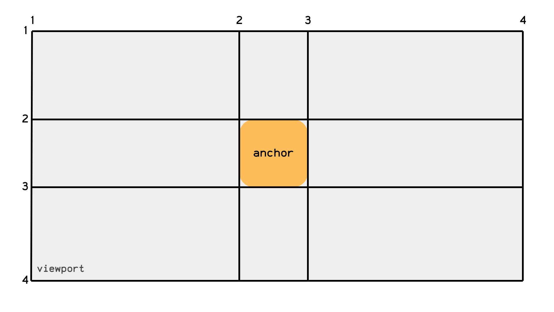
As useful as this representation is for understanding the concept of anchor positioning, it isn’t an exact representation of how the grid looks. In reality, the grid isn’t symmetrical at all, but rather contained by four imaginary lines on each axis, which includes:
- The
startof the target’s containing block. - The
startof the anchor element oranchor(start). - The
endof the anchor element oranchor(end) - The
endof the target’s containing block.
Since target elements must be absolutely positioned (i.e. position: absolute), their containing block is the viewport making the default grid look more like this

Now that we know what our grid really looks like, and we have mastered linking elements with matching anchor-name/position-anchor properties, the next step is moving your target around your anchor. One way is to mingle with the target’s inset properties (top, right, bottom, left, etc) but sometimes we want to place it on the “anchor’s top left corner” or “right next to the anchor” without resorting to inset properties.
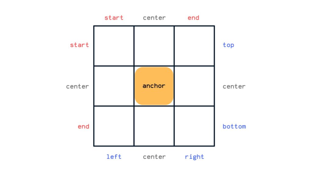
The inset-area property takes that weight off you and positions the target on the specified grid region. It works by setting the row and column of the grid using logical values like start and end (dependent on the writing mode); physical values like top, left, right, bottom and the center shared value.

So if we want to place our target, say in the top right corner, we could write inset-area: top right or inset-area: start end on an LTR containing block.
.target {
	position: absolute;
	position-anchor: --my-anchor;

	inset-area: top right;
	/* or */
	inset-area: start end;
}To place a target across two adjacent grid regions, we can use the prefix span- on any value (that isn’t center) a row or column at a time.
.target {
	position: absolute;
	position-anchor: --my-anchor;

	inset-area: span-top left;
	/* or */
	inset-area: span-start left;
}Finally, we can span across three adjacent grid regions using the span-all value.
.target {
	position: absolute;
	position-anchor: --my-anchor;

	inset-area: bottom span-all;
	/* or */
	inset-area: end span-all;
}The order of values doesn’t matter… unless we’re working with logical properties
There are more values than meets the eye. For example, logical values refer to the target’s containing block writing mode, so a self- prefix is needed to pick the target’s own writing mode.
.target {
  position: absolute;
  position-anchor: --my-anchor;

  inset-area: self-end self-start;
}
You may have also noticed that the inset-area property doesn’t have a strict order for physical values. So, we’re technically able to swap those values around because it all means the same thing. For example:
.target {
  inset-area: top left;
  /* same as: */
  inset-area: left top
}
But wait! The order is extremely important if we’re working instead with logical property values. That’s because the direction of logical property values is relative to a person’s writing mode (e.g. right-to-left).
.target {
  inset-area: start end; /* equates to "top" and "right" in LTR writing mode */
  /* is opposite of: */
  inset-area: end start /* equates to "bottom" and "left" in RTL writing mode */
}
This is because physical values aren’t ambiguous on which axis they refer: top will always refer to the grid’s “top row”, but logical values are ambiguous and depend on the context of the browser’s writing mode, so the first logical value sets the row, and the second value sets the column.
Using “ambiguous” and “explicit” logical values
The values are interchangeable so long as we’re explicit about which direction the values refer to by prepending inline- or block- to the value:
.target {
  position: absolute; /* required */
  position-anchor: --my-anchor;

  inset-area: inline-end block-start;
  /* or */
  inset-area: block-start inline-end;
}
CSS knows which direction each value is going because we were very explicit about it: This one goes in the inline direction, and this other one goes in the block direction. So the order doesn’t matter to CSS at all because it’s the same either way!
But what if our values are less declarative and instead are more ambiguous about which direction they refer to? An “ambiguous” value would be start or end because they do not explicitly say whether it’s talking about the inline or block direction. So, for example, if we have mixed ambiguous and explicit values like this:
.target {
  inset-area: block-end start;
}
…CSS will evaluate the ambiguous start value as inline-start because the block direction has already been accounted for with the explicit block-end value.
And if we were to declare two ambiguous logical values:
.target {
  inset-area: start start;
}
…then CSS will set the first value in the block direction, and the second value in the inline direction, or:
.target {
  inset-area: block-start inline-start;
}
A single value implies the span-all keyword
But let’s say we only provide one value and it’s an explicit one, say top:
.target {
  inset-area: top;
}
CSS will position the .target element along the anchor element’s top edge, but span it across all of the columns to take up the full space. So, in effect, declaring a single explicit top value implicitly sets the span-all keyword on the element, which means it is the same as writing:
.target {
  inset-area: top span-all;
}
Demo
Specification
The position-anchor property is defined in the CSS Anchor Positioning Module Level 1 specification, which is currently in Working Draft status at the time of writing. That means a lot can change between now and when the feature becomes a formal Candidate Recommendation for implementation.
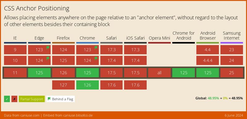
Browser support
More information and tutorials
- “CSS Anchor Positioning” (CSSWG)
- “inset-area Documentation” (MDN)
- “Introducing the CSS anchor positioning API” (Una Kravets)
- “CSS Stuff I’m Excited After the Last CSSWG Meeting” (Juan Diego Rodríguez)
