DigitalOcean provides cloud products for every stage of your journey. Get started with $200 in free credit!
The CSS border-image-repeat property controls how a border image is repeated to fill the outer edges of an element. It can also control the center of an element’s background when border-image-slice is set to fill.
.container {
  border-style: ridge;
  border-width: 3rem;
  border-image-source: url('path/to/image.jpg');
  border-image-slice: 70;
  border-image-repeat: repeat;
}The border-image-repeat property is defined in the CSS Backgrounds and Borders Module Level 3 specification.
Syntax
border-image-repeat: stretch | repeat | round | space- Initial value:
stretch - Applies to: all elements (including the
::first-letterpseudo-element), except internal table elements whenborder-collapseis set tocollapse. - Inherited: no
- Percentages: n/a
- Computed value: two keywords, one per axis
- Animation type: discrete
Values
/* Keyword values */
border-image-repeat: stretch;
border-image-repeat: repeat;
border-image-repeat: round;
border-image-repeat: space;

/* Multiple value syntax */
border-image-repeat: stretch repeat;
border-image-repeat: stretch round;
border-image-repeat: stretch space;

border-image-repeat: round stretch;
border-image-repeat: round repeat;
border-image-repeat: round space;

border-image-repeat: repeat stretch;
border-image-repeat: repeat round;
border-image-repeat: repeat space;

border-image-repeat: space stretch;
border-image-repeat: space round;
border-image-repeat: space repeat;

/* Global values */
border-image-repeat: inherit;
border-image-repeat: initial;
border-image-repeat: revert;
border-image-repeat: revert-layer;
border-image-repeat: unset;
stretch
This is the default value. It stretches the image to fill in the border region.
repeat
This value repeats the border image in tiles to fill the border region. If the tiling reaches a point where there is no more space for a full tile, that tile may be clipped to properly fill the remaining space to prevent gaps.
round
Like repeat, this value repeats and stretches the image to fill all the border sides. But unlike repeat, the round value will rescale the image to prevent gaps rather than clipping tiles.
space
Like the other values, space repeats the border image in tiles to fill the border region. If there is an space leftover, space will distribute it around the tiles to fill the entire area rather than clipping and stretching tiles, or rescaling the image.
Some background
We can set an image to be used as the border of an element:
.element {
  border-image-source: url("/path/to/image.webp");
}
That won’t do anything because we haven’t actually set the border’s width and style, so let’s do that:
.element {
  border: 2.5rem solid; /* shorthand for `border-width` and `border-style` */
  border-image-source: url("/path/to/image.webp");
}
We don’t have to set the border-color but it might be a good idea as a fallback in the event the border image file fails to load for some reason.
That draws our border using the image file we supply for it (here’s the file we’re using in the examples):
We’ve generated images for all directions of the border. The problem is we haven’t provided any instructions for what to do with that image to fill the available space. But first, we can “slice” the image with border-image-slice. That divides into nine sections — the four corners, the four sides, and the center.

Once the border image is sliced up, the tiles are positioned and border-image-repeat: stretch (the default value) takes over to stretch the entire image to fill all of the available space we drew for the border.
Now we can explicitly declare border-image-repeat and set it with any of the values we covered.
Drawing border images with two repeat values
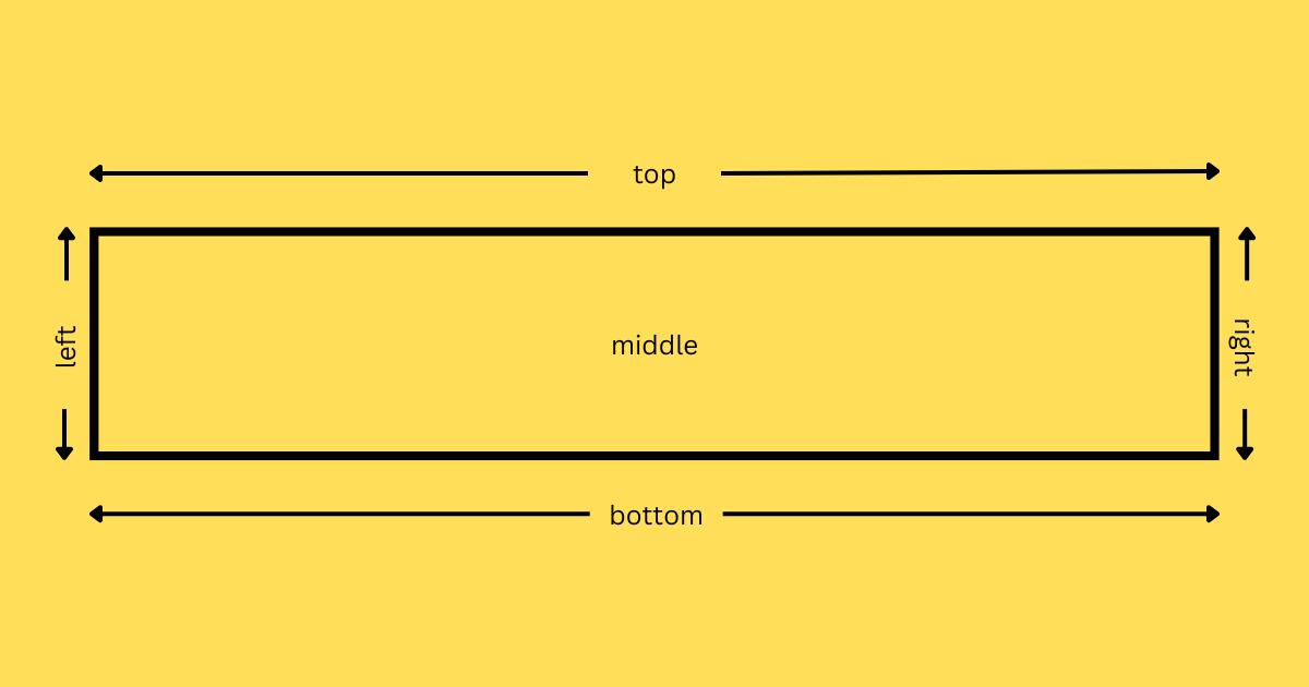
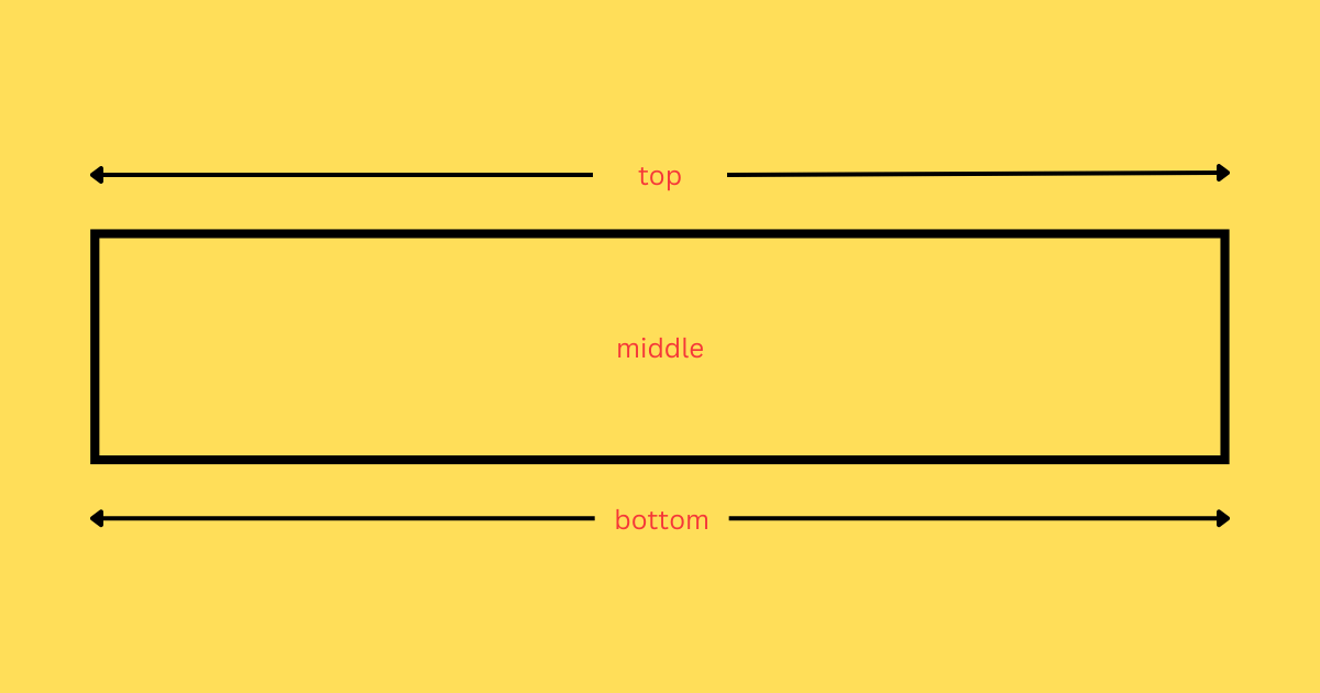
So, border-image-repeat can take up to two values. When we work with the two-value syntax, the first keyword sets the scaling and tiling in the horizontal direction (the top and bottom border edges). It can also set the middle region when border-image-slice is set to fill.

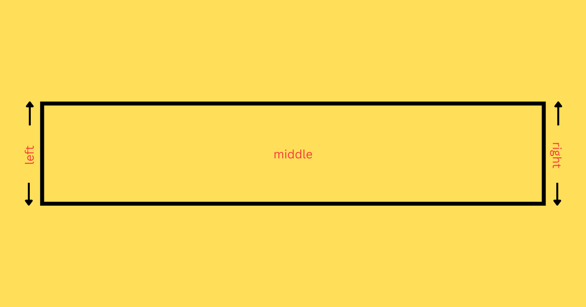
The second keyword in the two-value syntax sets the scaling and tiling in the vertical direction (the left and right border edges), as well as the middle image when border-image-slice is set to fill.

The official specification does a remarkable job outlining the process that takes place when repeating a border image with the two-value syntax. We’ll plop it in here verbatim:
- If the first keyword is
stretch, the top, middle and bottom images are further scaled to be as wide as the middle part of the border image area. The height is not changed any further. - If the first keyword is
round, the top, middle and bottom images are resized in width, so that exactly a whole number of them fit in the middle part of theborder-imagearea, exactly as forroundin thebackground-repeatproperty. - If the first keyword is
repeatorspace, the top, middle, and bottom images are not changed any further.
Browser support
More information
- CSS Backgrounds and Borders Module Level 3 (W3C specification)
- Understanding
border-image(CSS-Tricks) - How To Add Border Images and Gradient Borders with Pure CSS (DigitalOcean)